ABOUT
Designer, artist and lecturer based in London. Co-founder of Otog Studio, Ola works across design, objects, textiles and creative direction.
Her practice is rooted in a plural approach, engaging with material as artefact, narrative as function, and origin as a shifting lens. She explores systems of meaning through interpretation, visibility and process, reflecting on how objects are seen, made and understood.
Ola teaches at Kingston University, where she leads project-based learning that moves from concept to production. Her approach centres on critical authorship, reflective practice and the cultural systems that shape contemporary creative industries.
She studied Visual Communication, Textile and Fashion Design at the Royal Academy of Fine Arts Antwerp, Central Saint Martins and Vilnius Academy of Arts. Born in Ukraine.
EXPERTISE
Visual Identity & Communication
Digital Design
Objects & Textile
Art and Creative Direction
Teaching & Educational Practice
Digital Design
Objects & Textile
Art and Creative Direction
Teaching & Educational Practice
PARTICIPATIONS
2025
Earth, group exhibition, XYZ Gallery, London, UK
2024
London Design Festival, London, UK
2024
Royal Designers for Industry Summer Session, Dartington Hall, UK
2023 – 2025
Artist-in-residence, Acme Studios, London, UK
2023
New Wave, group exhibition, Spitalfields Studios, London, UK
2023
Nightwatch residency, FOMU, Antwerp, Belgium
2023
Group exhibition, Photo Museum FOMU, Antwerp, Belgium
2023
Bosbubbles festival, Het Bos, Antwerp, Belgium
2022
Ungeborene Tränen, exhibition, Galerie Judith Andreae, Bonn, Germany
2022
Nachtplan conference, Leuven, Belgium
2022
Design residency, Nachtplan, Leuven, Belgium
2022
Course leader, Interdisciplinary Design, Projector Online University, Kyiv, Ukraine
2021
Conference talk, Designship No Matter What, CONVERS10N International Design Conference, Vilnius, Lithuania
2021
Course leader, All Inclusive Design: Interdisciplinary Thinking and Making, Ukraine
2021
Course leader, Design Out of the Box, Projector Online Institute, Kyiv, Ukraine
2020
Conference talk, Recycled Everything, Whatabout International Conference (online)
2020
Workshop tutor, Personal Design Language and Design Research, Projector, Kyiv, Ukraine
2019 – 2020
Workshop tutor, Design of Ideas, Sochnik Design School, Kharkiv, Ukraine
2018
Meno Celes, group exhibition, Vilnius, Lithuania
2018
Group exhibition, Design Conference, Central Academy of Fine Arts, Beijing, China
2018
Costume design, Luci Mie Traditrici, Kyiv National Opera, Ukraine
2018
Group exhibition, Vogue UA and Ivan Honchar Museum, Kyiv, Ukraine
2017
Collaboration project with fashion brand DANSHAN, London, UK
2017
A Pleasant Voyage into Design Experience, group exhibition, Vilnius, Lithuania
2017
Pop-up collaboration, Vogue UA& GoGlobal volunteer project, Kyiv, Ukraine
WORK COMMISSIONS
Creative & Cultural Industries, Kingston University
Co-Founder at Otog Studio
London Design Festival
Vogue
Metaverse Fashion Week
FOMU - Photo Museum Antwerp
Gallery Jjudith Andreae
Mastercard
BNP Paribas
HET BOS
L'oreal
Creative & Tech Online Institute
AWARDS & MEMBERSHIPS
2025
Fellow of the Royal Society of Arts (RSA), London, UK
2025
Member of the London Guild of Weavers, Spinners & Dyers, London, UK
2024
DYCP grant recipient, Arts Council England, London, UK
2023
Winner, Certificate of Typographic Excellence, Type Directors Club, New York, USA
2020
Winner, Fashion Collaboration Award, Elle Style Awards Ukraine, Kyiv, Ukraine
2017
Fashion Design Scholarship Winner, Central Saint Martins competition with Vogue UA, London, UK
PUBLICATIONS
Slanted Magazine
It’s Nice That
Vogue
Adobe
Harper's Bazaar
Collide24
Elle
Bird in Flight
It’s Nice That
Vogue
Adobe
Harper's Bazaar
Collide24
Elle
Bird in Flight
EDUCATION
2016 – 2018
MA in Visual Communication, Vilnius Academy of Arts, Vilnius, Lithuania
2017
Fashion Mix, Central Saint Martins College of Fashion, London, UK
2012 – 2014
BA in Costume Design, Vilnius Academy of Arts, Vilnius, Lithuania
2012 – 2013
Fashion Design, Royal Academy of Fine Arts Antwerp, Antwerp, Belgium
2009 – 2012
Fashion Design, Kyiv University of Technology and Design, Kyiv, Ukraine
2006 – 2009
Fine Arts, Mykolayiv College of Culture, Mykolayiv, Ukraine
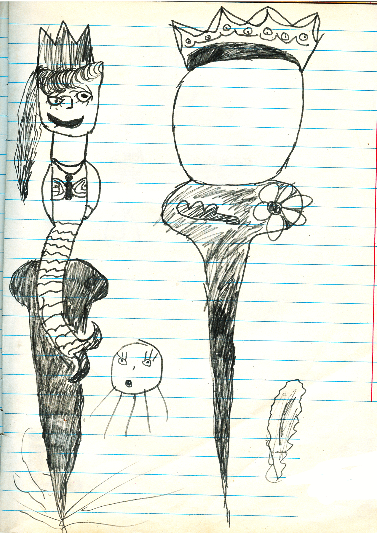
( Self-portrait as a mermaid, drawn in childhood. )
( Self-portrait now. )
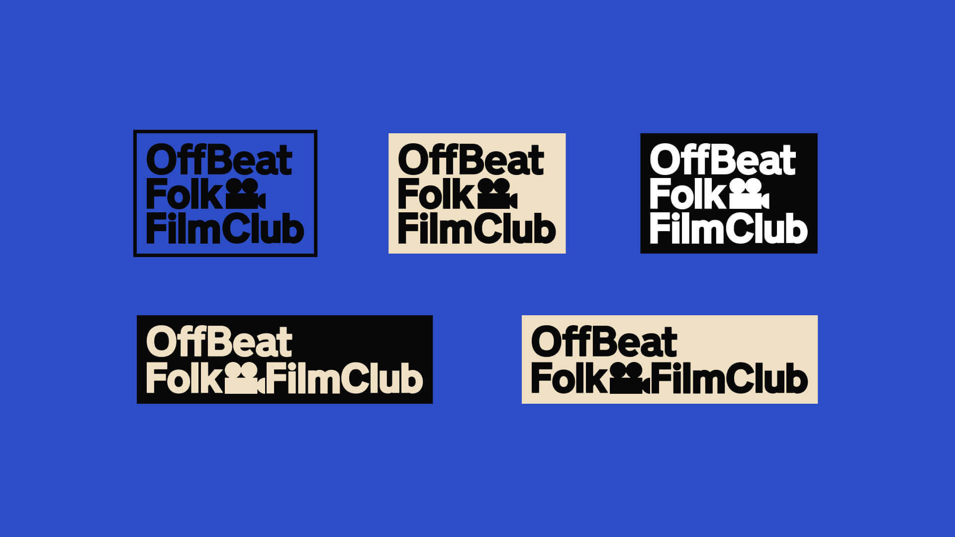
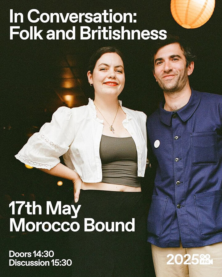
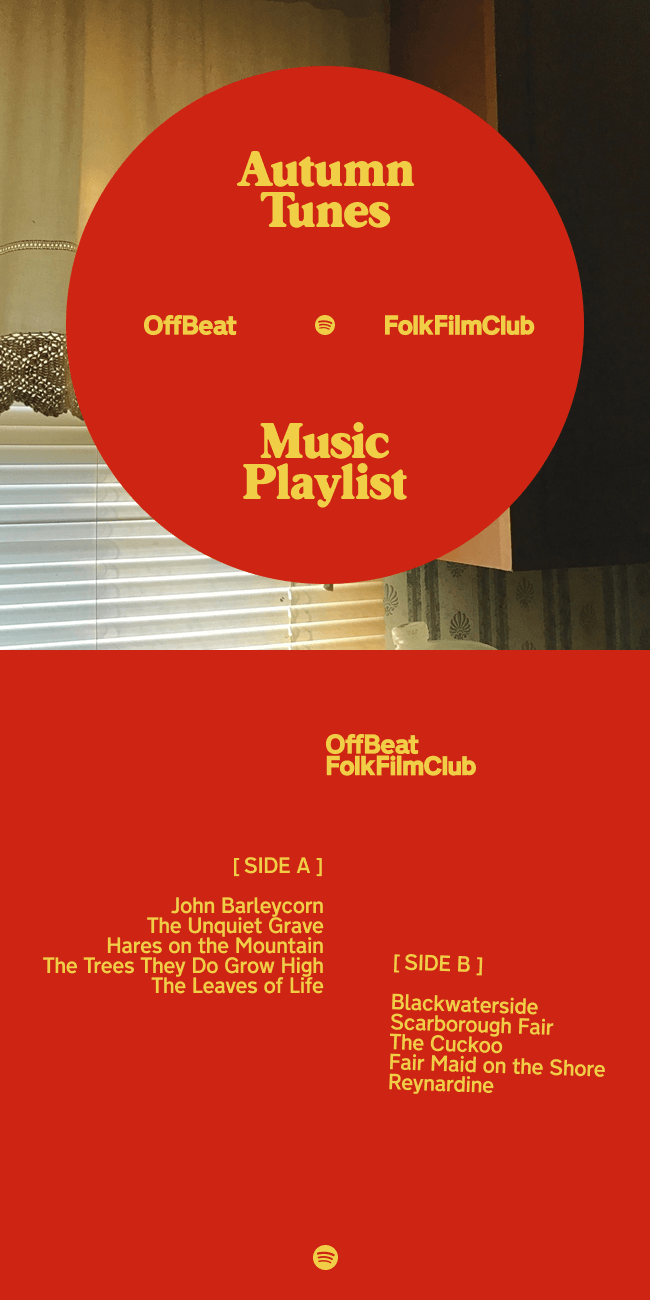
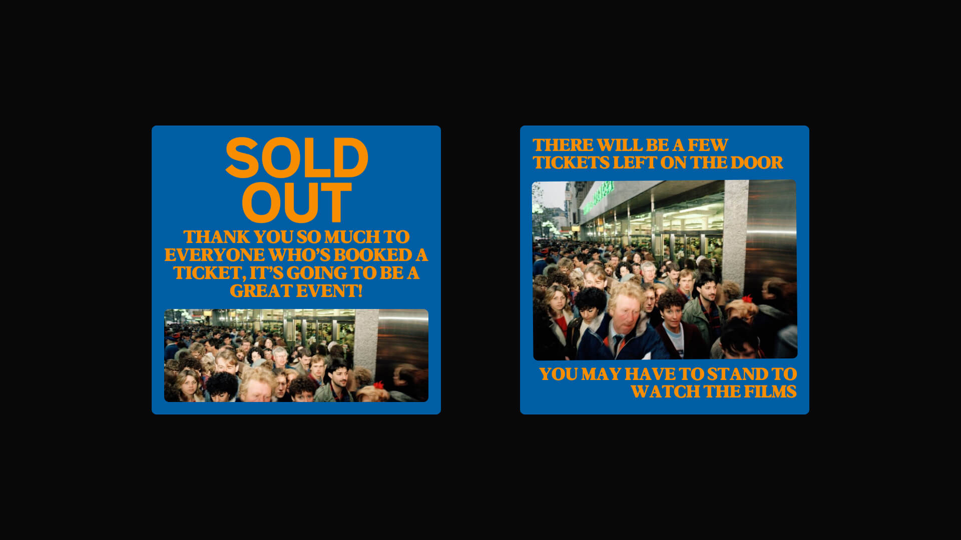
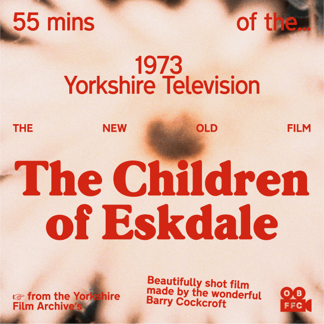
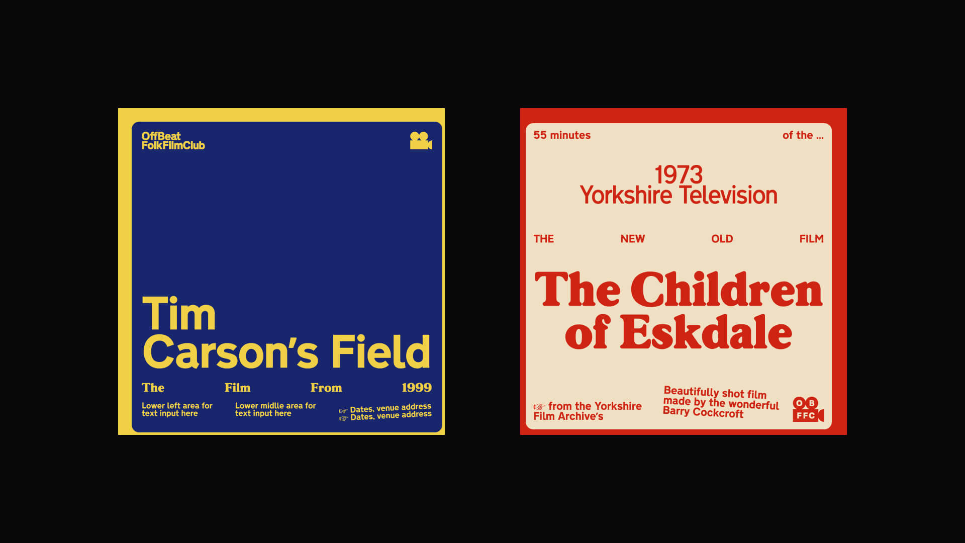
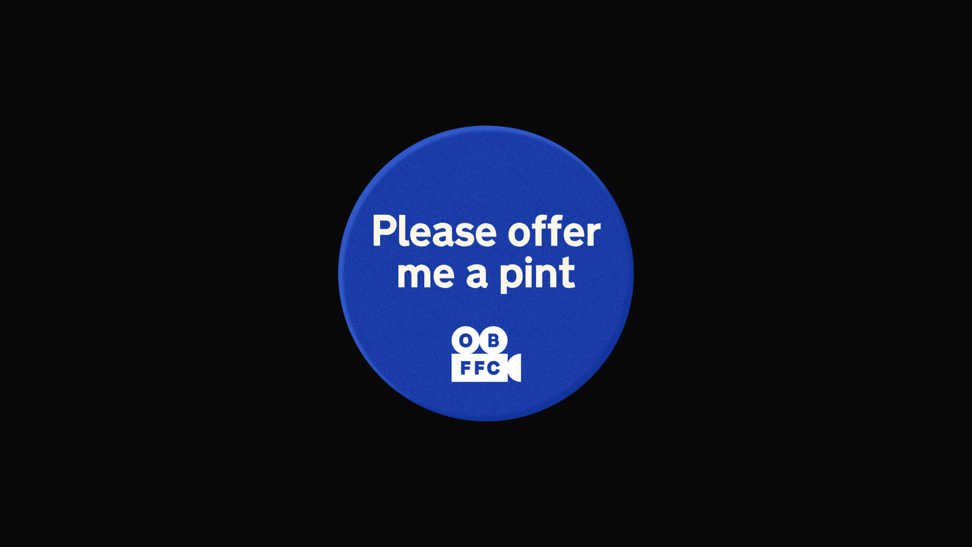
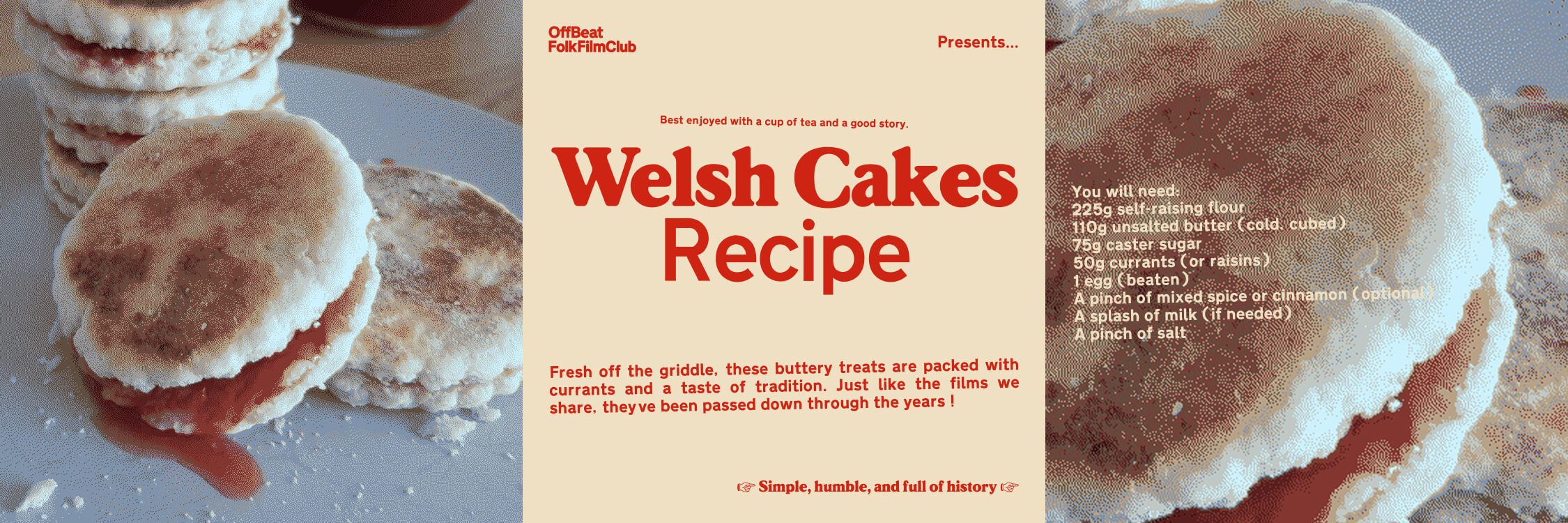
OFFBEAT folk film club
Brand identity design for OffBeat, designed at Otog Studio
OffBeat is the UK’s only dedicated film club focused on the folk and working culture of the British Isles. It celebrates the strange, wonderful, and overlooked, curating events, screenings, and talks that dig into the eccentric rhythms of rural life and collective memory. At Otog Studio, we developed a visual identity that reflects OffBeat’s commitment to British heritage. The concept draws on the language of midcentury public signage, a nod to state design at its most utilitarian, but reframed through a folk lens.
We used a typeface originally developed for UK transport signage, adapting it with angled compositions, text misalignments, and softened imperfections. This approach echoes the aesthetics of vernacular signage and local craft, where functionality meets character.
The colour palette and image treatments take cues from community halls, British Pathe reels, and the textures of working-class interiors, building a world that feels both familiar and quietly surreal. OffBeat’s brand doesn’t just frame films, it acts as an extension of their ethos: honest, odd, and grounded in place.
First screen animation: Jack Pell
Music: Poppy Hankin from Girl Ray
Animation by Jack Pell
The Pavilion of Culture
Exhibition identity, designed at Otog Studio
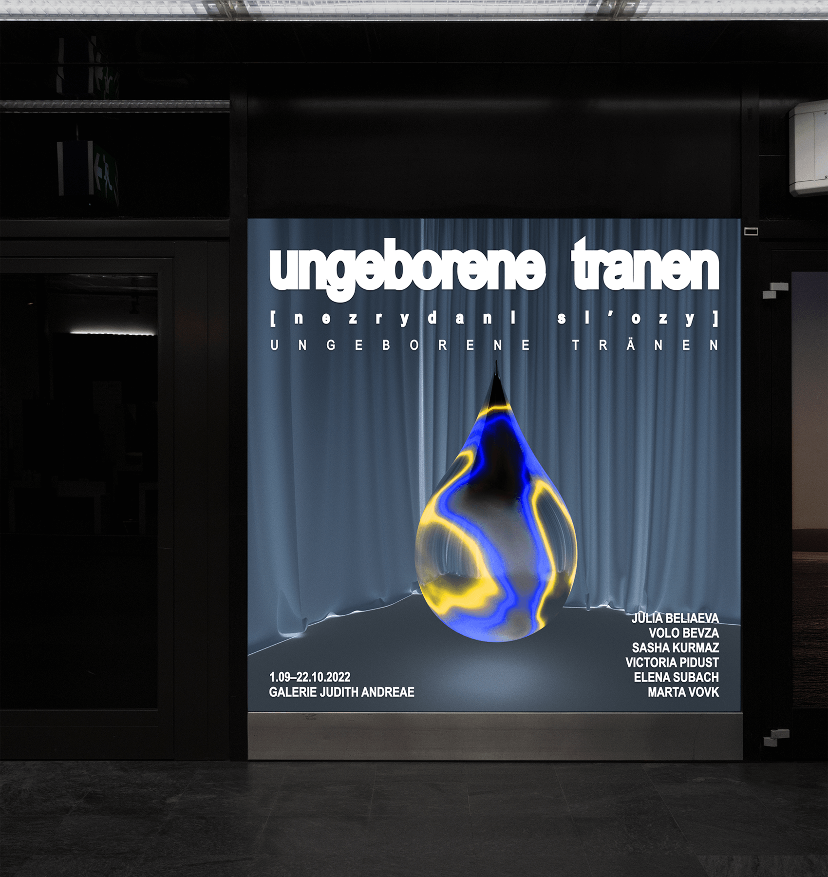
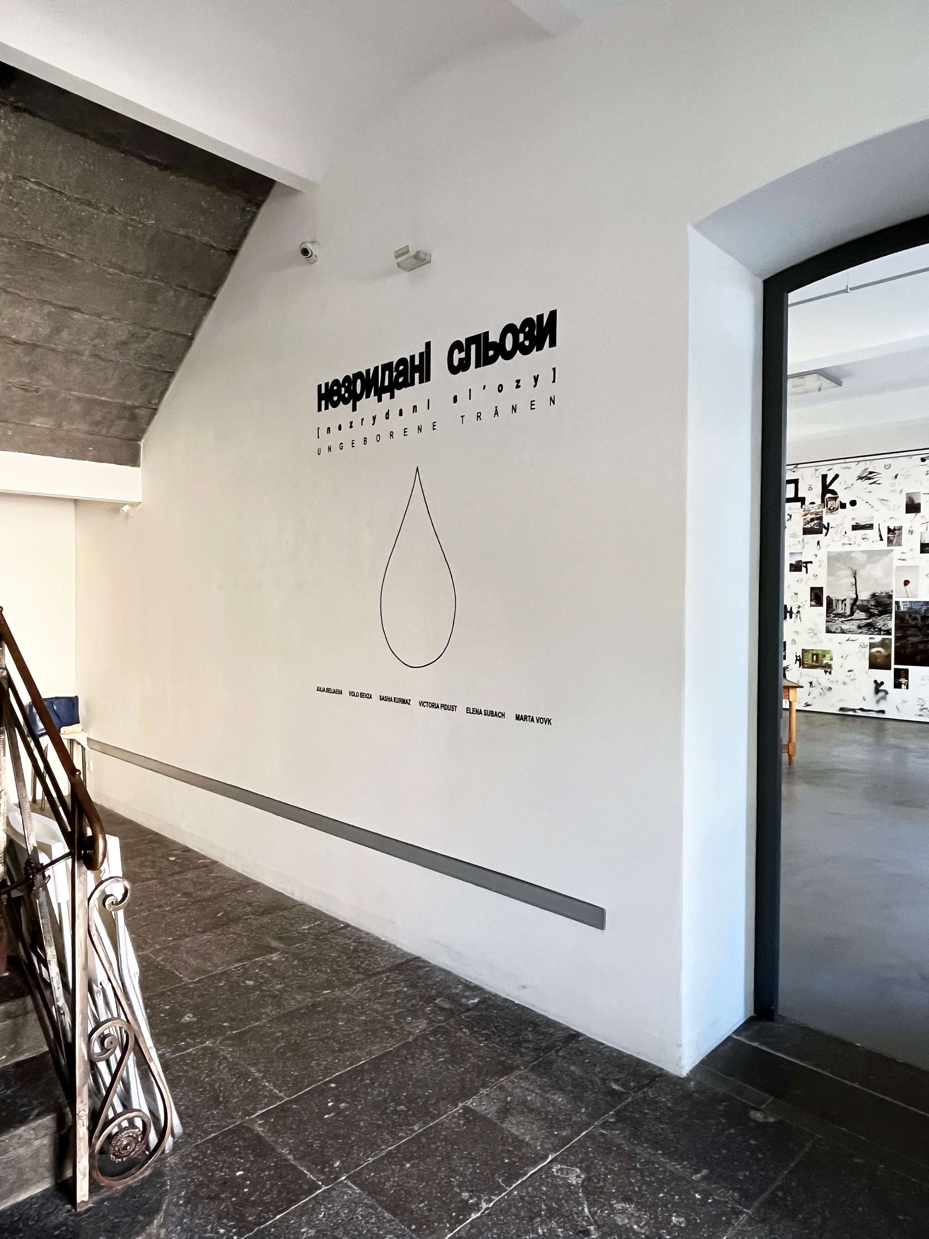
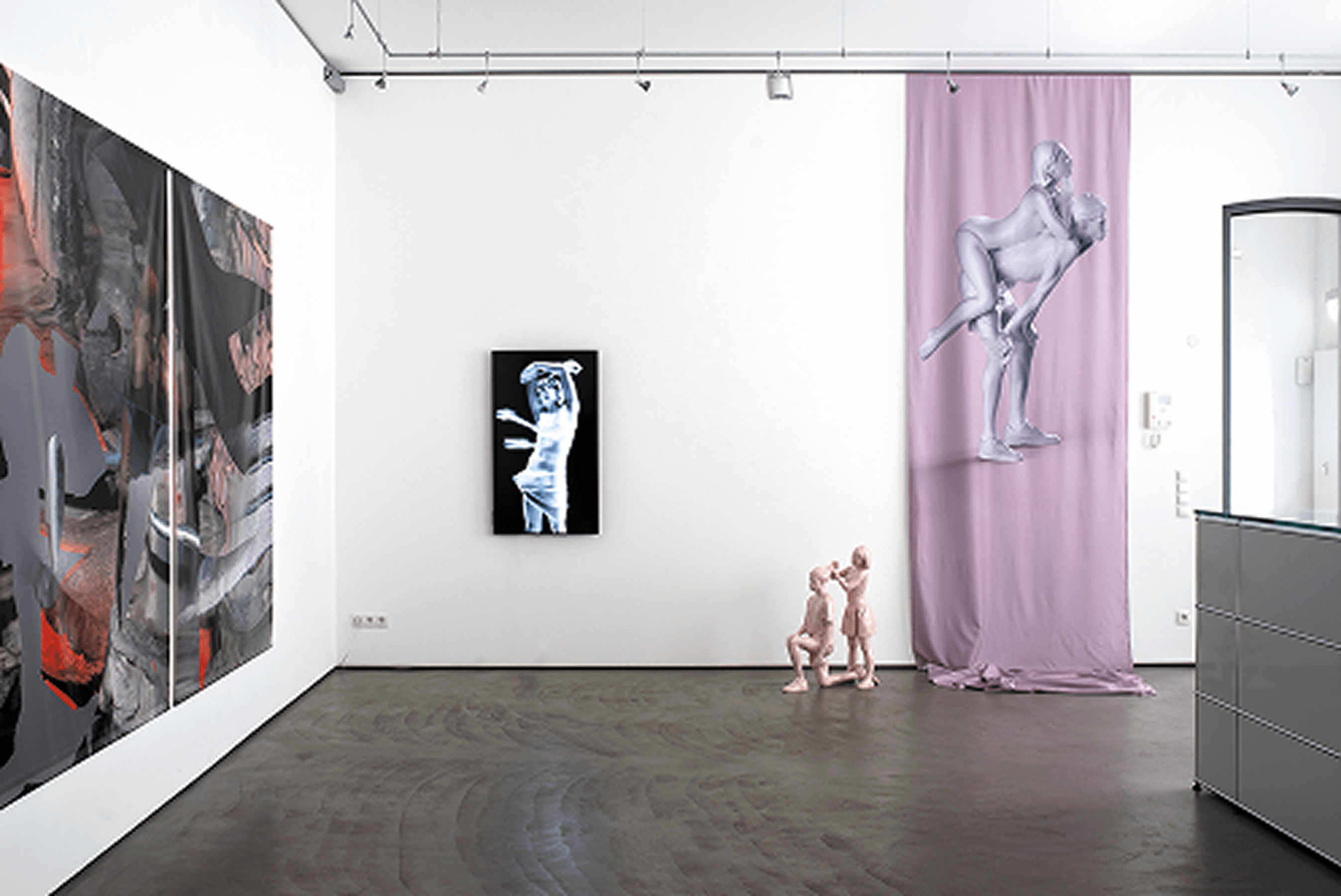
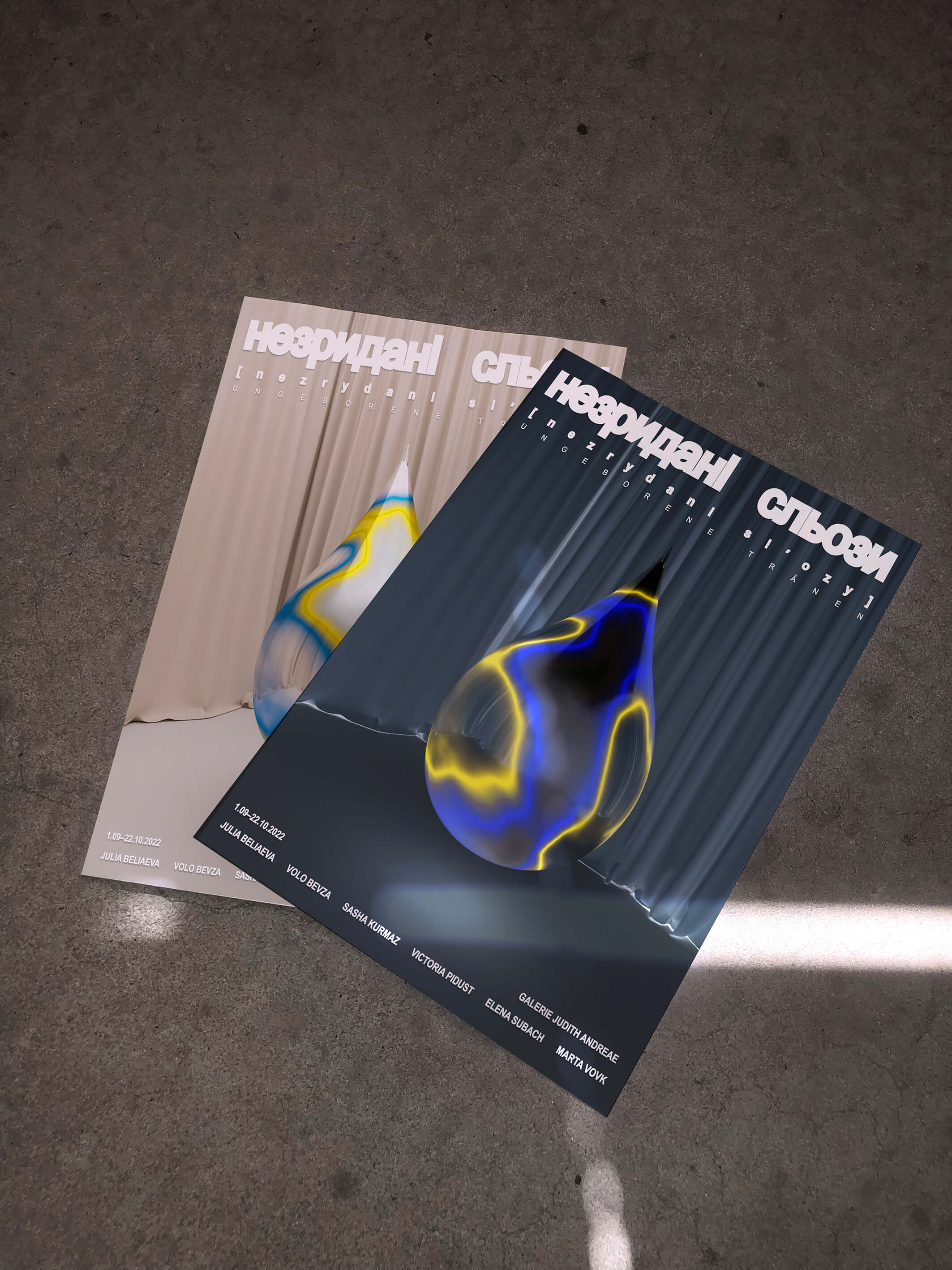
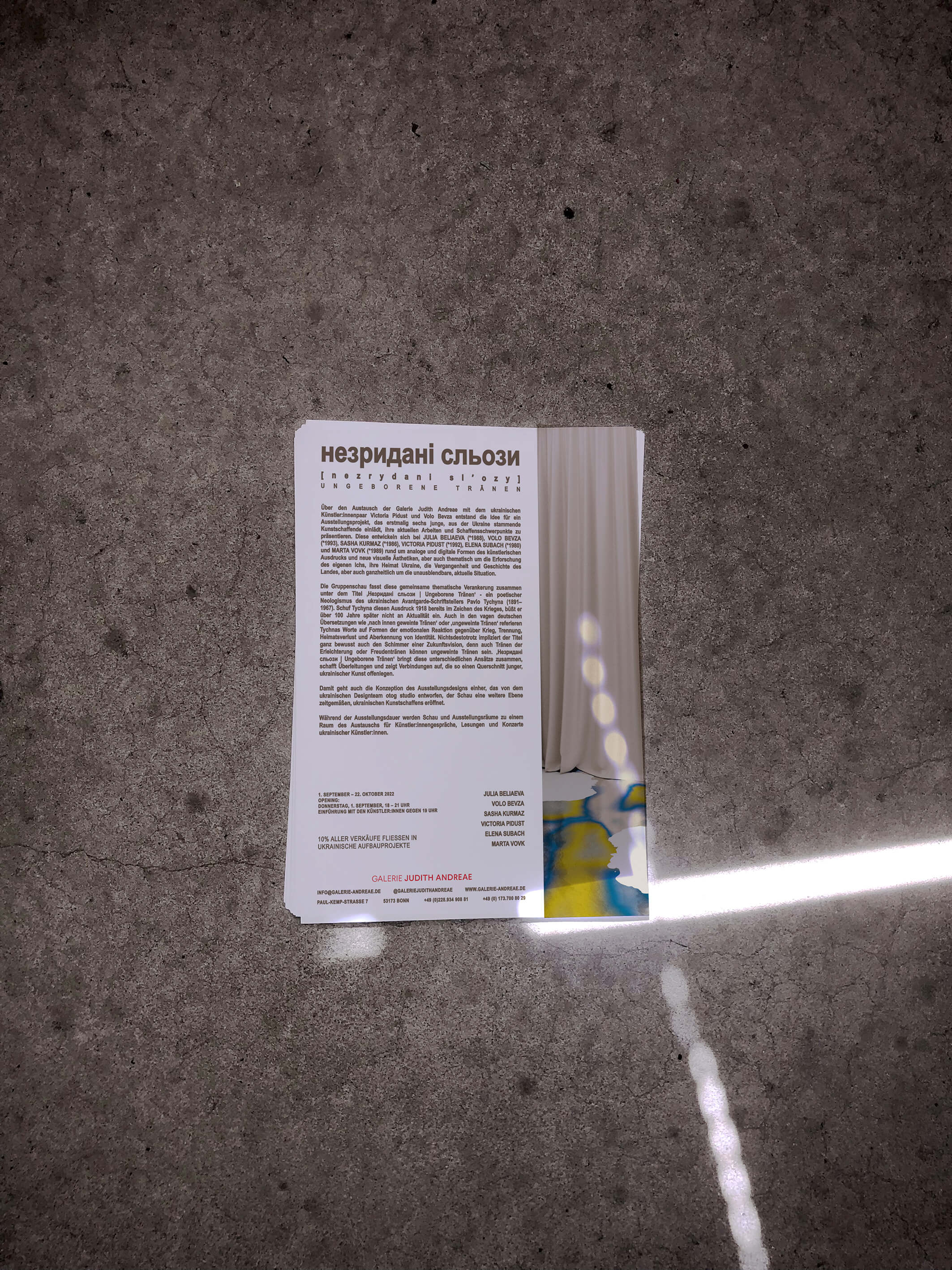
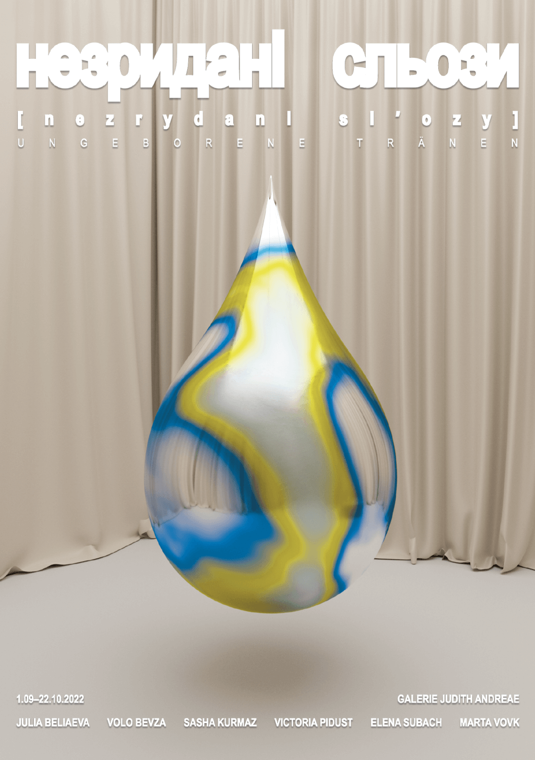
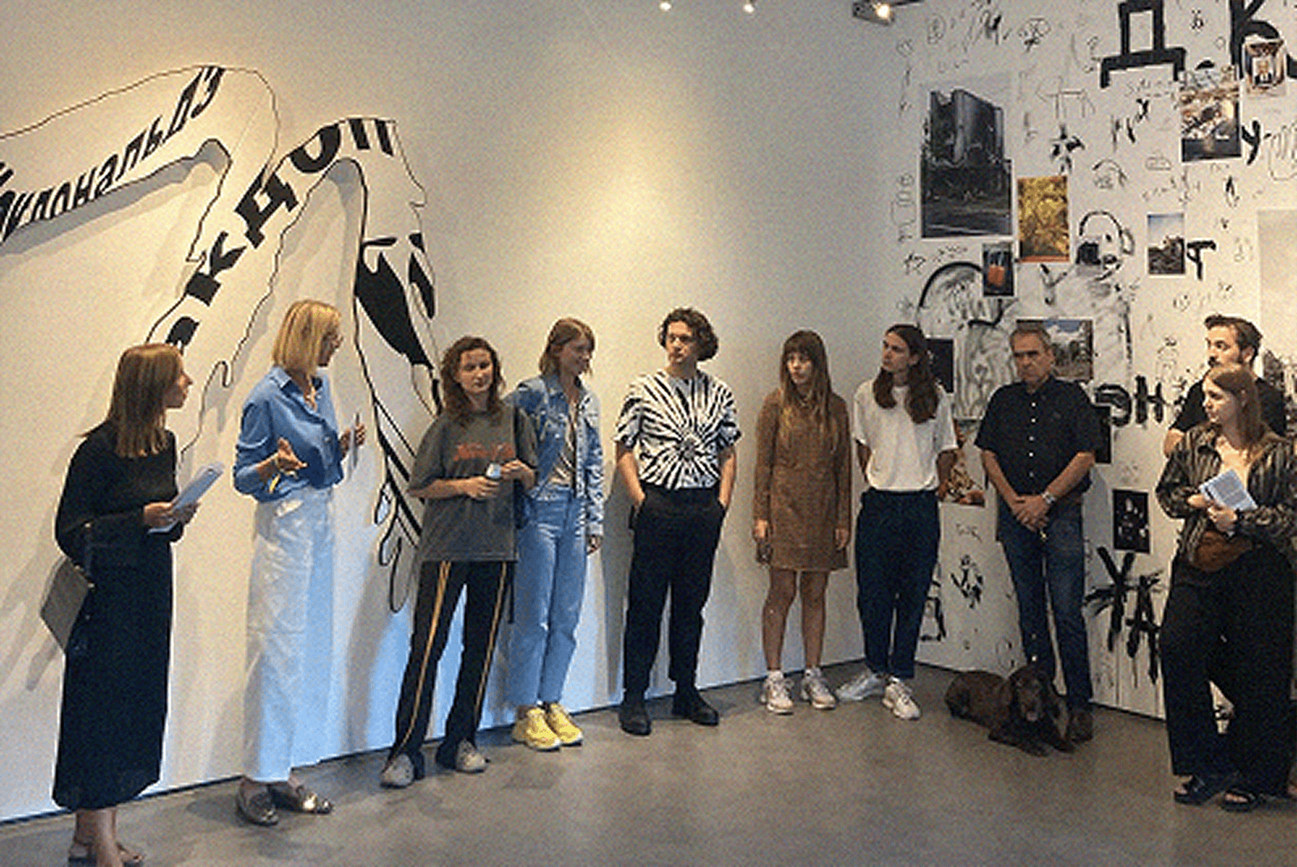
For the exhibition Незридані сльози | Ungeborene Tränen at Gallery Judith Andreae in Bonn, Otog Studio developed the visual identity, shaping a unified language around a deeply emotive and politically charged gathering of works by six young Ukrainian artists: Julia Beliaeva, Volo Bevza, Sasha Kurmaz, Victoria Pidust, Elena Subach, and Mensch Marta.
The title, meaning Unborn Tears, was drawn from a phrase by Ukrainian avant-garde writer Pavlo Tychyna, a reflection on grief that has not yet been expressed, and memory still in the making. The exhibition brought together diverse analogue and digital practices to explore themes of identity, homeland, and historical continuity, often marked by rupture.
Our identity centred on a floating tear, a visual metaphor rendered in the colours of the Ukrainian flag. Two versions of the motif were developed: a light and an inverted dark, evoking the layered duality of the Ukrainian experience, resilience and fragility, hope and inherited trauma.
The Pavilion of Culture
Exhibition identity, designed at Otog Studio
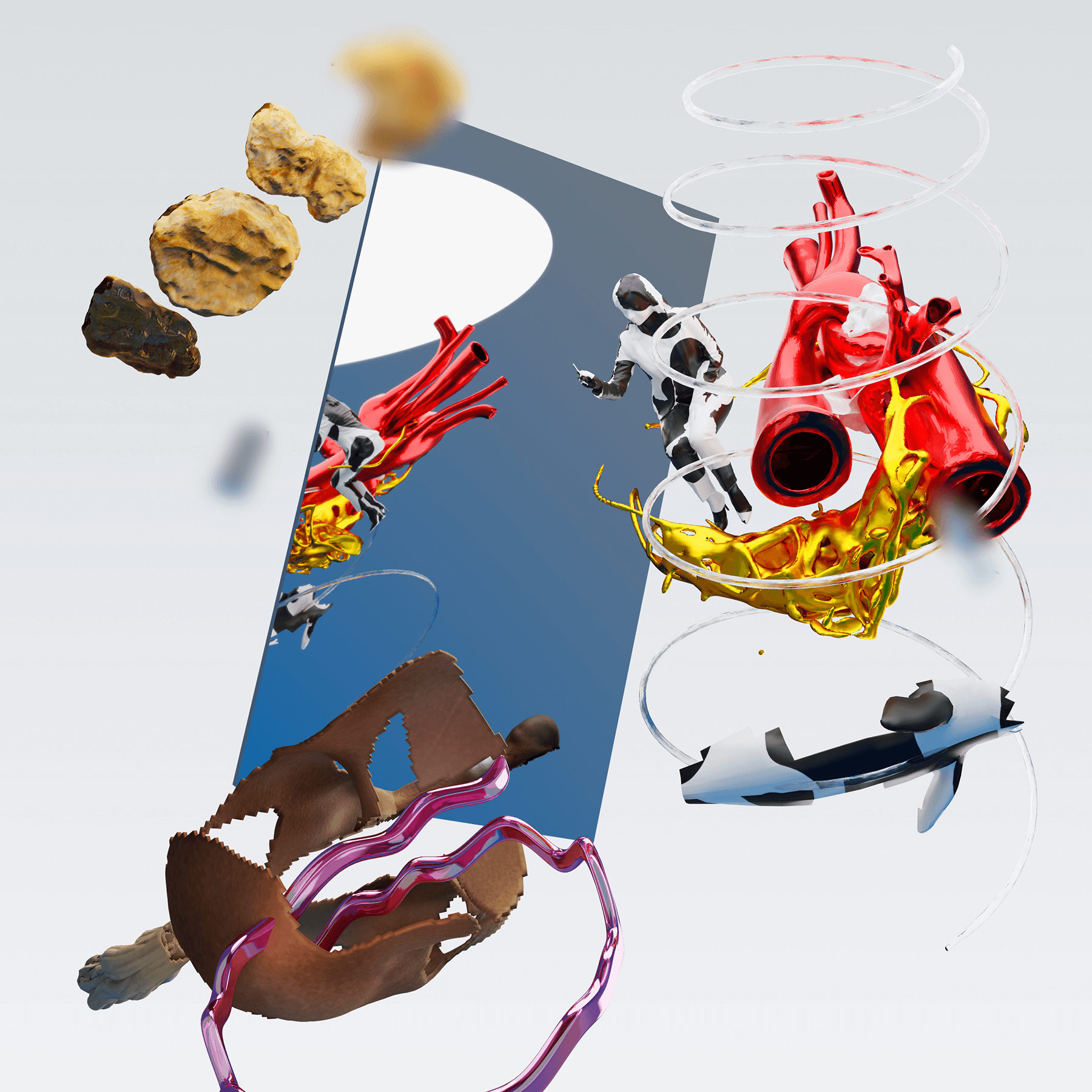
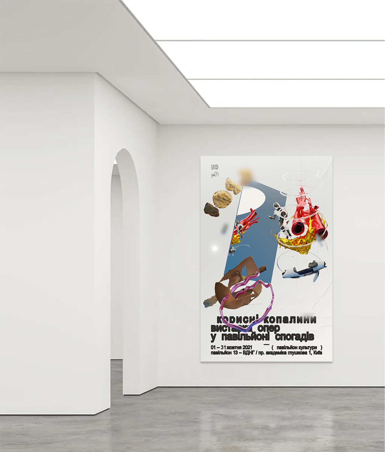
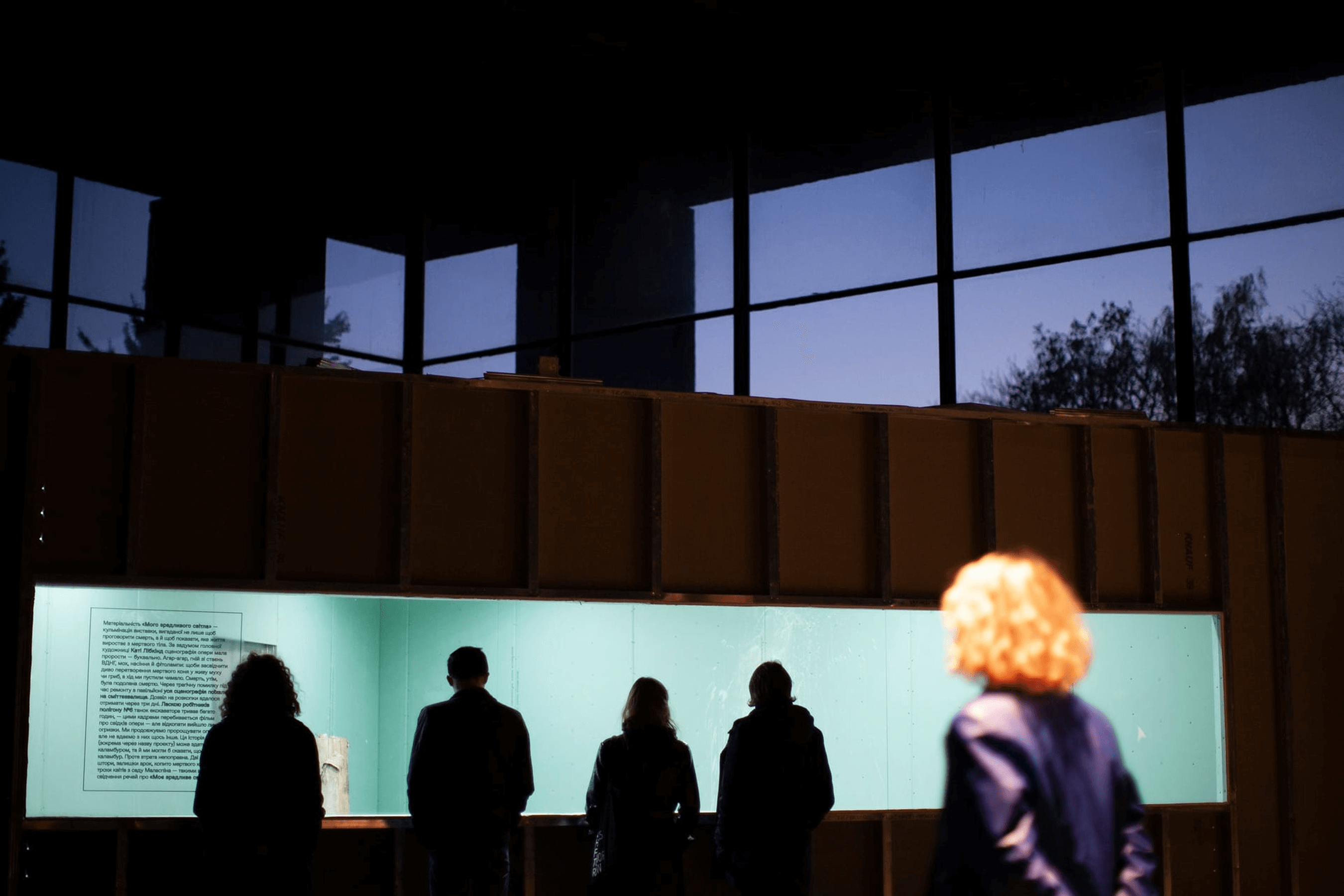
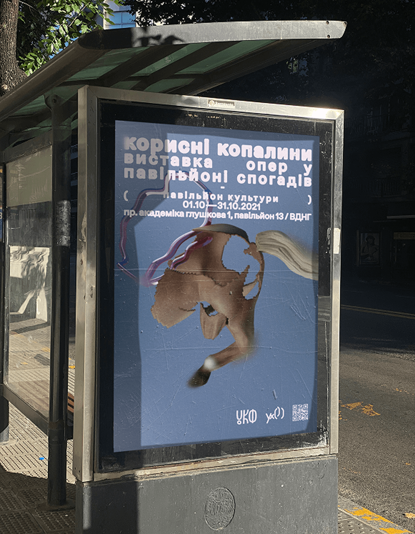
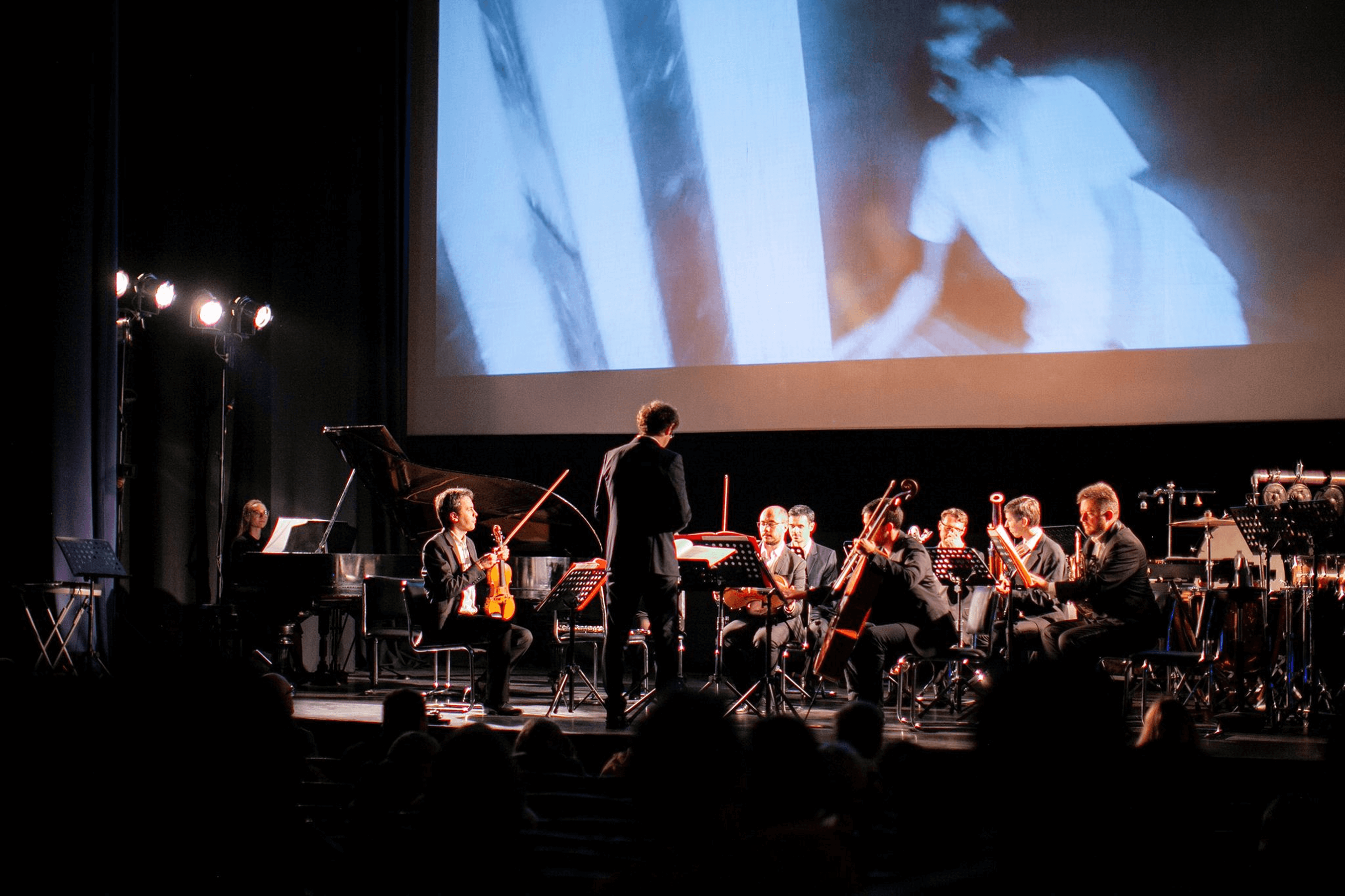
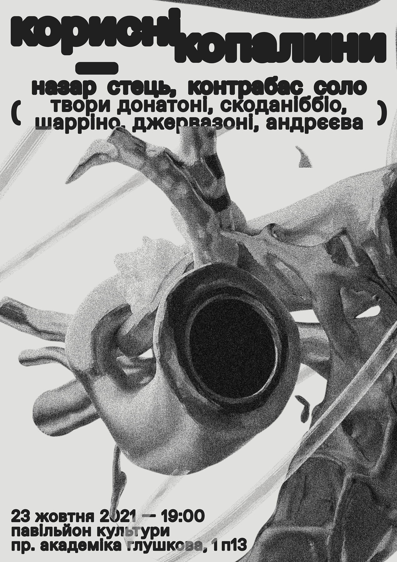
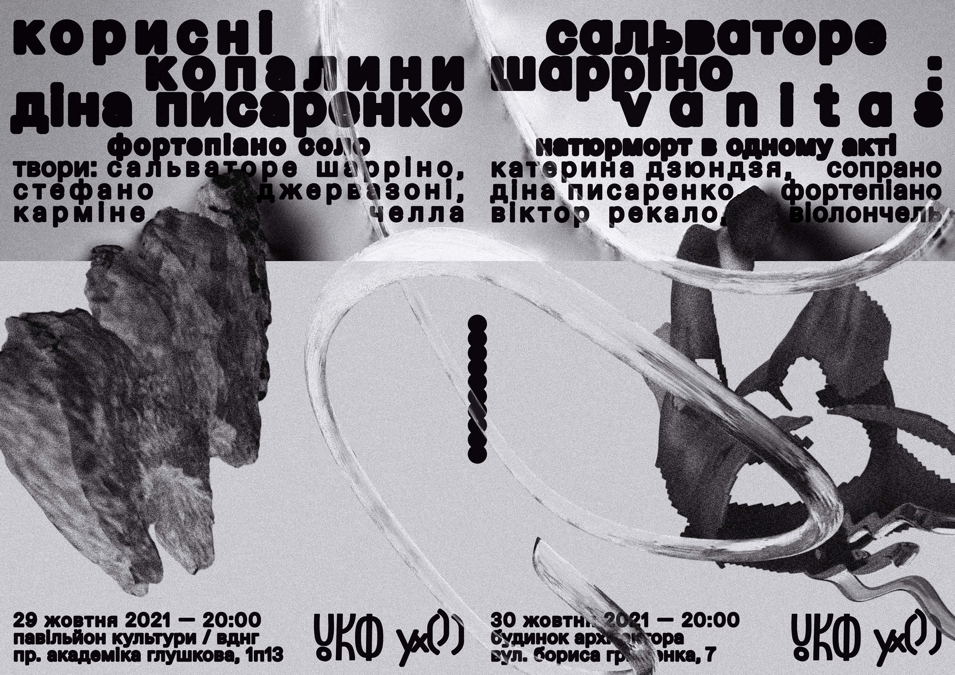
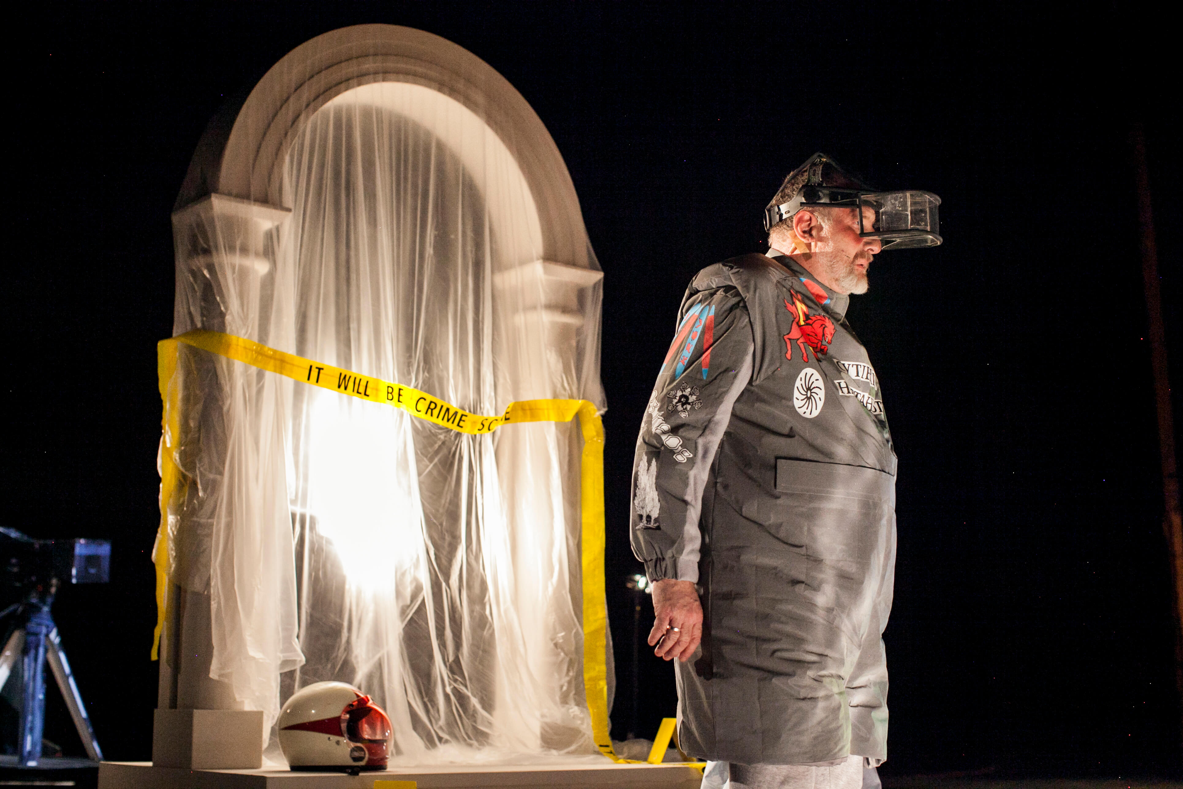
At Otog Studio, we created the visual identity for Useful Fossils — a retrospective exhibition presented within The Pavilion of Culture. The project revisits a series of experimental opera productions by Ukho Agency, originally staged at the National Opera of Ukraine between 2016 and 2018. The exhibition offers a non-linear reading of past performances, re-entering their narratives through memory, interpretation, and symbolic residue.
Our identity design focused on translating key motifs from each opera into a virtual and spatial language. Rather than reducing the works to a fixed aesthetic, we developed a system of visual cues, floating references, fragments, and digital compositions, that invite the viewer into both the plot and its surrounding commentary.
The result is not a single story, but a layered field of associations. A space where memory, performance, and image meet, and where cultural fragments are not fixed, but in flux.
Photo: Zhenia Perutska
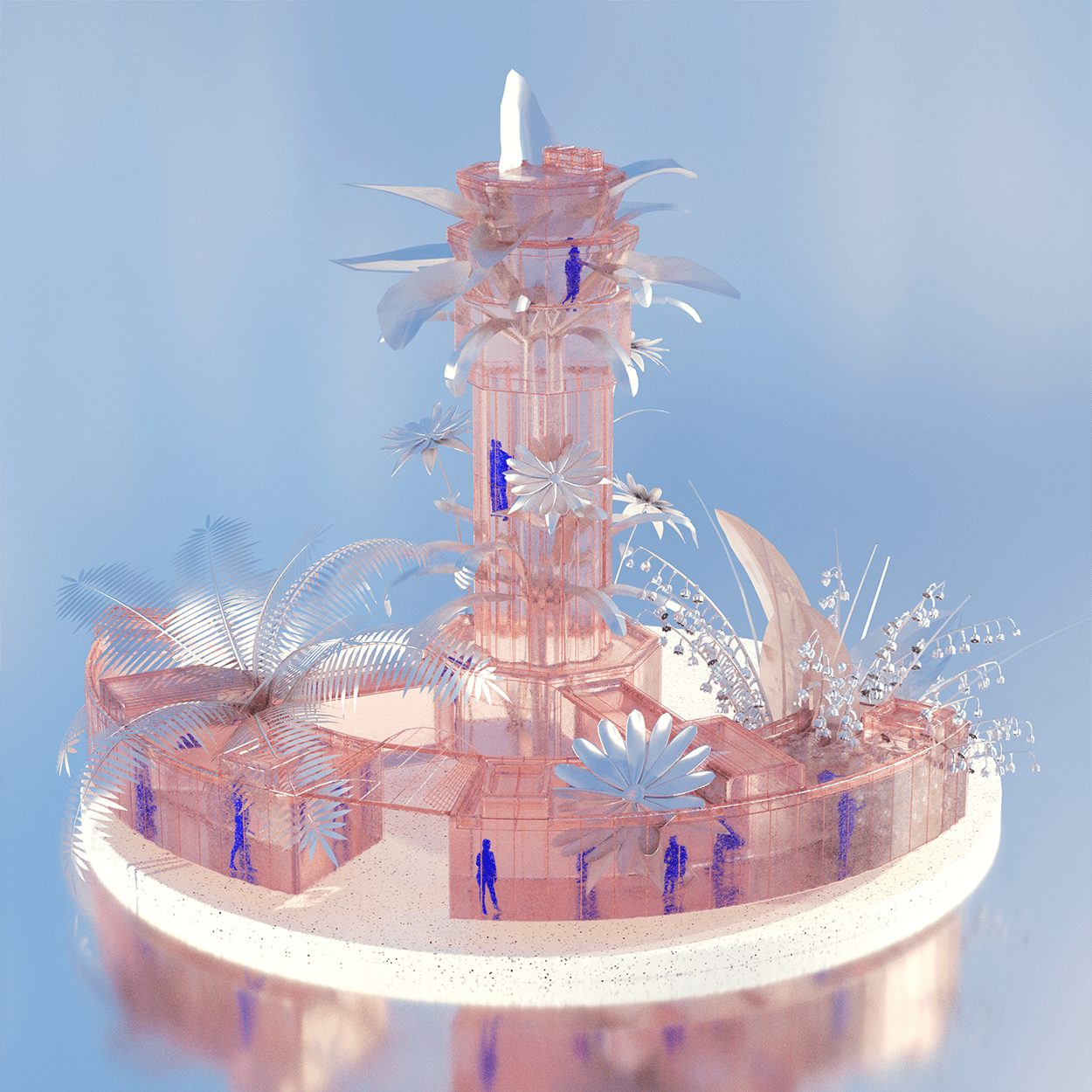
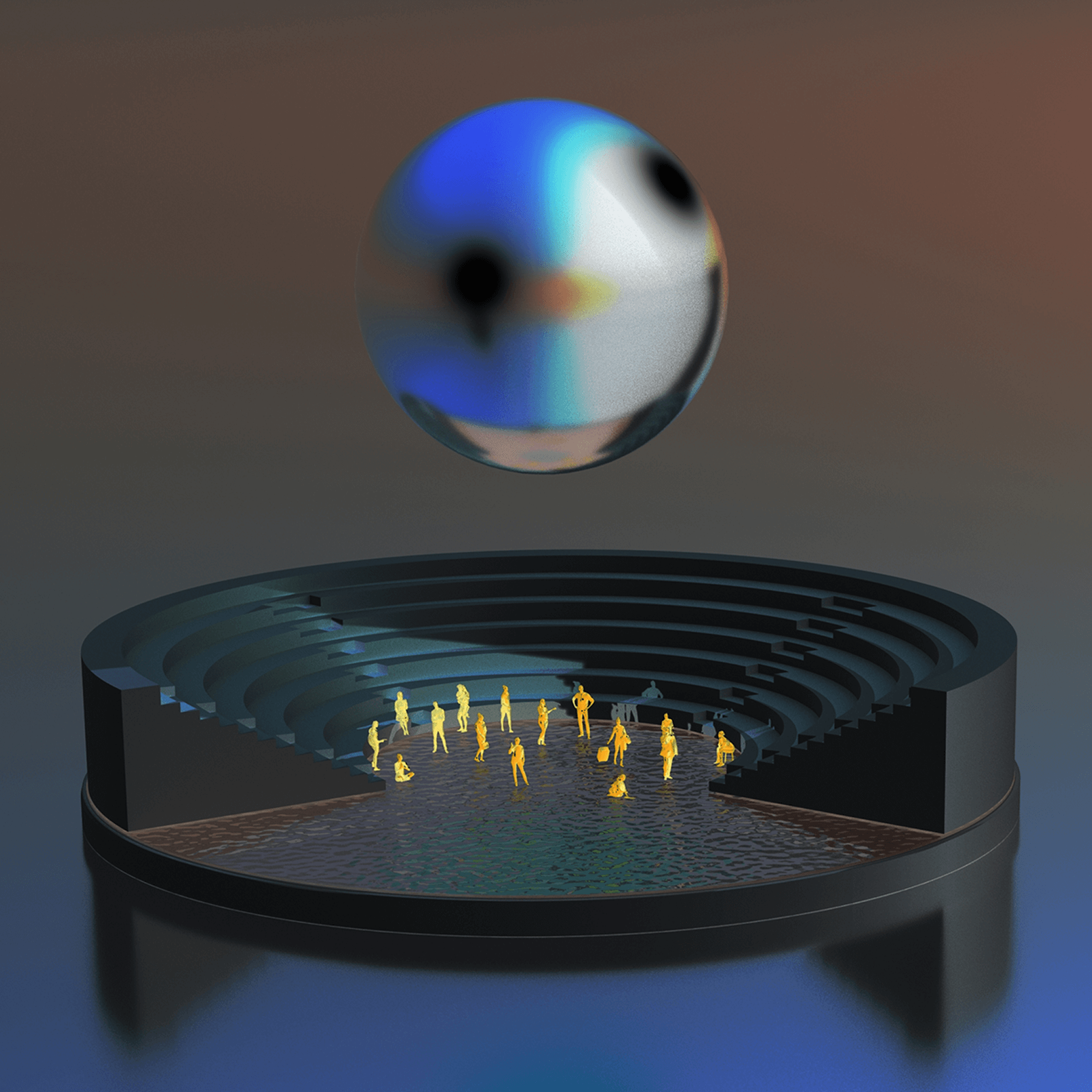
SHARED REALITY
Speculative architecture, designed at Otog Studio
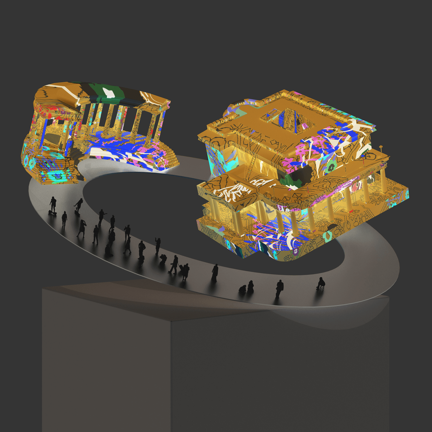
Commissioned by the Ministry of Culture and Information of Ukraine in partnership with MetaHistory and Depositphotos, Shared Reality is a series of speculative architectural illustrations, reimagining heavily damaged cultural landmarks.
As invited artists, we designed five unique artworks of social places shaped by presence, memory, and future use. The project draws from a shared feeling from our own childhood: that monuments and cultural sites were to be respected at a distance, not touched, climbed, or interacted near. These unspoken rules made them feel sacred, yet remote. In Shared Reality, we chose to reverse that distance.
We imagined spaces where people gather, create, where architecture invites interaction, not avoidance. These artworks act as both speculative futures and emotional blueprints, reminding us that the act of rebuilding is not just physical, but collective.

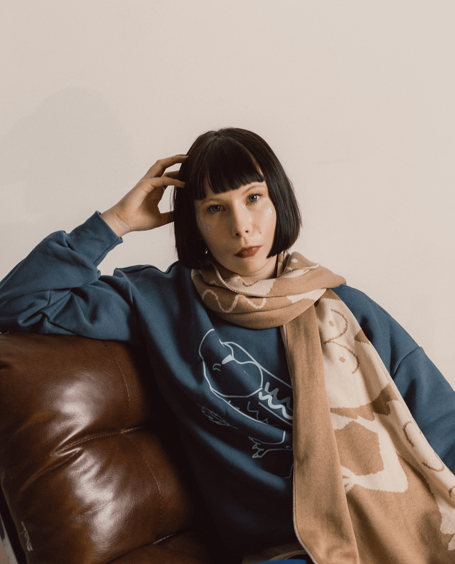
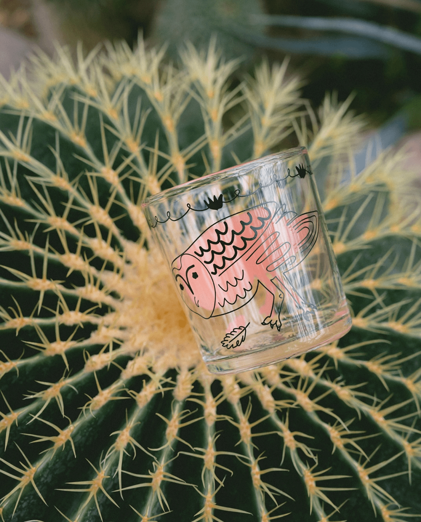
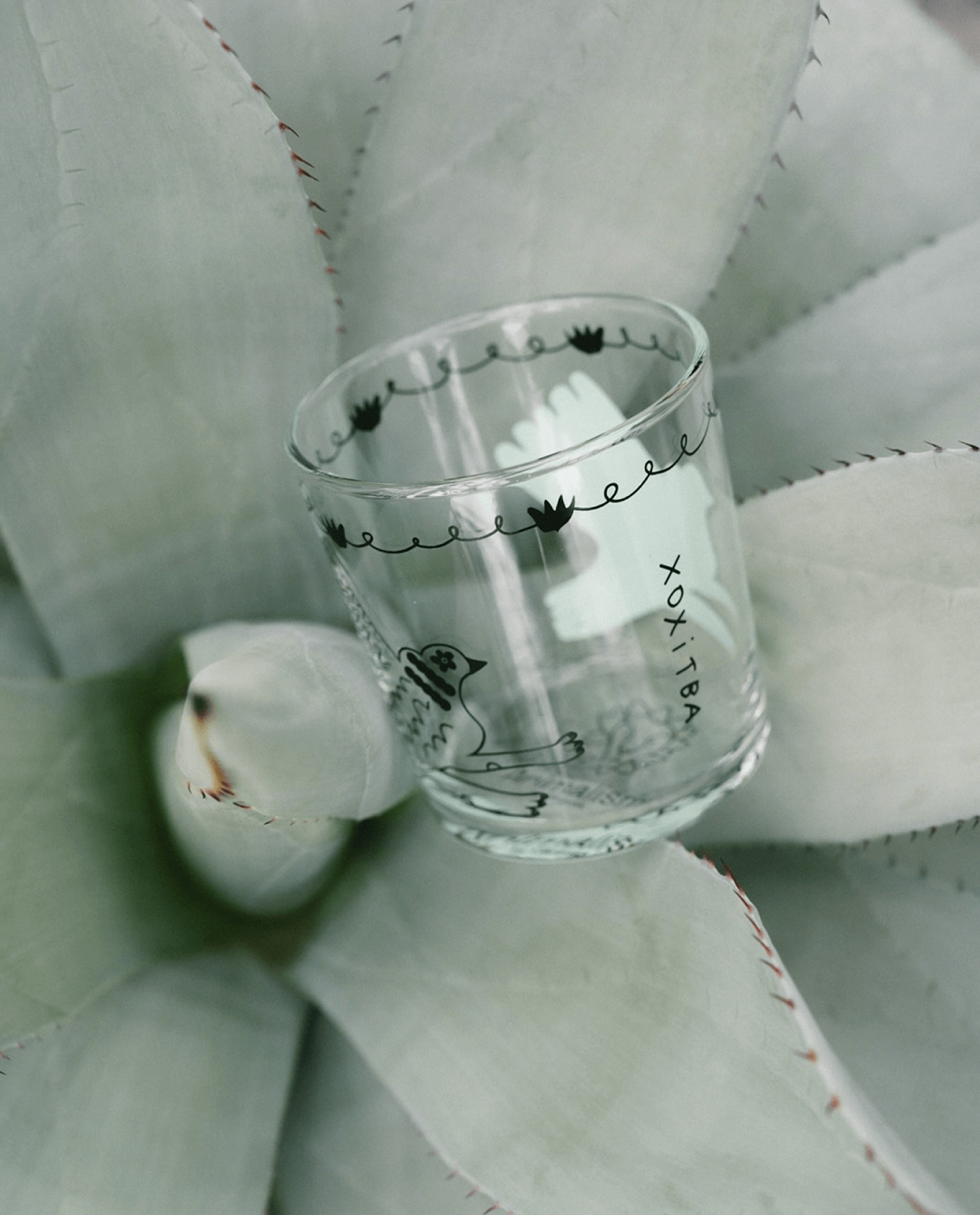
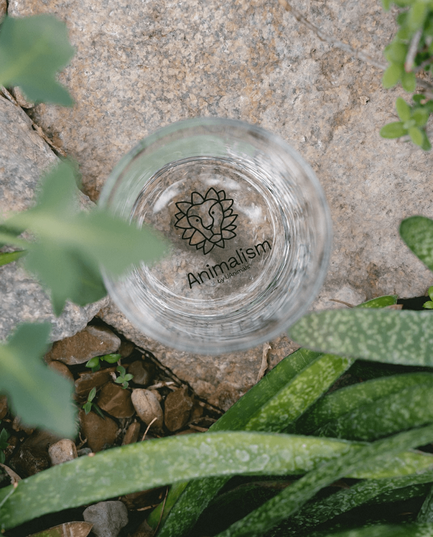
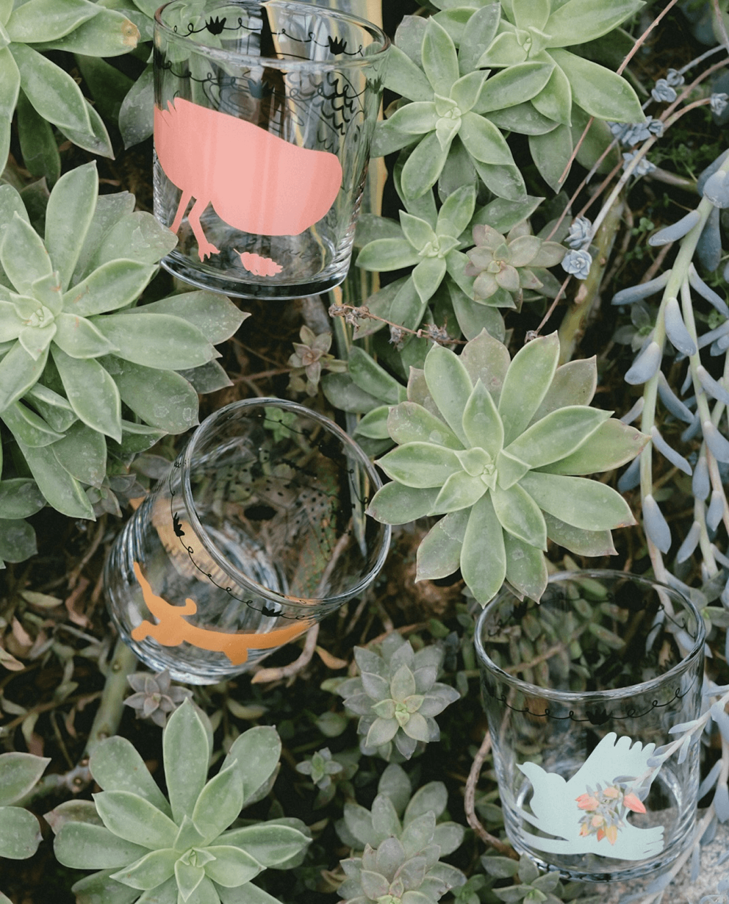
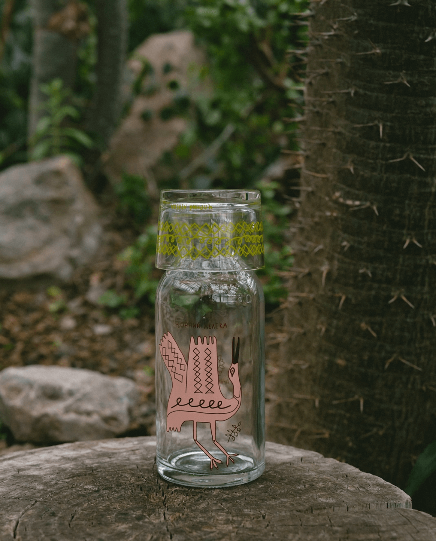
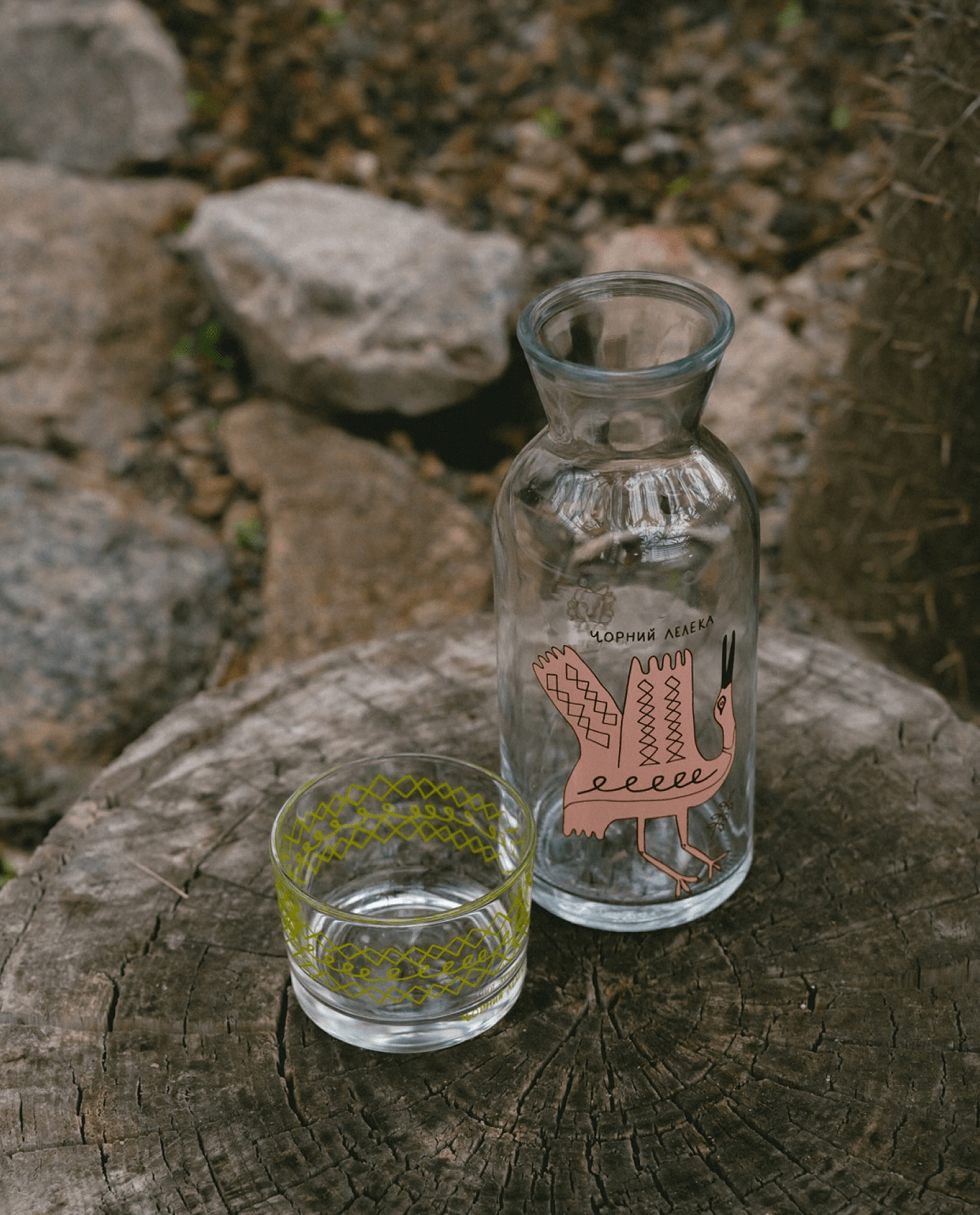
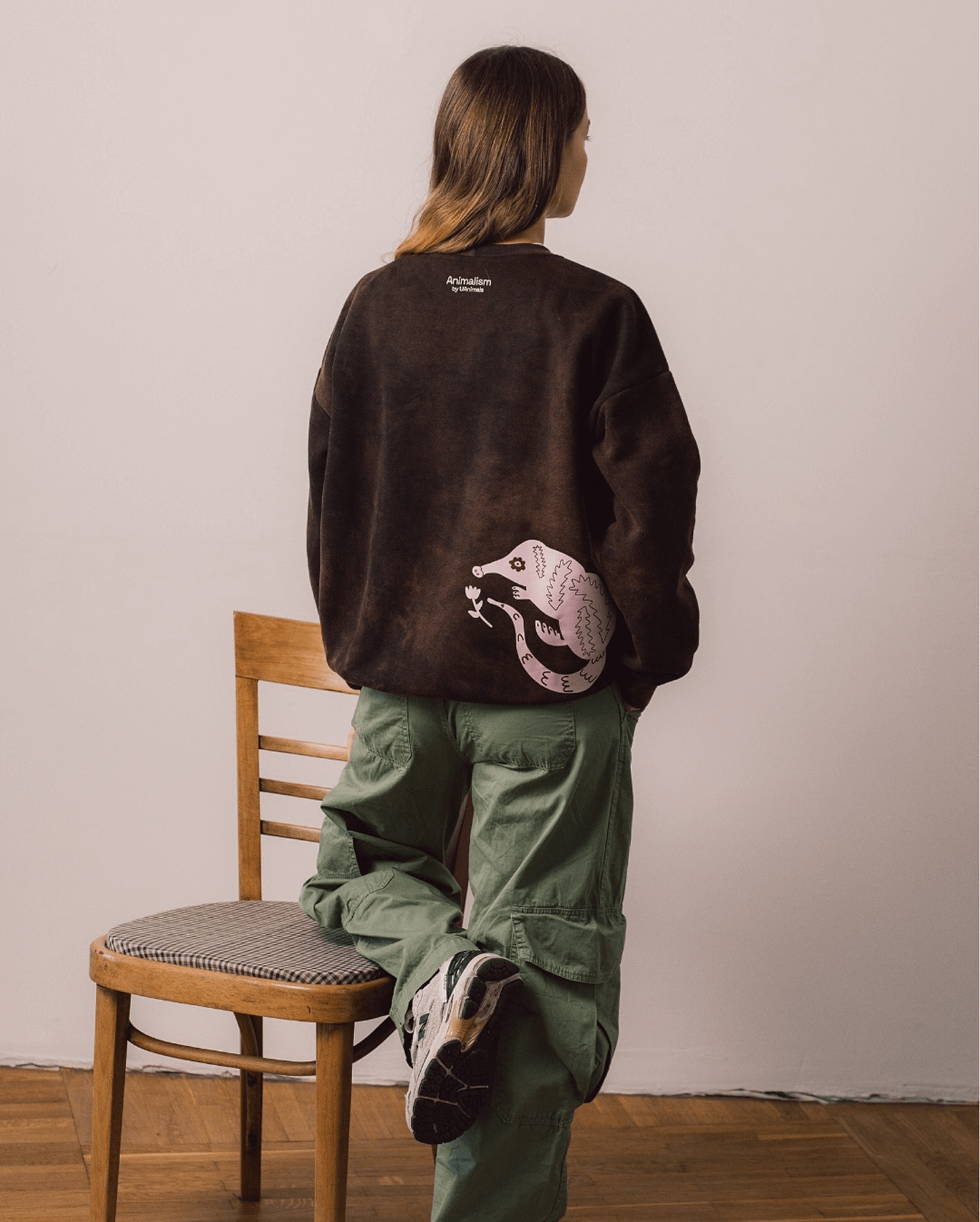
Animal Support Fund
Merchandise, designed at Otog Studio
Commissioned by UAnimals in collaboration with Tomatoes and Salt buro, this project aimed to raise awareness about endangered animals while generating direct support for their protection and rescue efforts.
The campaign, titled Animalism, was built around the idea of care, empathy, and the quiet symbolism animals carry within folk traditions. At Otog Studio, we developed a range of merchandise, including knitwear, glassware, and printed garments, designed to bring this message into daily life in a subtle, tactile way.
Our visual language was rooted in traditional folk art, drawing from motifs found in embroidery, painted ceramics, and ornamental borders. Rather than recreating these styles literally, we reinterpreted them with a modern expressive hand-drawn character.
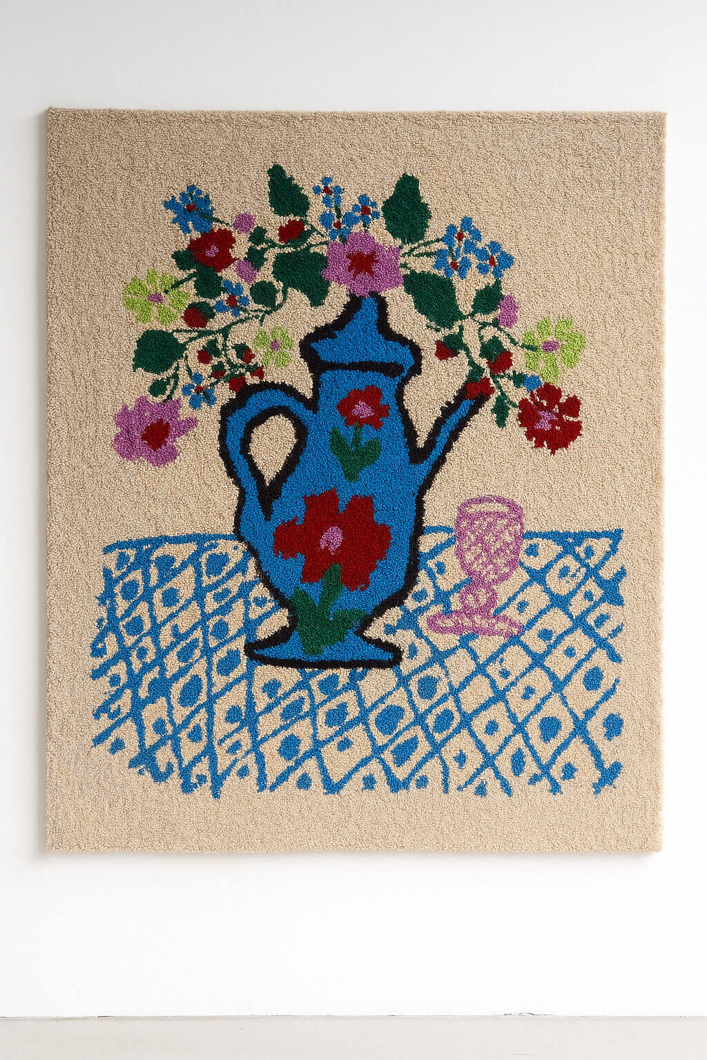
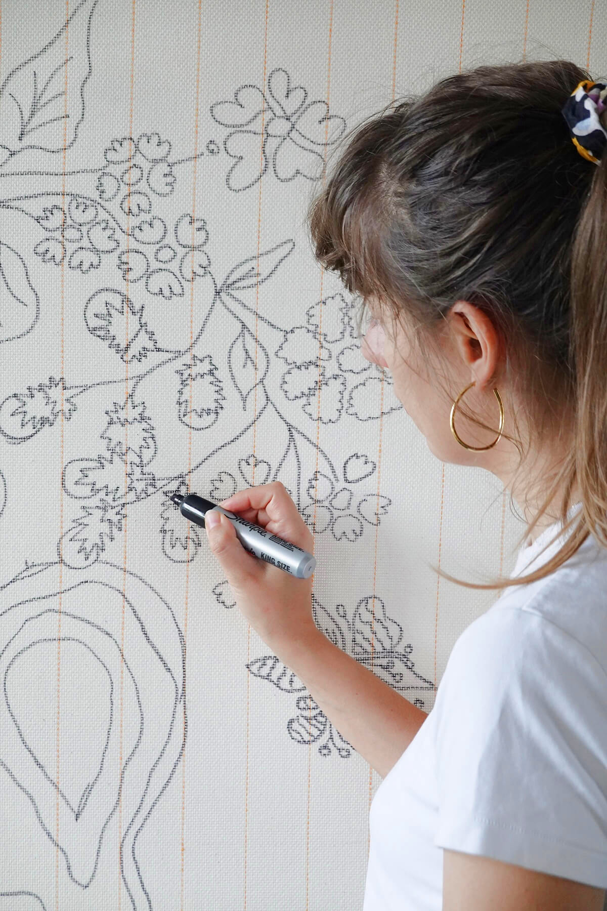
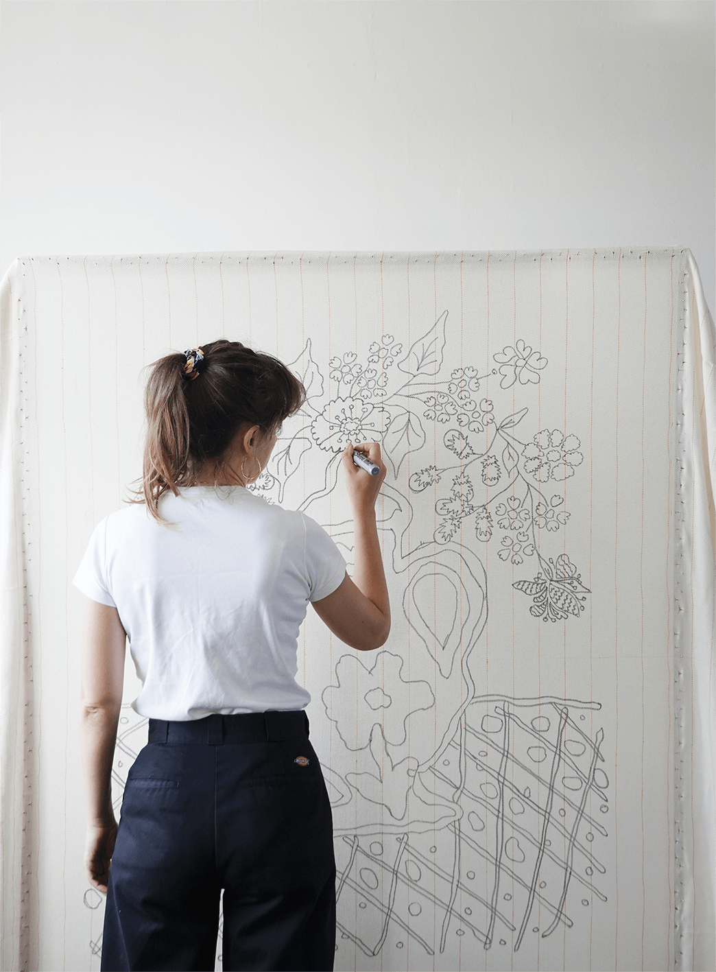
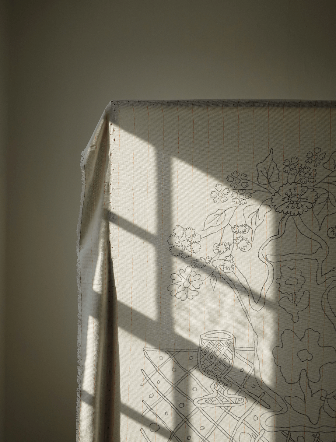
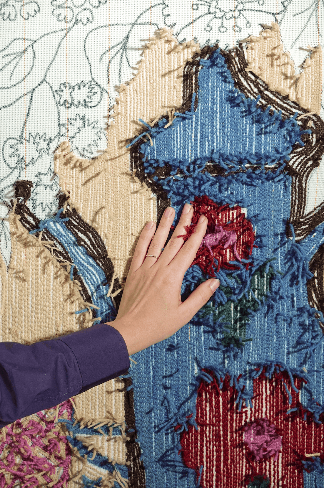
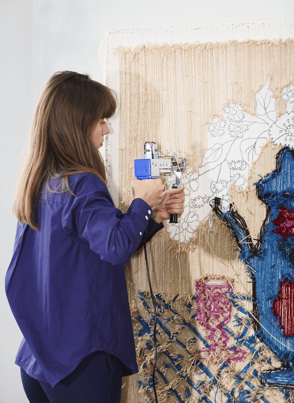
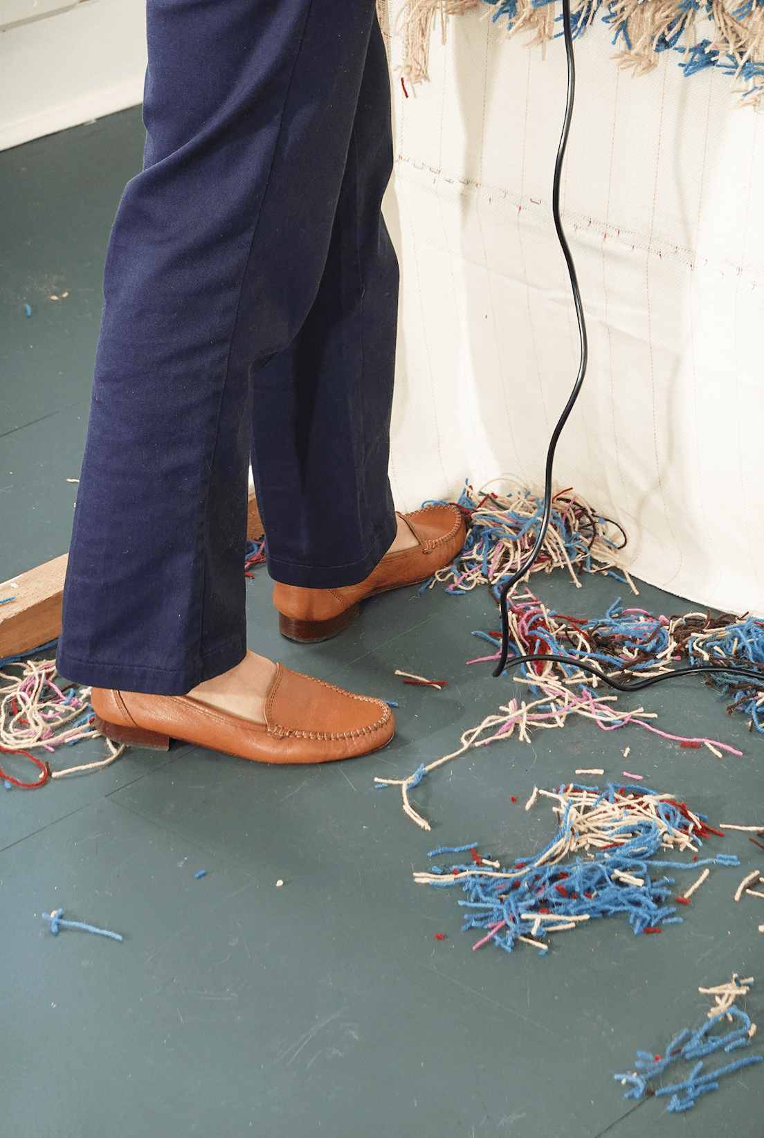
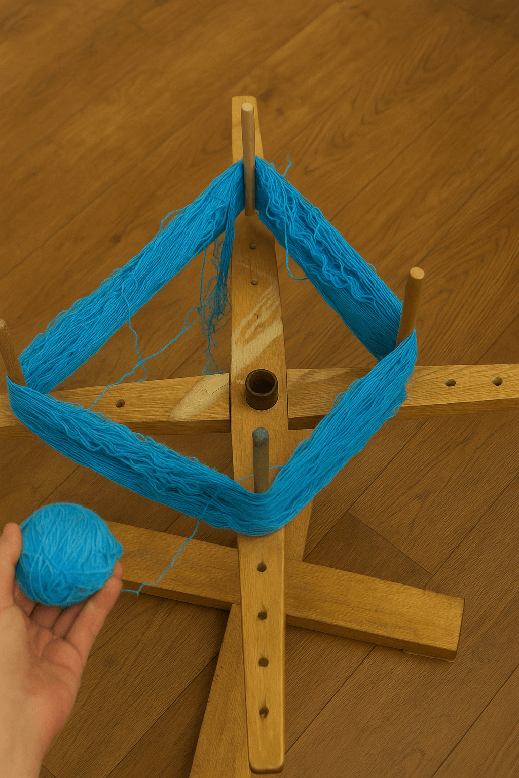
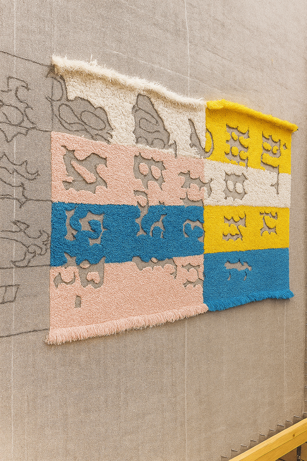
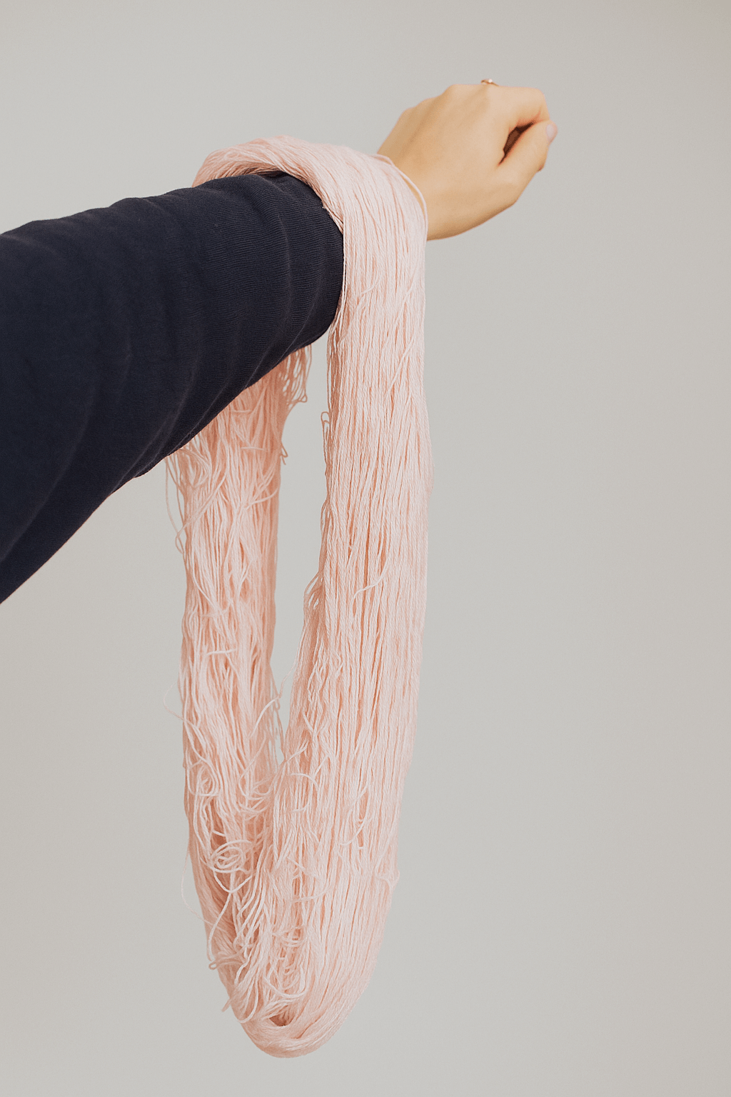
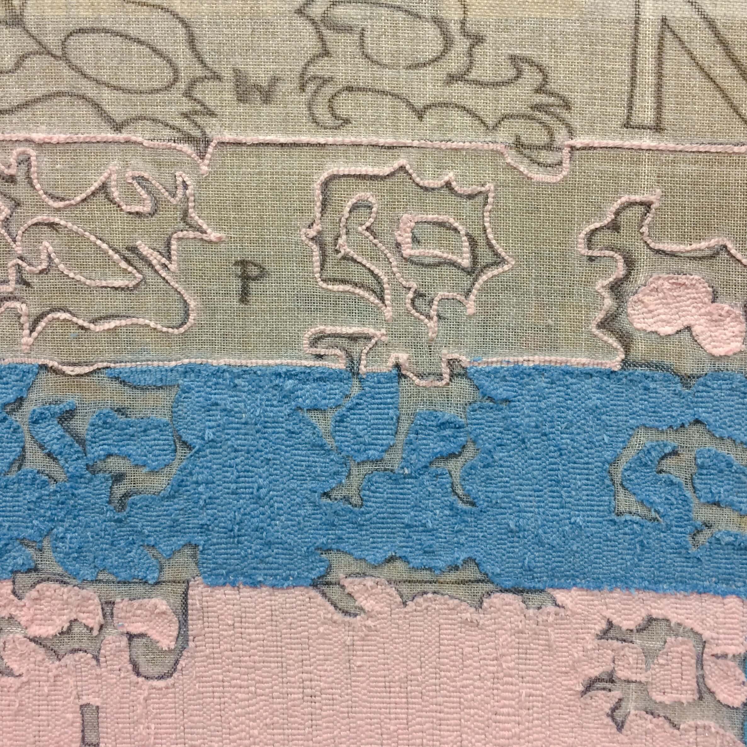
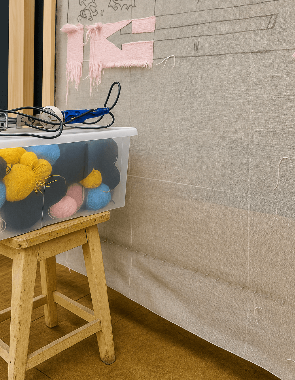
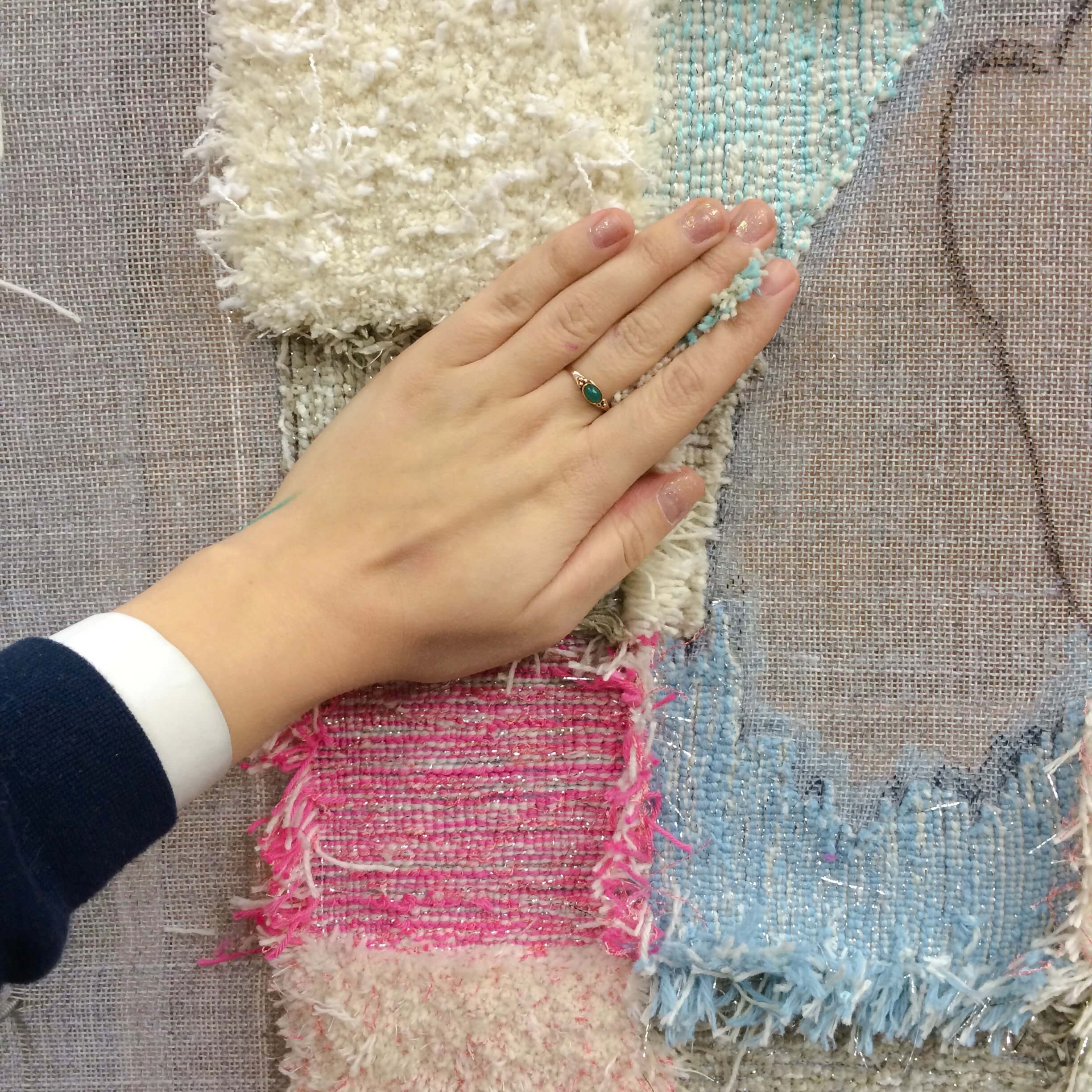
In My Garden
Tapestry, tufted wool
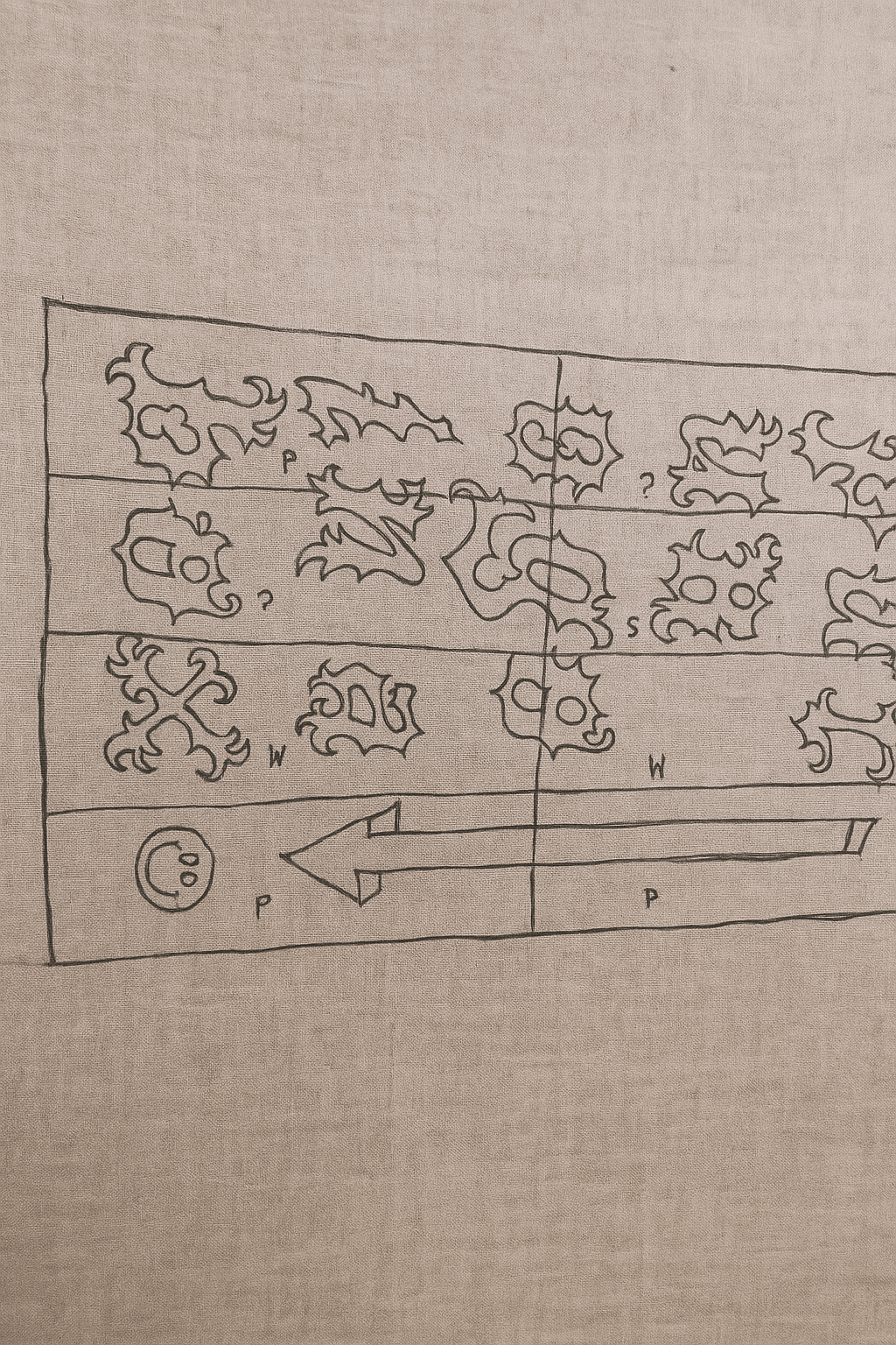
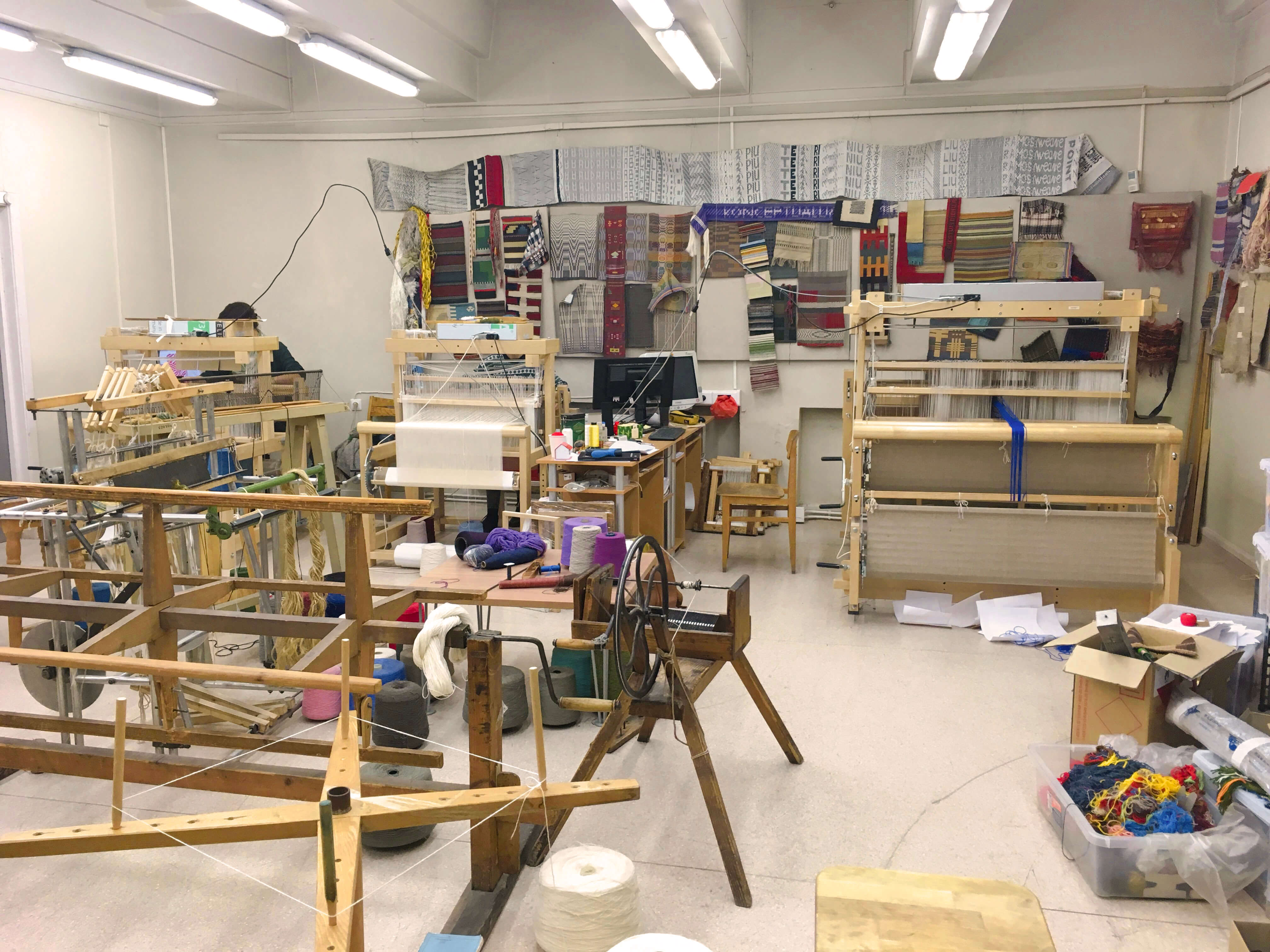
Created as part of the DYCP Award supported by Arts Council England, In My Garden is a hand-tufted carpet that weaves together personal memory and cultural heritage, considering weaving to be the oldest craft language of women.
This work began with a drawing I made as a child, a simple sketch that became a point of return. In My Garden explores where creative reflection begins, and how personal imagination connects with inherited traditions.
Floral forms drawn from Ukrainian embroidery are layered into the composition, not only as visual references but as symbols of continuity, gestures passed down through generations, reinterpreted through my own hand. Every thread is a stitched local history of identity and place into textile.
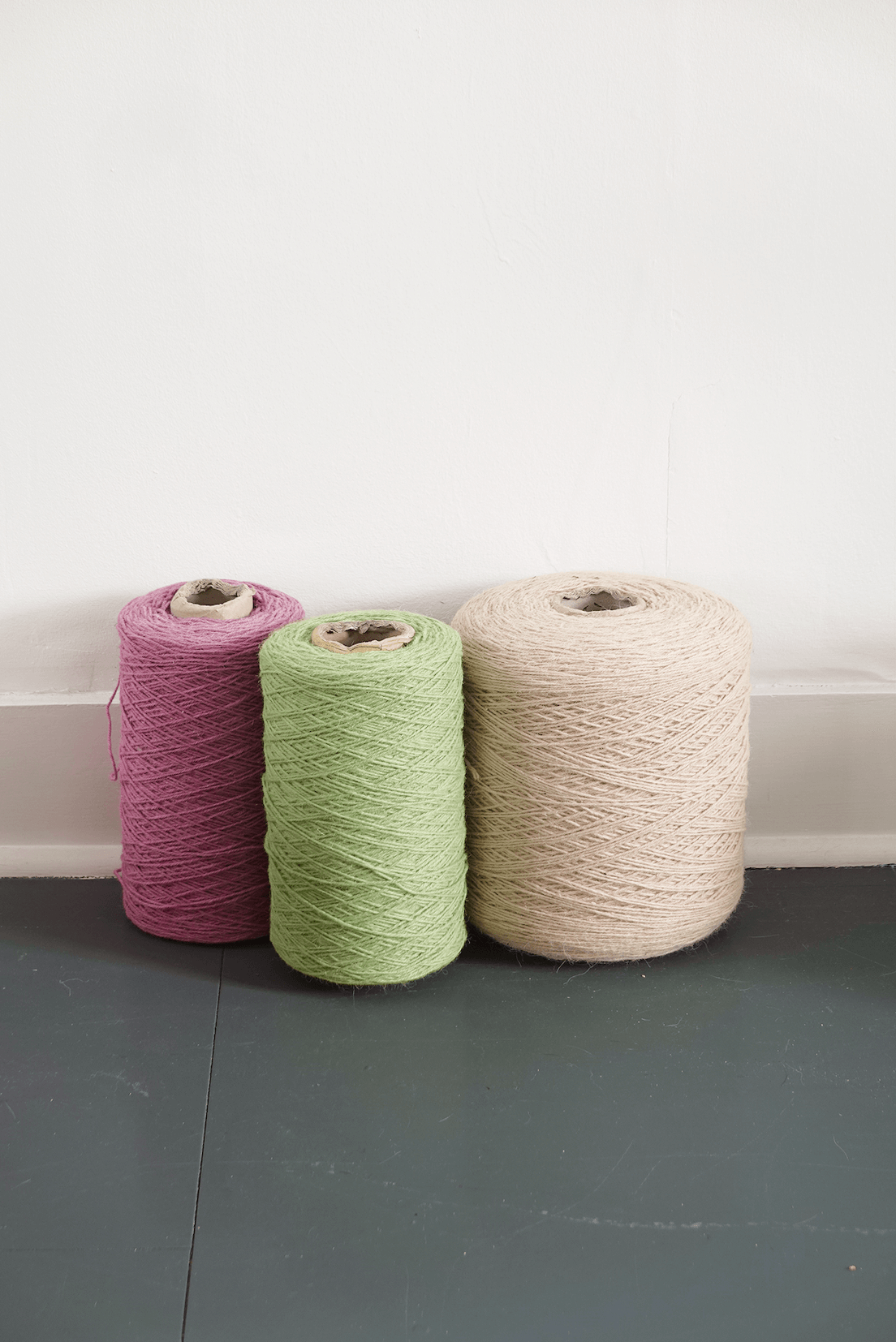
Made entirely by myself, the piece uses wool threads handwoven and dyed by women in a Ukrainian village. Their quiet, skilled labour sits at the heart of the work, grounding it in place, care and cultural memory.
It’s a reflection on origin, of image, of self, and of the unseen contexts that shape how we make and live.
This work began with a drawing I made as a child, a simple sketch that became a point of return. In My Garden explores where creative reflection begins, and how personal imagination connects with inherited traditions.
Floral forms drawn from Ukrainian embroidery are layered into the composition, not only as visual references but as symbols of continuity, gestures passed down through generations, reinterpreted through my own hand. Every thread is a stitched local history of identity and place into textile.
Made entirely by myself, the piece uses wool threads handwoven and dyed by women in a Ukrainian village. Their quiet, skilled labour sits at the heart of the work, grounding it in place, care and cultural memory.
It’s a reflection on origin, of image, of self, and of the unseen contexts that shape how we make and live.
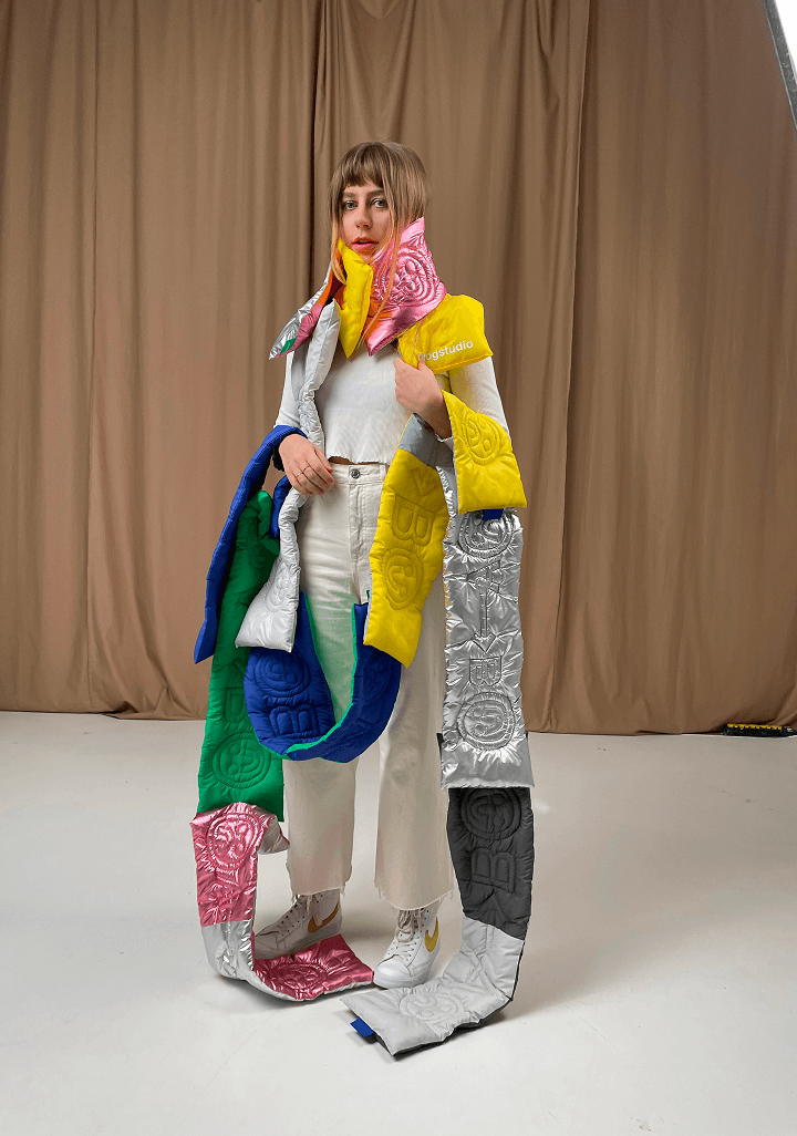
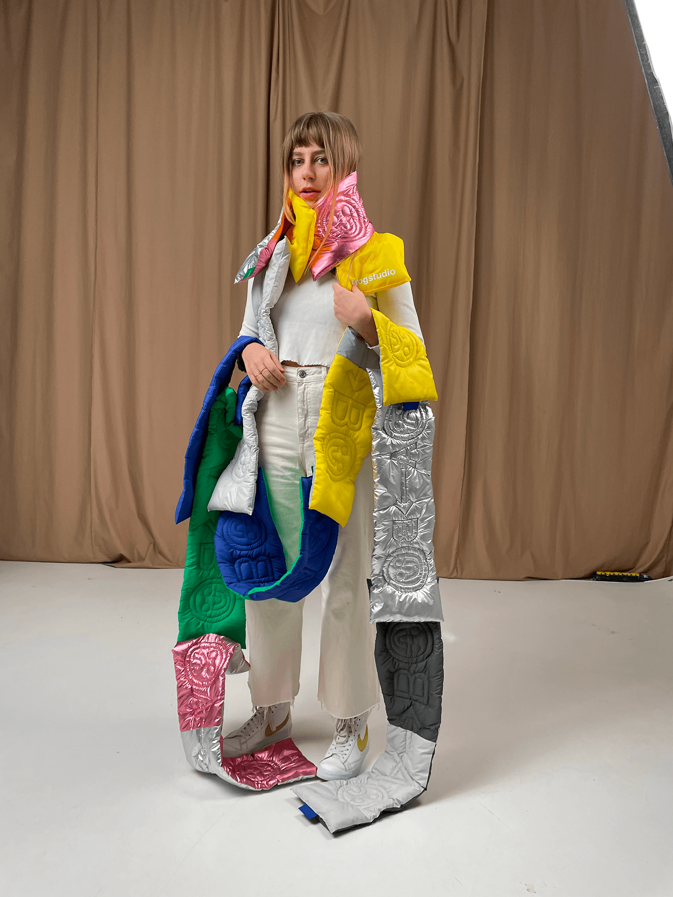
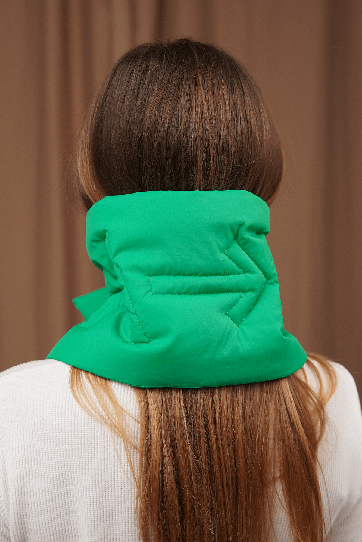
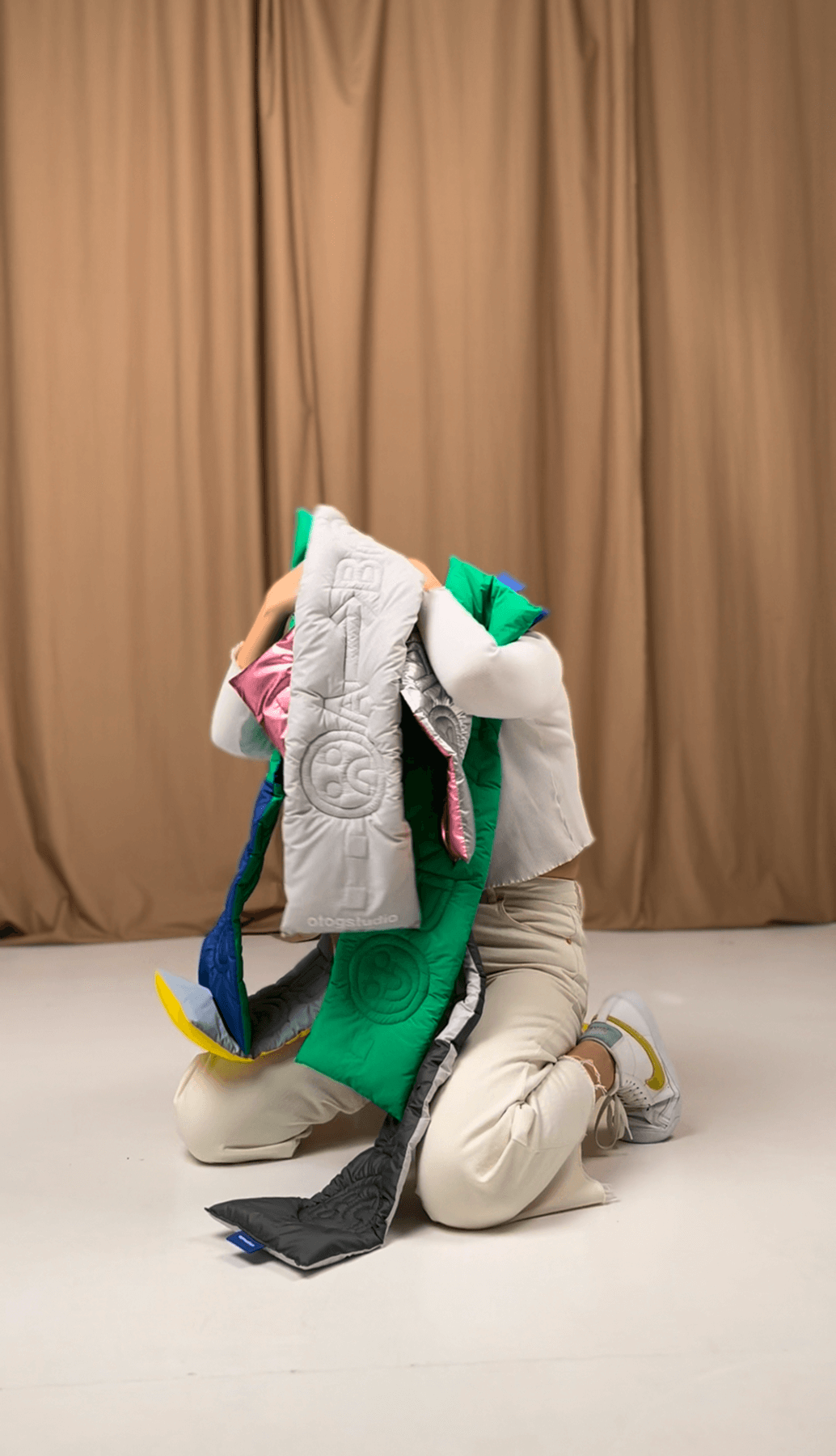
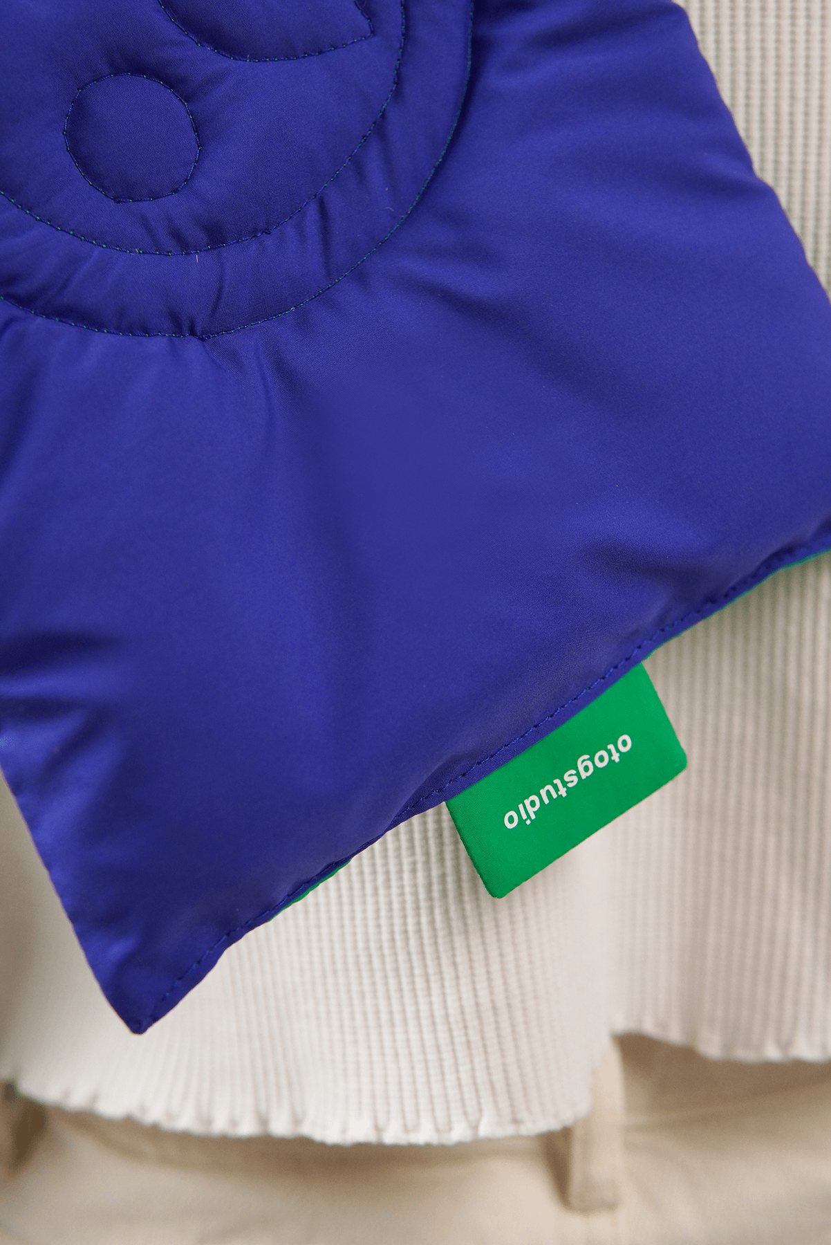
From Point A to Point B
Merchandise design for Otog Studio
Designed as a wearable edition for Otog Studio, From Point A to Point B is a modular scarf collection that moves between function and concept, a piece that works both as accessory and statement.
The title becomes the idea: a quiet metaphor for movement, transition, and the continious desire to improve, whether in ideas, environments, or the self.
Each scarf comes with a built-in magnetic fastening system, removing the usual fuss of wear while allowing multiple scarves to link together, forming new lengths, shapes, and combinations. The fabric is light and rain-resistant.
These scarves are fragments of a journey, tactile, adaptable, and grounded in the transformative concept.
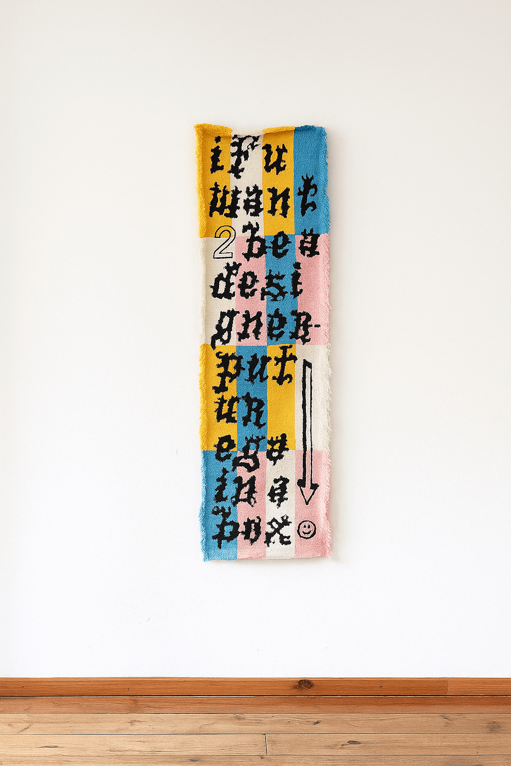
PUT UR EGO IN A BOX
Tapestry, tufted wool
PUT UR EGO IN A BOX explores self-identification in the blurred space between art and design, touching on the stereotypes and unspoken dynamics that circulate within creative communities.
It comes as a handwoven tapestry bearing the provocative phrase: “IF U WANT TO BE A DESIGNER PUT UR EGO IN A BOX.” The work questions not only the role of ego in creative practice, but also the tendency to regulate and limit others in the name of professionalism.
By placing this statement within the context of a domestic textile, an object often associated with warmth and neutrality, the project challenges expectations of where critical thought should live, and what design is allowed to say.
Using humour as a tool, the piece suggests that ego itself isn’t the problem, but rather how we navigate each other’s egos. The work invites reflection on how identity is shaped, constrained, or resisted within the boxes we’re handed.
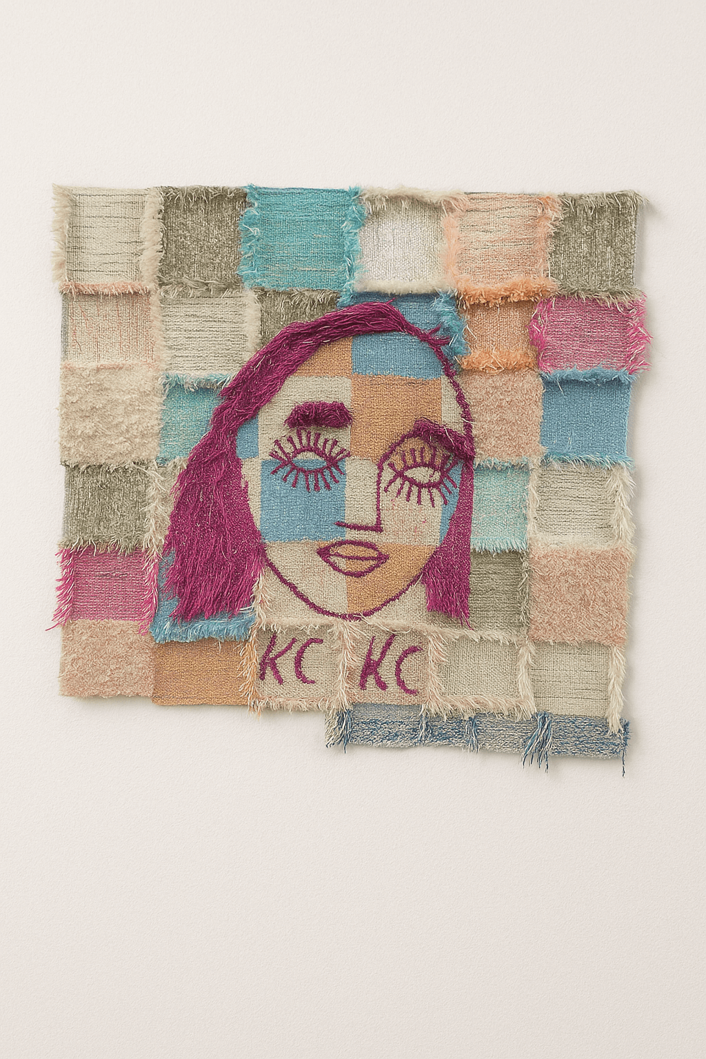
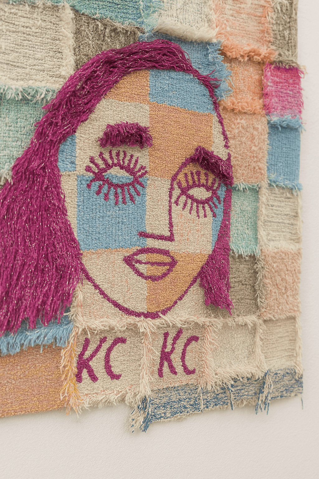
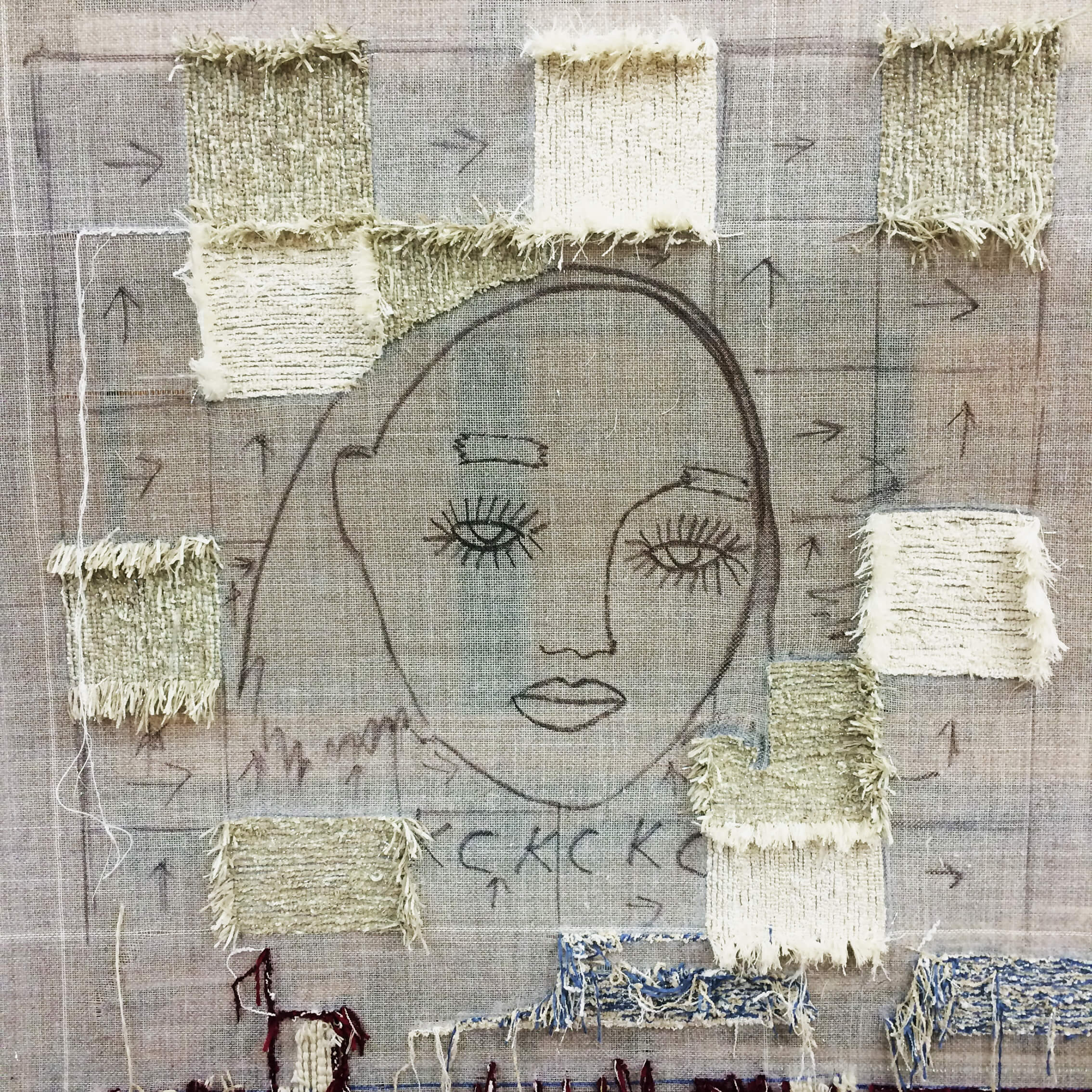
Portrait After Sound
Tapestry, tufted wool
Portrait After Sound explores the way we respond to sound before language, the instinctive recognition that happens when someone calls, whistles, or makes a noise not shaped by words.
The work reflects on those moments in public spaces when a sound cuts through, sharp, familiar, directed. How do we know it’s meant for us? What subtle shift happens in the body or face when we recognise a sound as ours, when we’re called not by name but by tone, gesture, or instinct?
Hand-tufted in wool, the piece acts as both portrait and echo, a soft record of something fleeting, a reflection on how connection often begins not with language, but with sound.
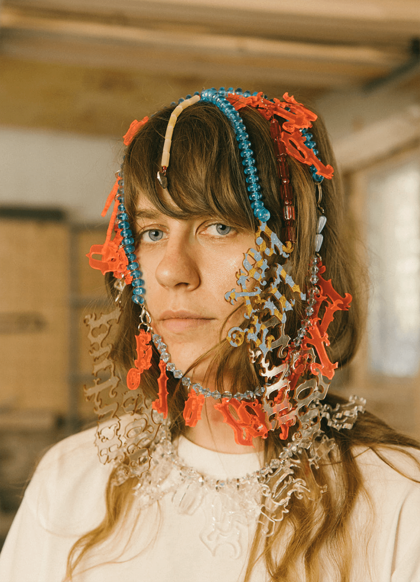
Letterwear
Accessories exploration series
Letterwear treats decoration as action, a series of accessories built around the idea that to wear language is to carry meaning.
Each piece comes with worn typographic fragments, creating a dialogue between text, body, and surface. Letters become both texture and message, blending the visual language of fashion with the directness of written form. The project sits between wearable object and a statement, where to adorn is to communicate.
Each piece comes with worn typographic fragments, creating a dialogue between text, body, and surface. Letters become both texture and message, blending the visual language of fashion with the directness of written form. The project sits between wearable object and a statement, where to adorn is to communicate.
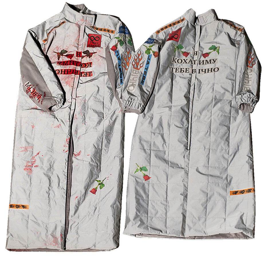
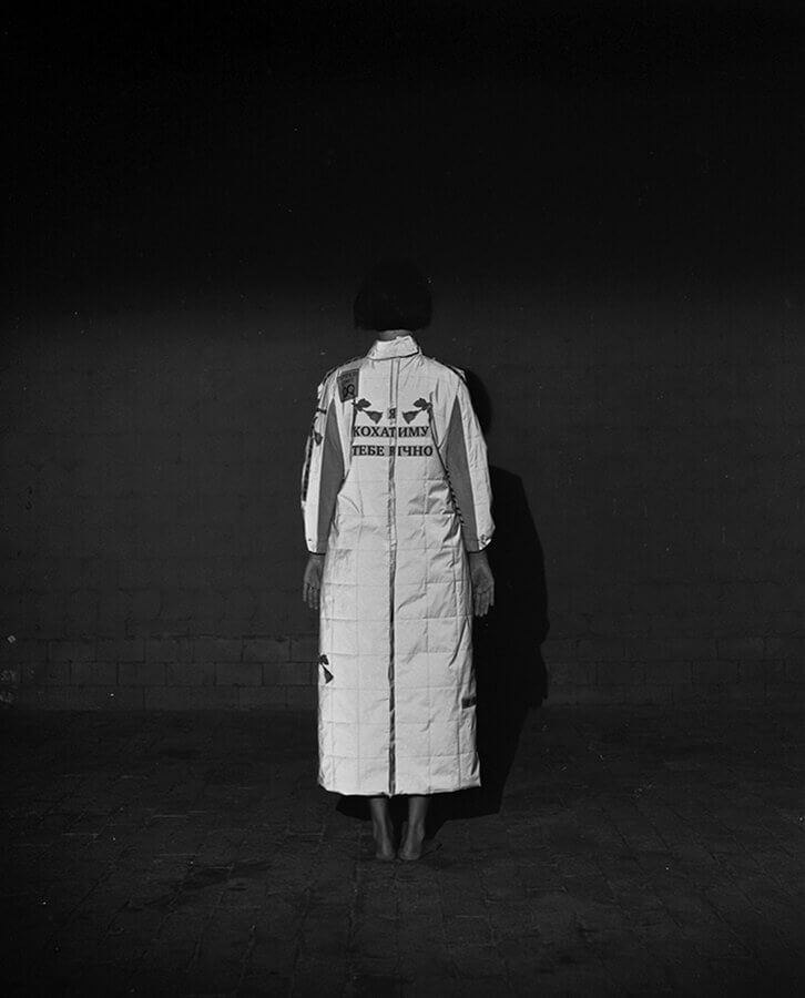
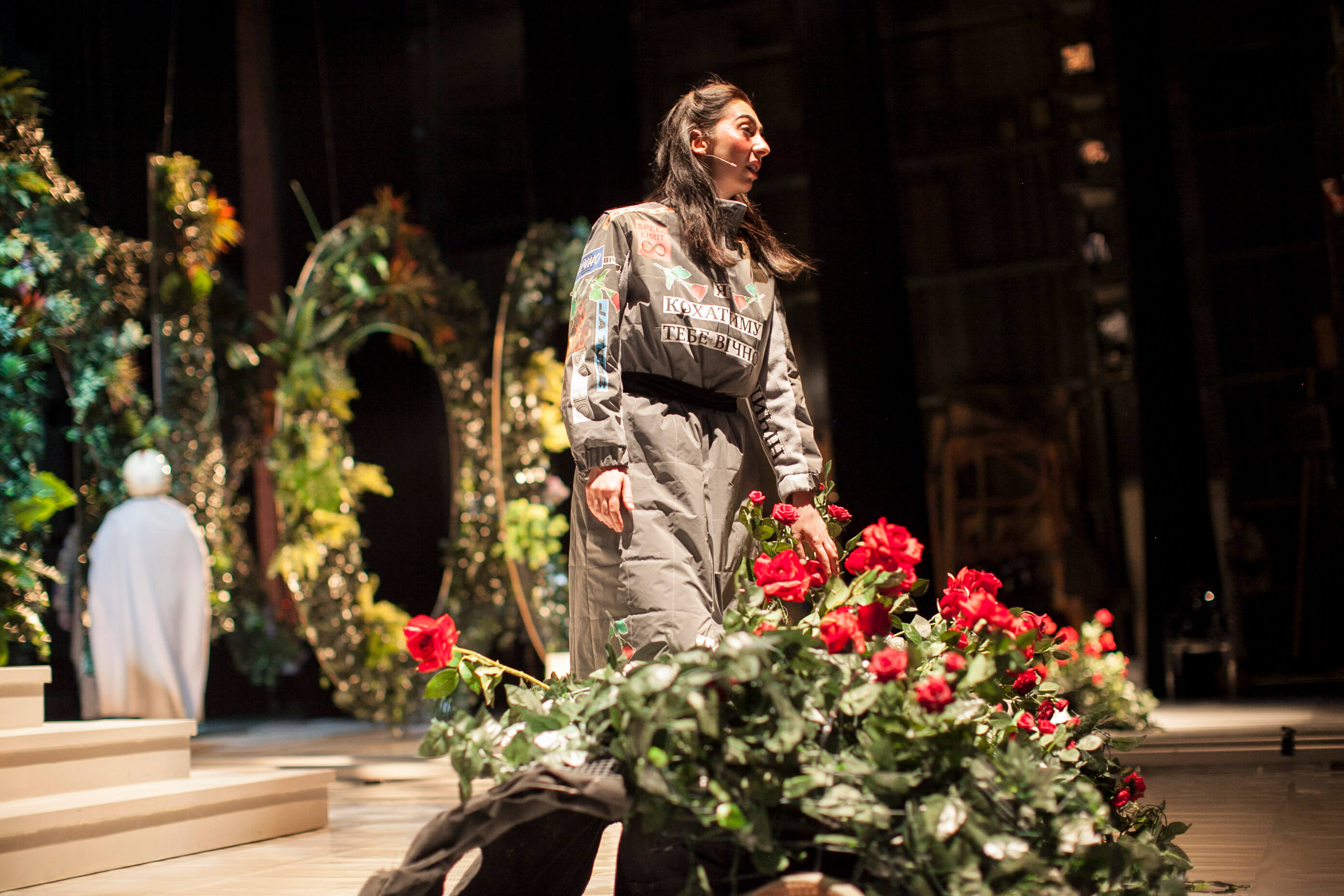
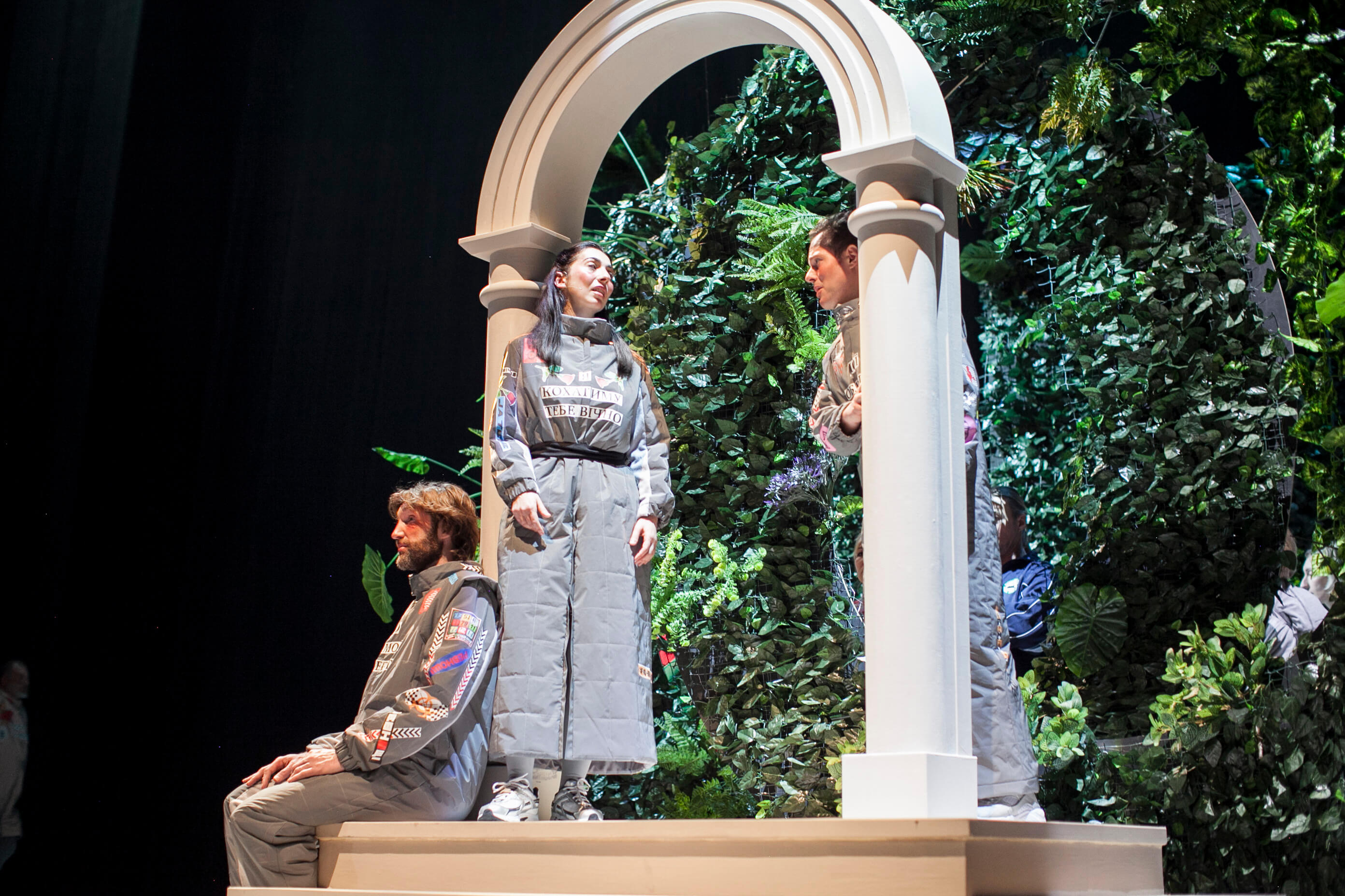
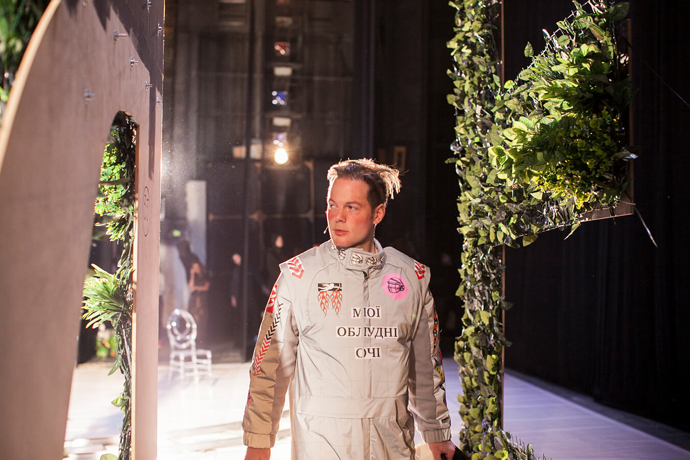
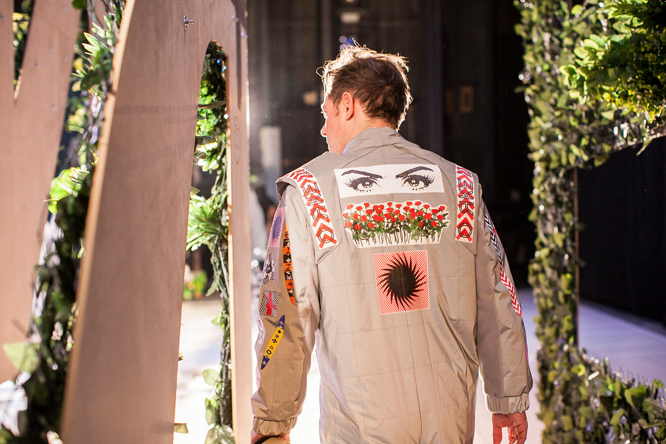
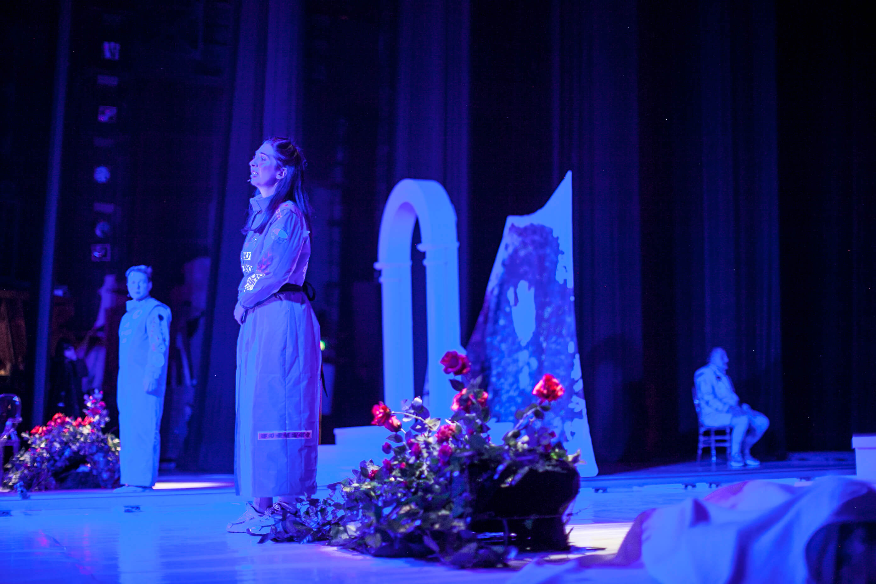
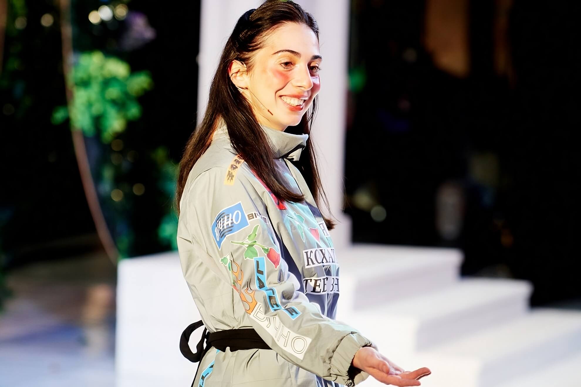
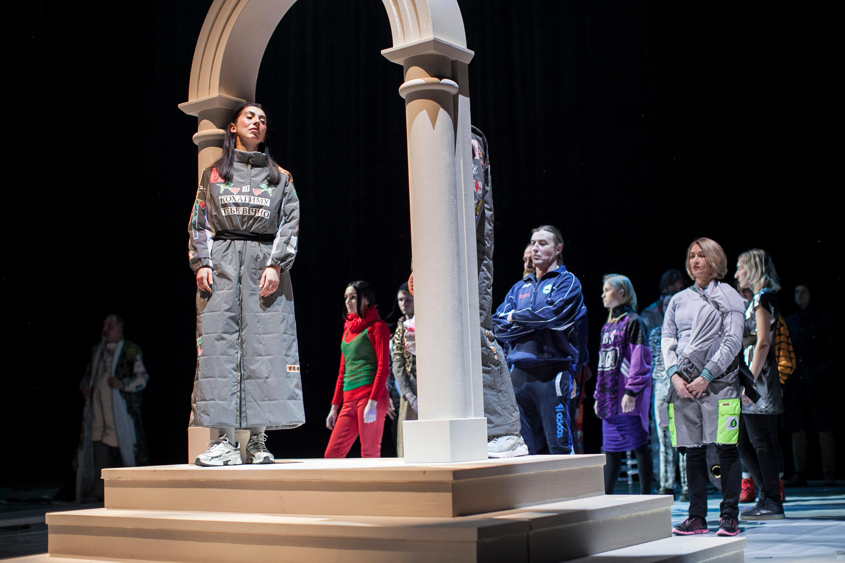
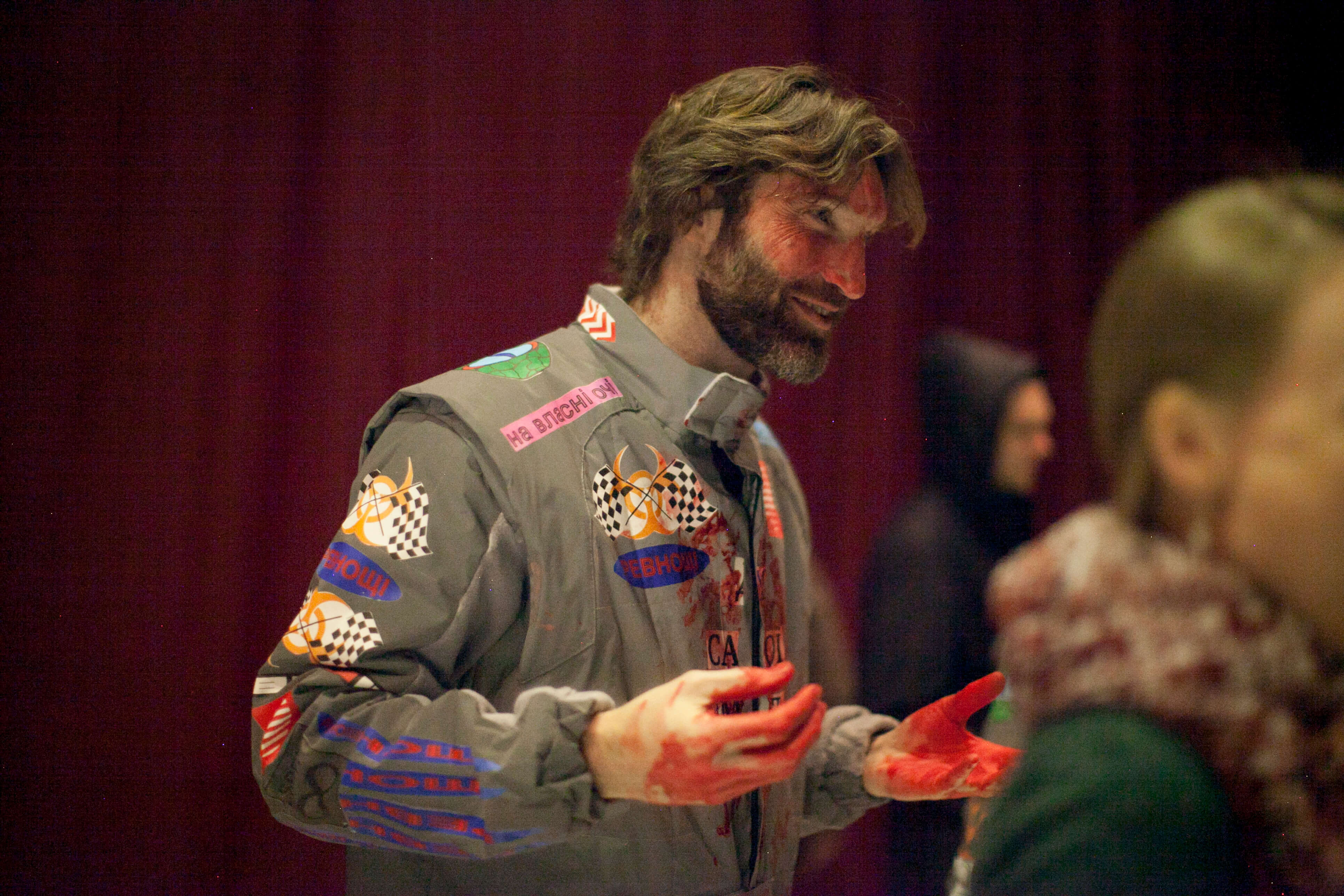
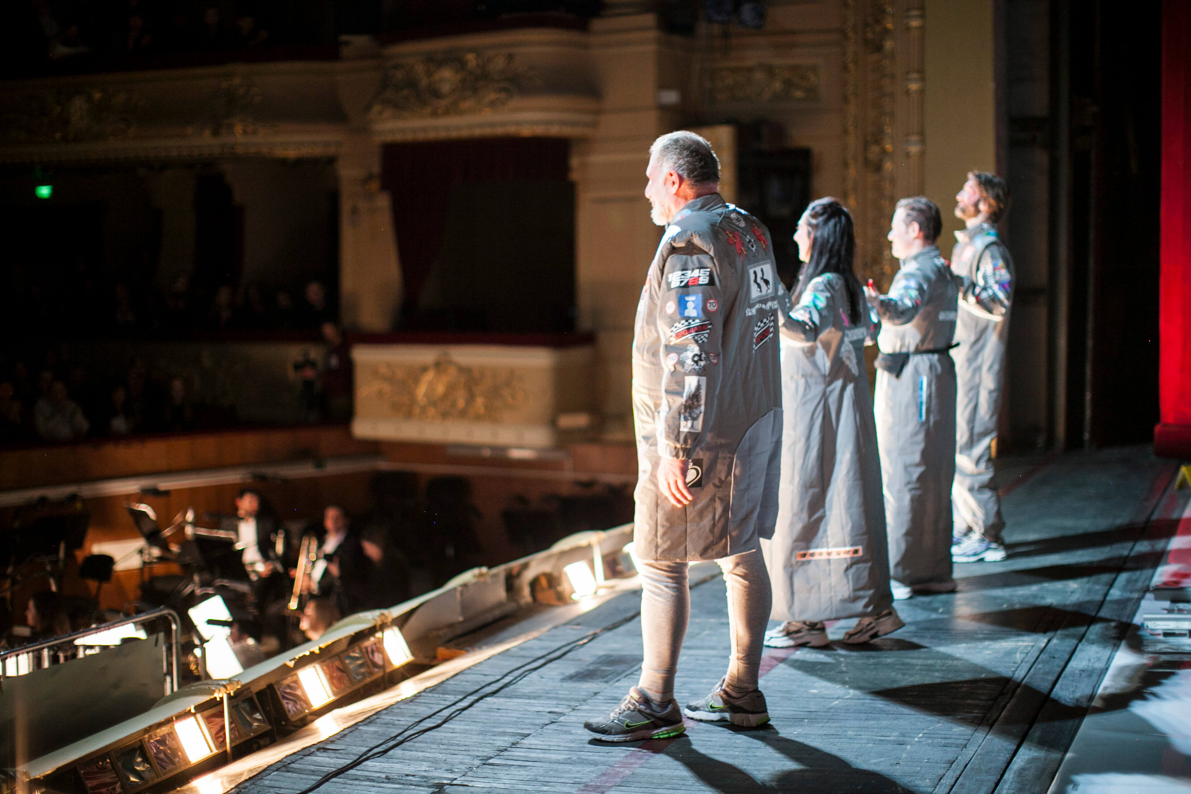
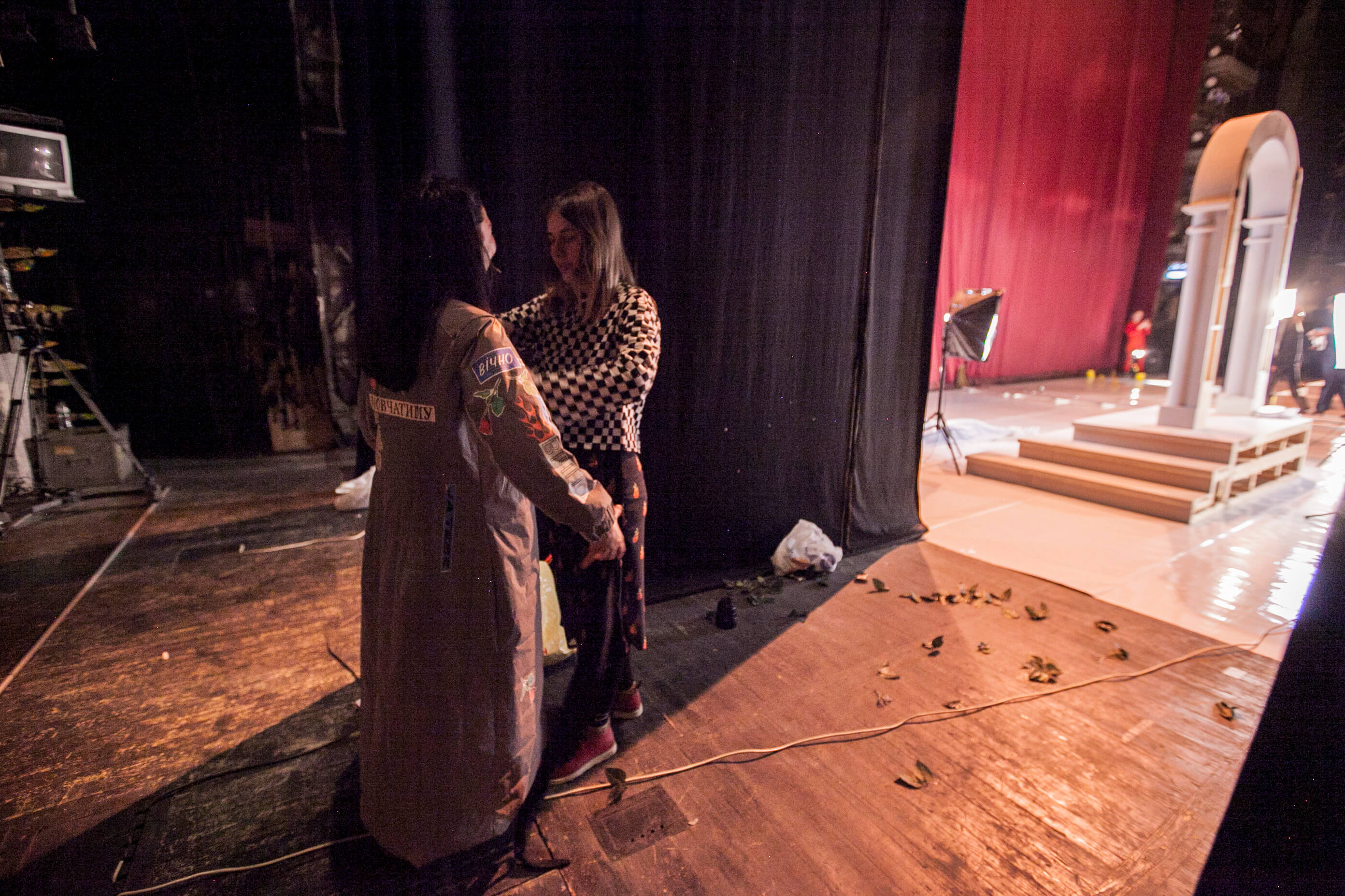
Luci Mie Traditrici
Costume design for opera Luci Mie Traditrici
Commissioned by UKHO Music, this project involved the full costume design for Salvatore Sciarrino’s Luci Mie Traditrici, a contemporary opera exploring obsession, betrayal and collapse.
The four central characters were each dressed in reflective, tailored suits, garments constructed with printed extracts from the character’s own spoken lines and symbolic motifs. These suits drew visual language from racing uniforms, referencing the opera’s circular pacing and mounting psychological velocity.
Costumes for the wider ensemble, around 20 performers, were made through a process of deconstruction and reuse. I reworked worn garments into singular pieces, each one shaped by the body and presence of the individual performer.
The design approach moved between precision and fragmentation, echoing the opera’s tension between formality and disintegration, and allowing the clothes to hold traces of both structure and improvisation.
Photo: Zhenia Perutska
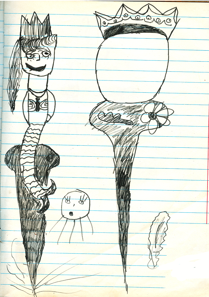
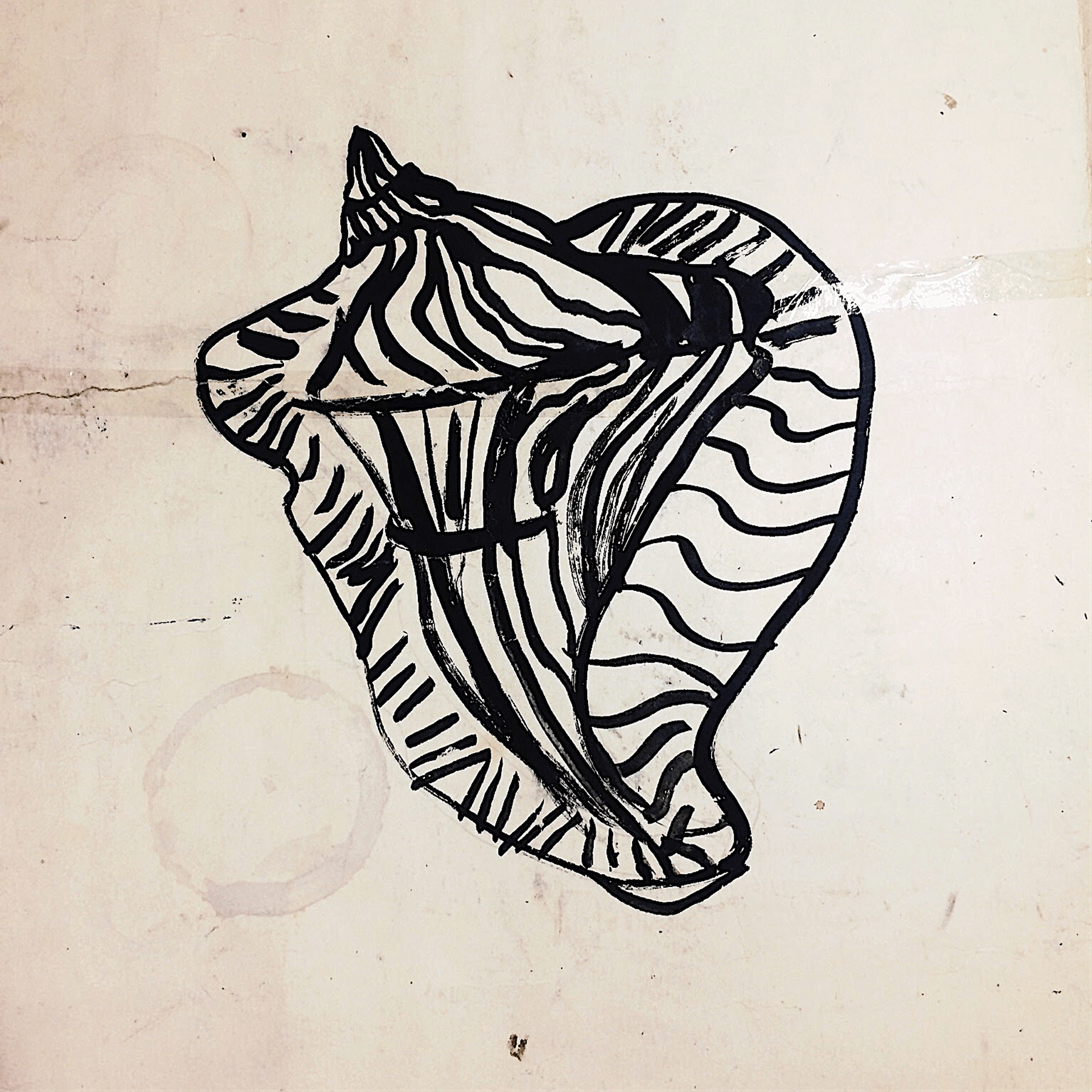
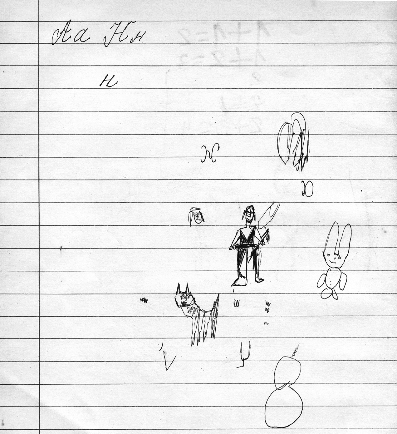
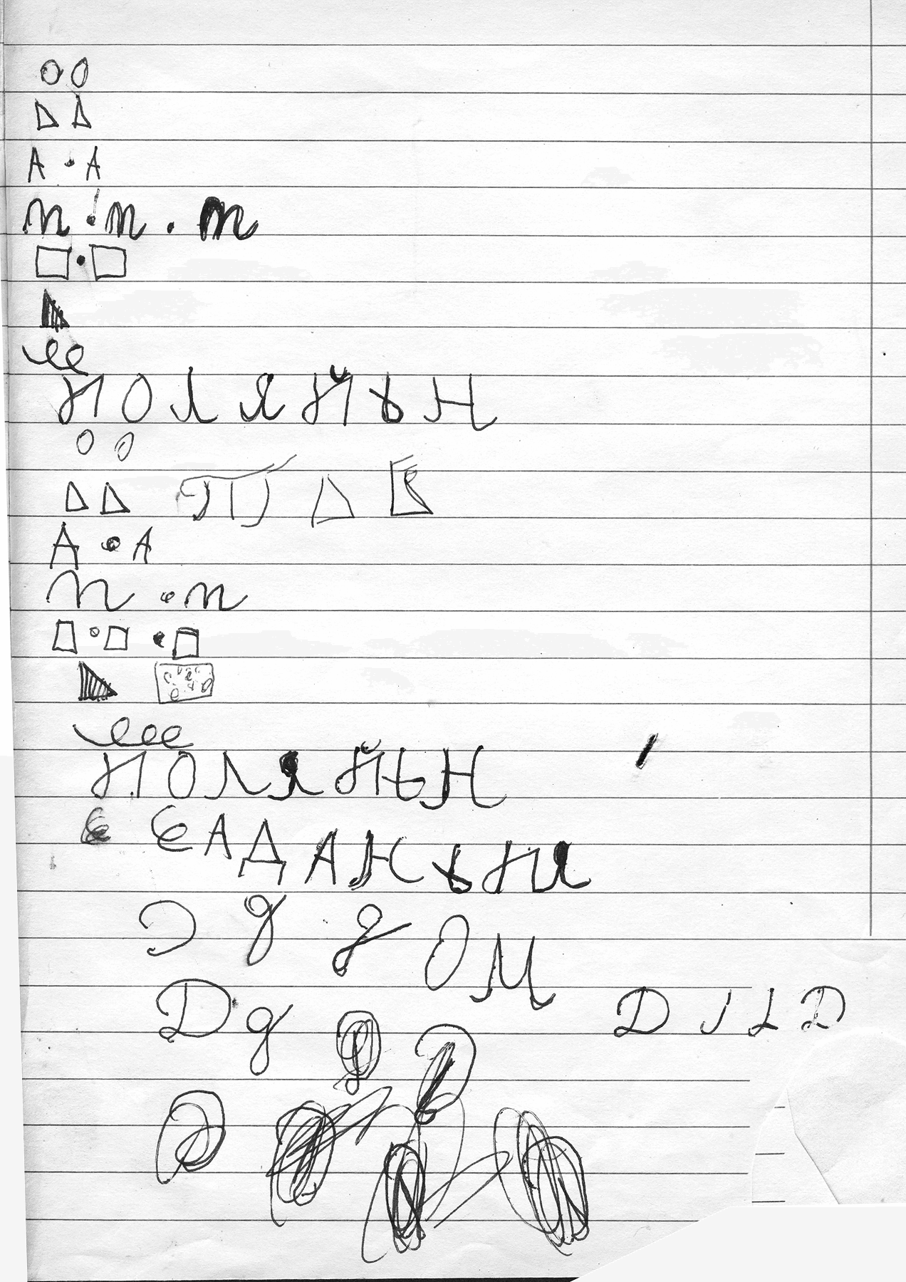
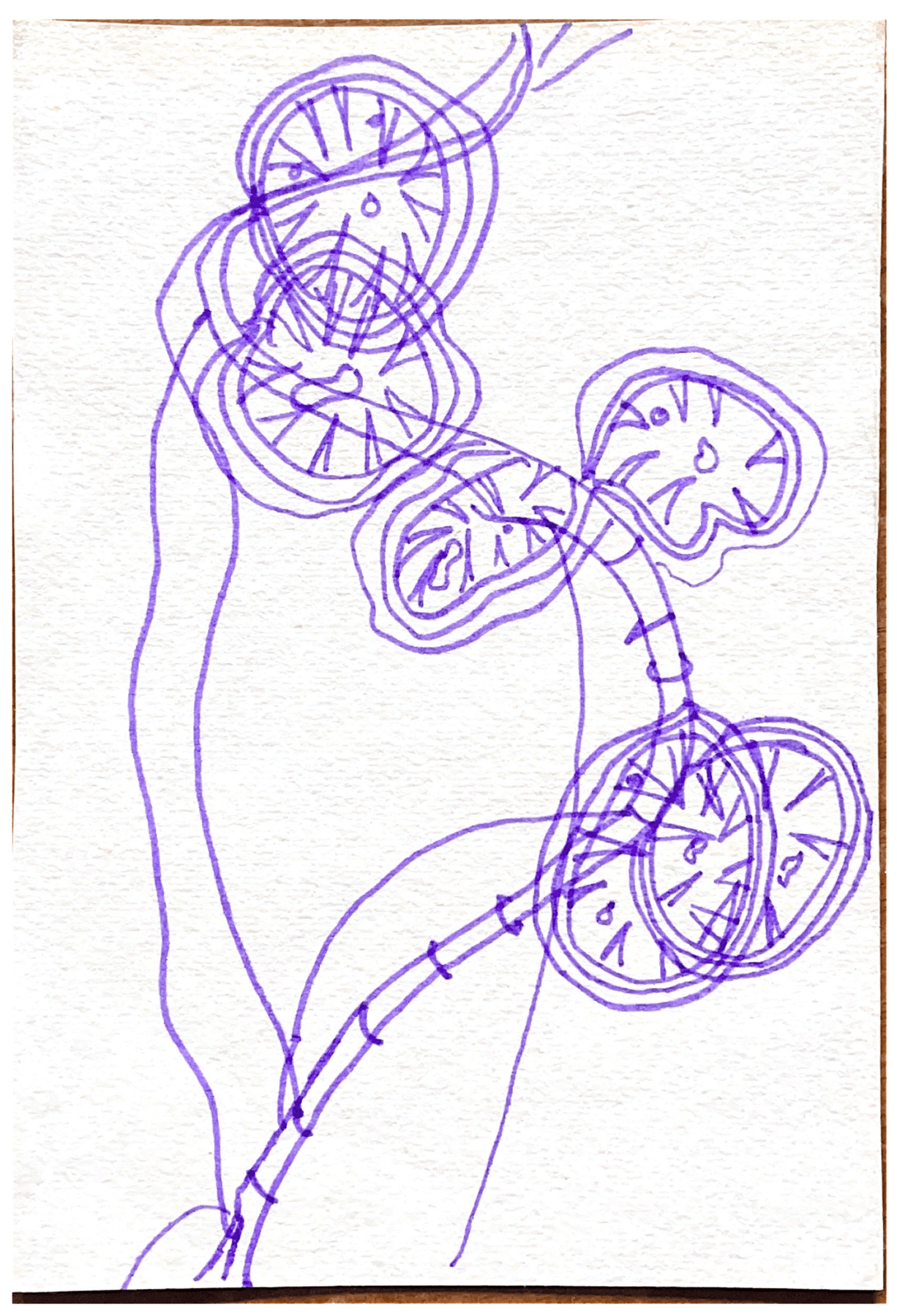
Pre-Language Memory
Childhood drawings (archival scans)
Pre-Language Memory is a collection of scanned childhood drawings, the earliest traces of visual expression I’ve preserved.
Made long before I had the words to explain, these images reflect a time when drawing was both a way of exploring the world and shaping my own. Each line carries something unfiltered, a directness that feels both raw and clear.
These works matter to me not for technical skill, but for what they hold: authenticity, simplicity, and a kind of unguarded beauty. They speak of a time when imagination and observation were inseparable, and creativity was instinctive rather than learned.
This series forms a quiet foundation, a record of early thinking through image, where expression came before language.
Drawing archive
(pre-2016)
Coming Soon
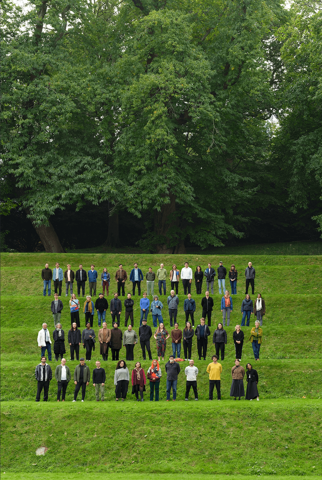
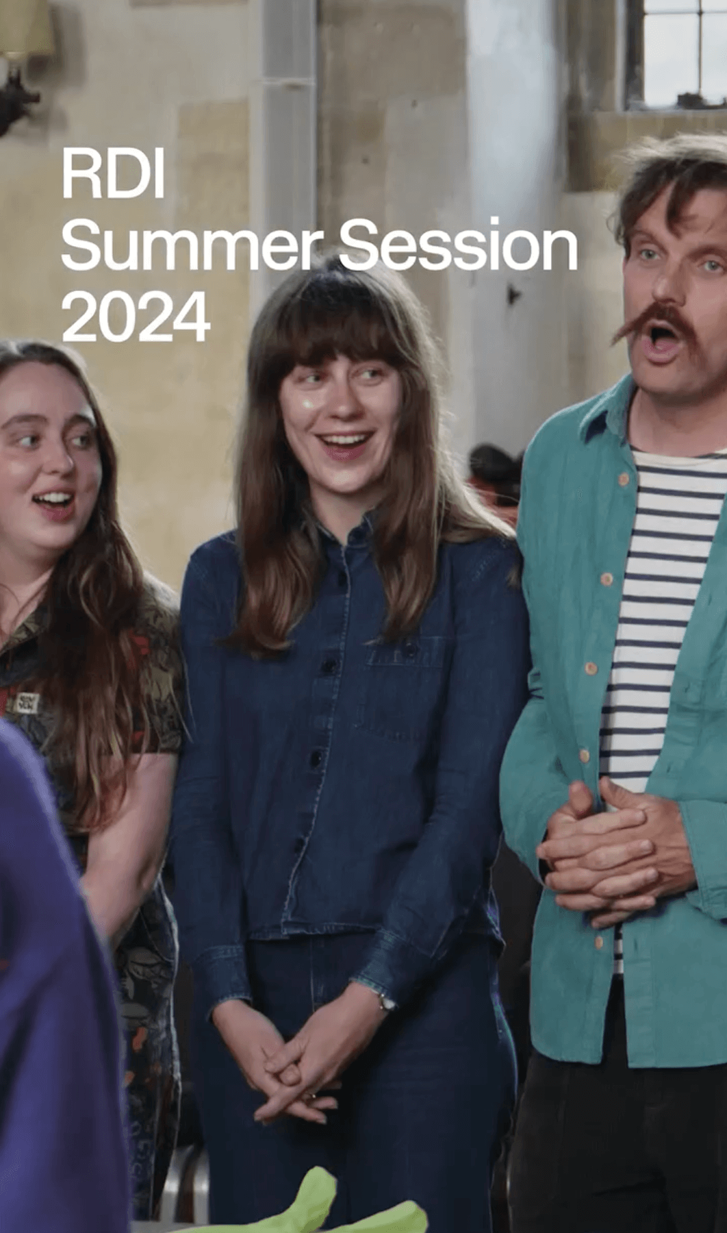
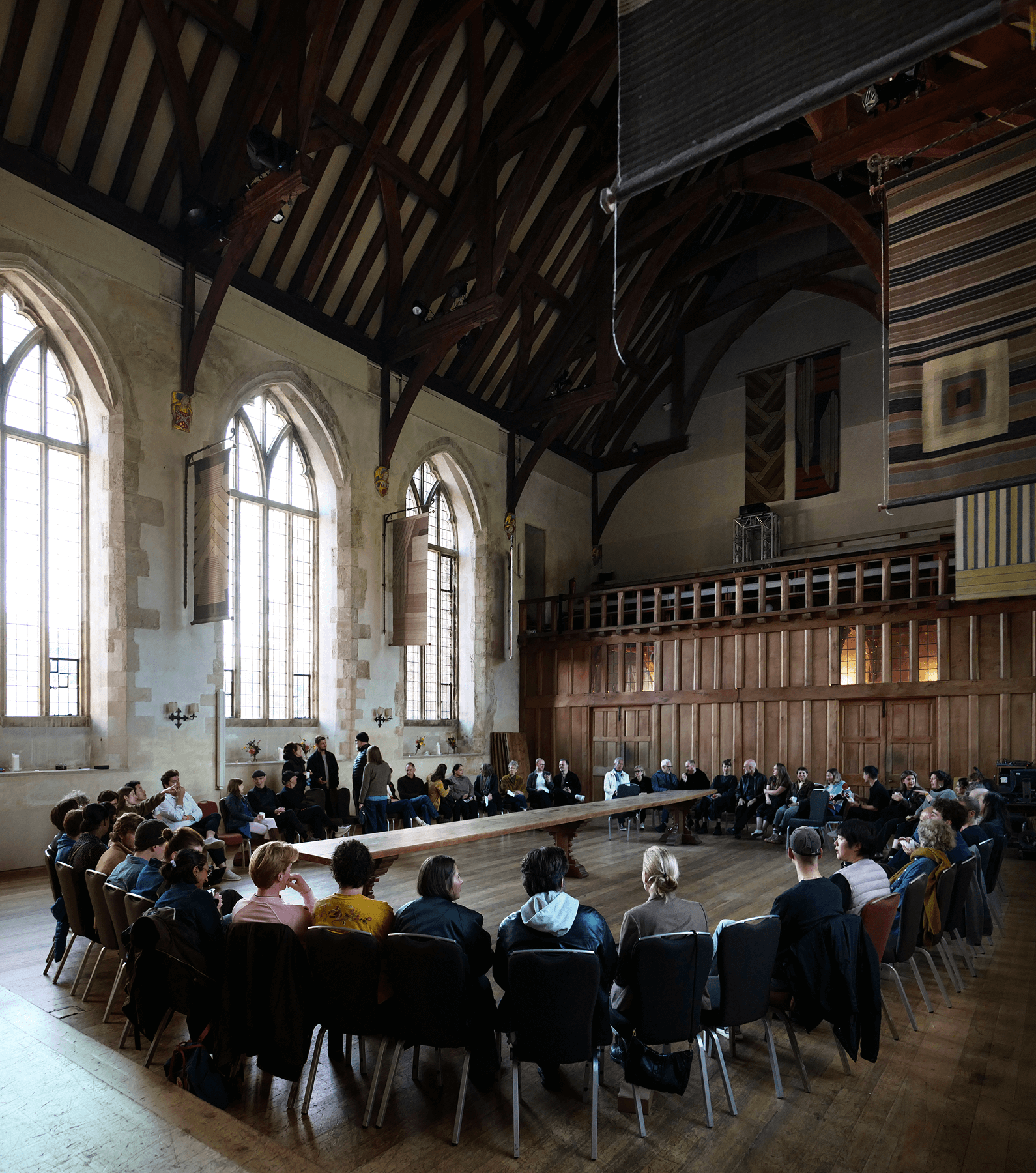
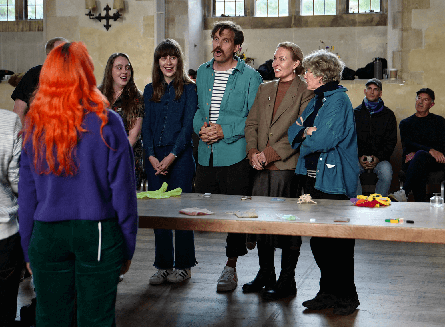
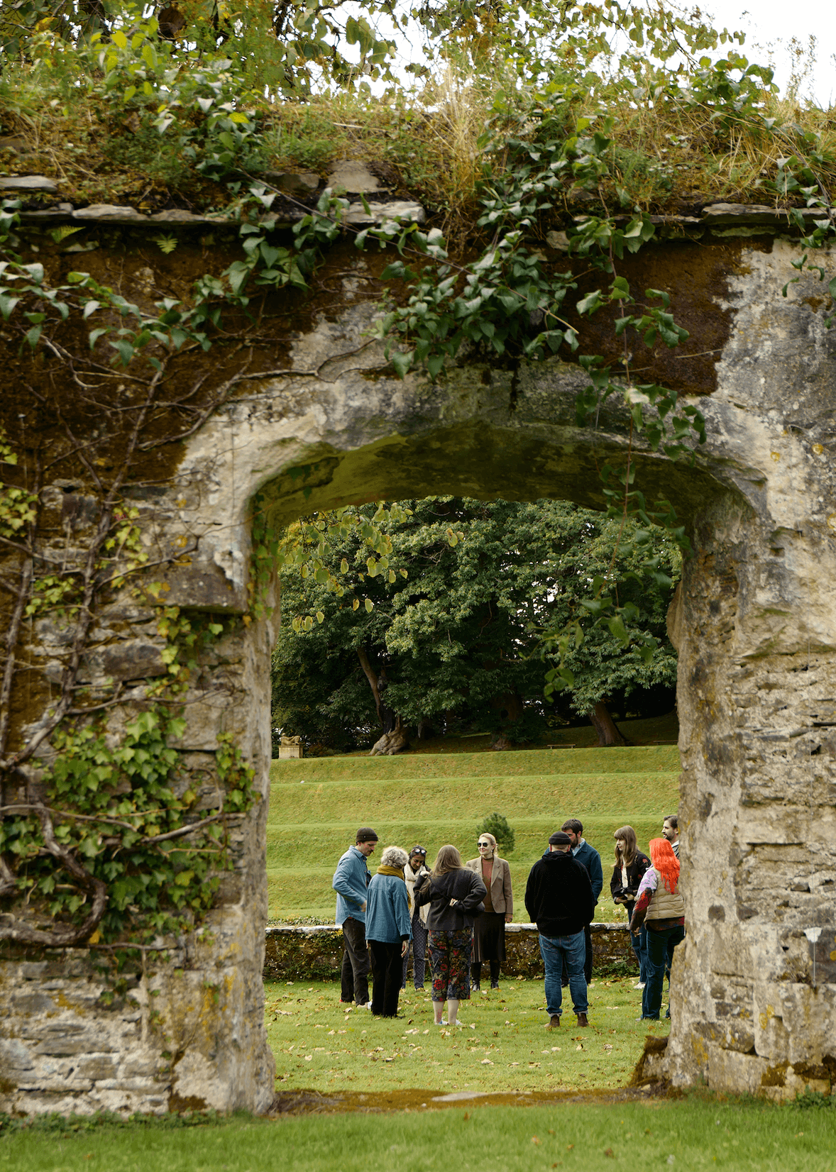
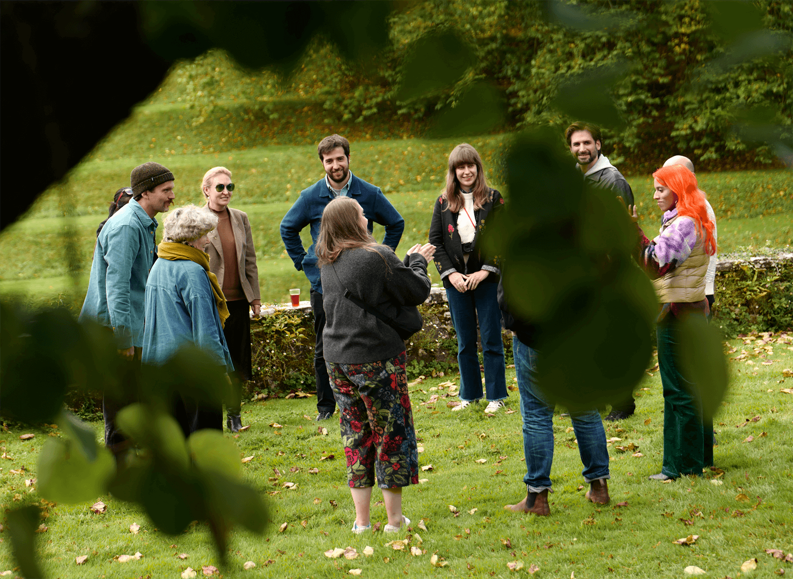
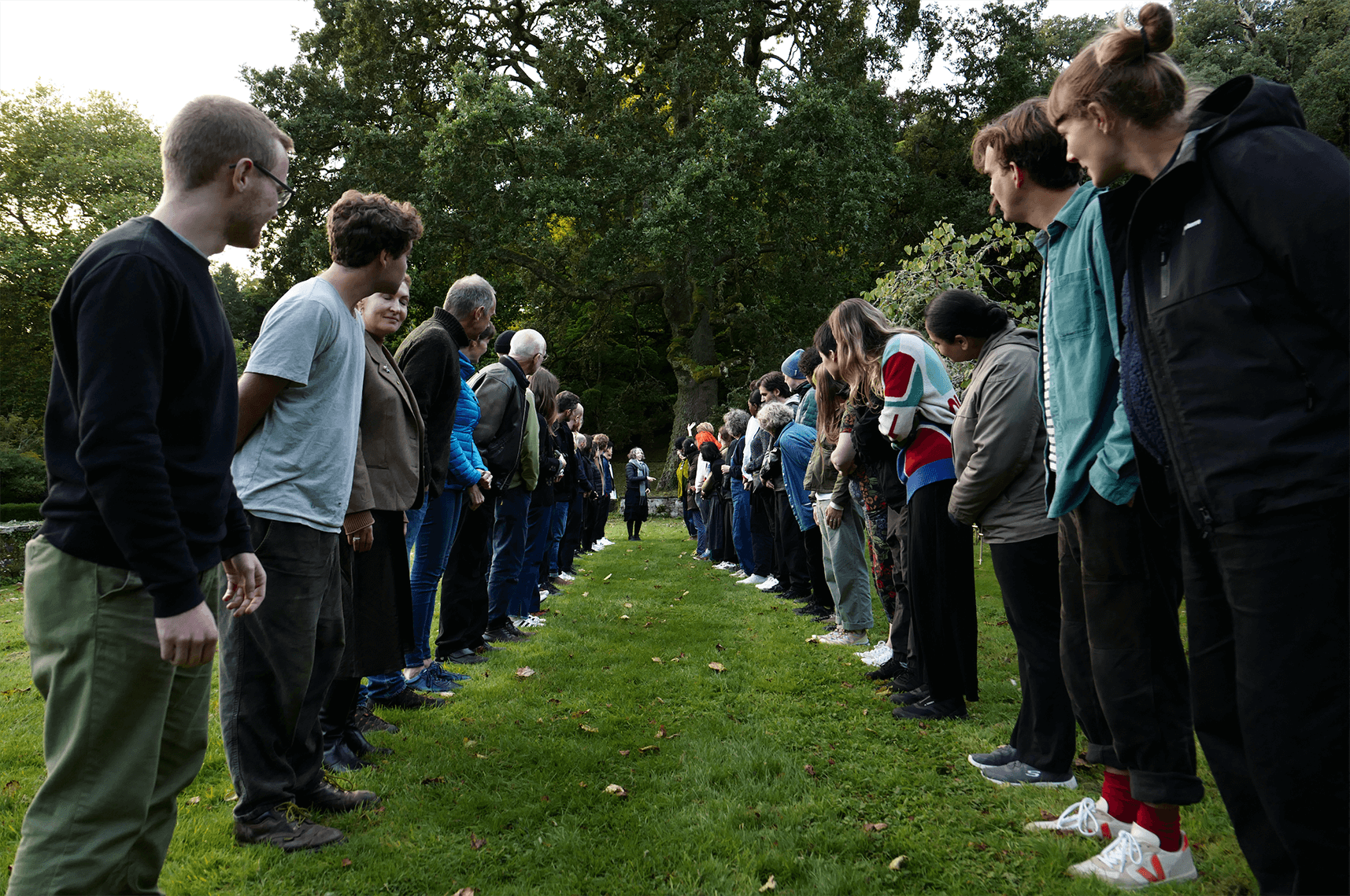
Royal Designers for Industry
Summer Session 2024
I was selected to participate in the Royal Society of Arts’ Summer Session 2024 at Dartington Hall, a cross-disciplinary gathering of designers, scientists, engineers and creative practitioners.
Centred around the theme “Mend, Do and Make”, the session explored how design, science and thought can collectively respond to a world in need of care. The session set a space for dialogue, reflection and shared experience across generations and disciplines, with no fixed outcome, but lasting impact.
Photo: RDIs/Philip Vile
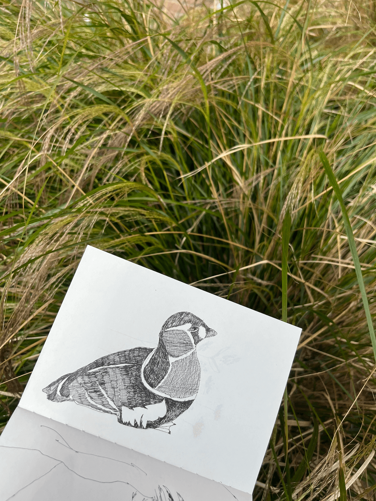
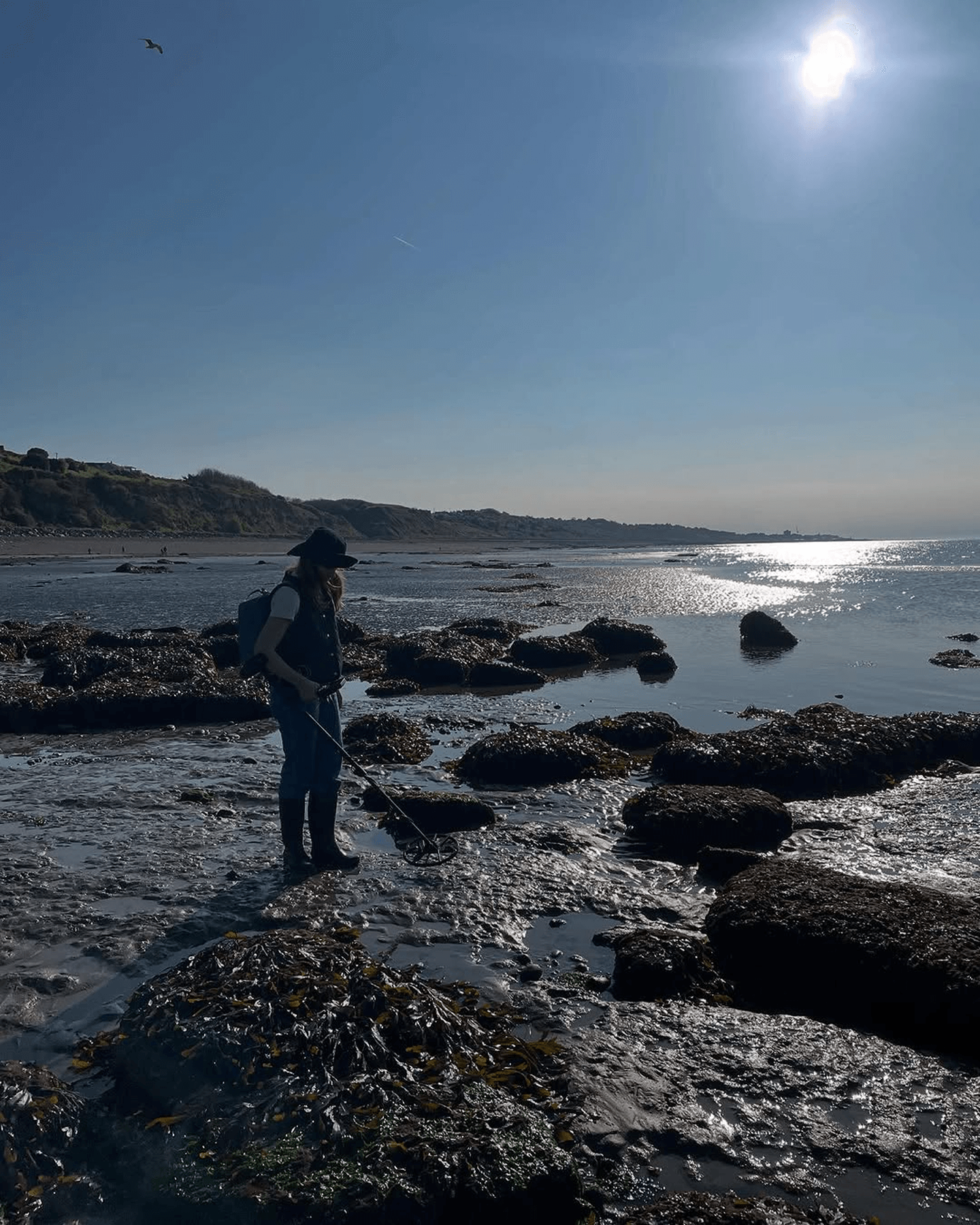
Archeology of Place
Ongoing field research project
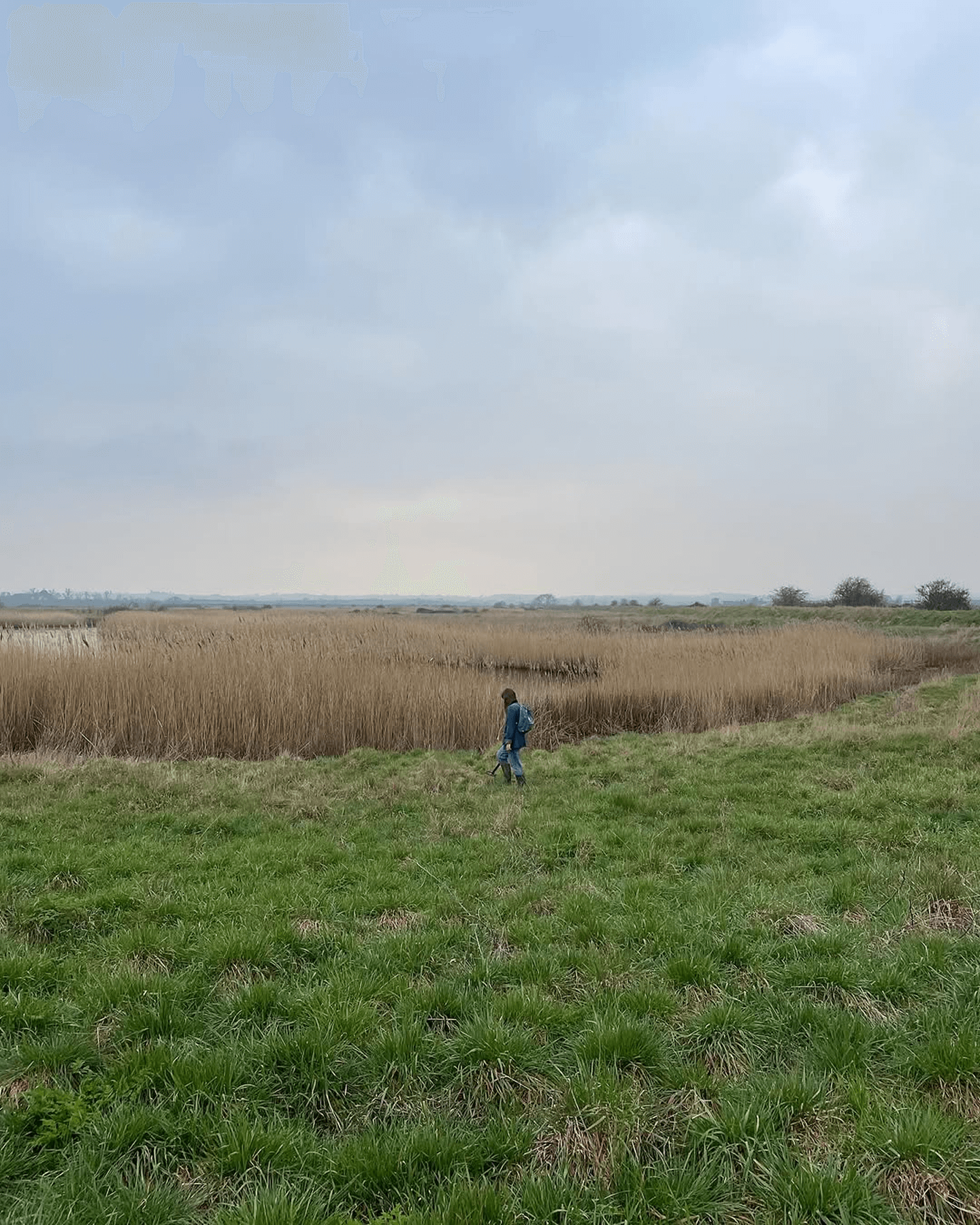
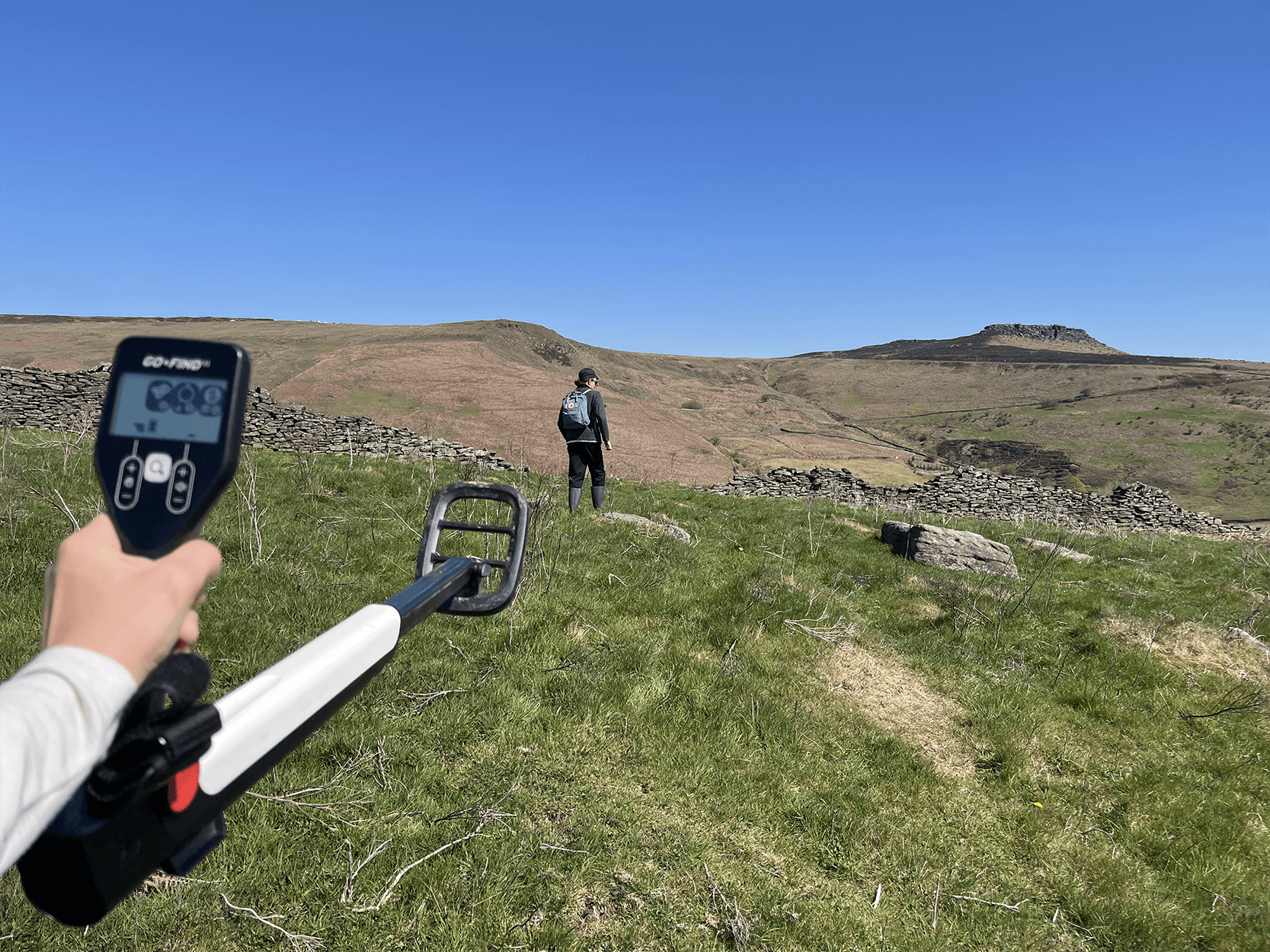
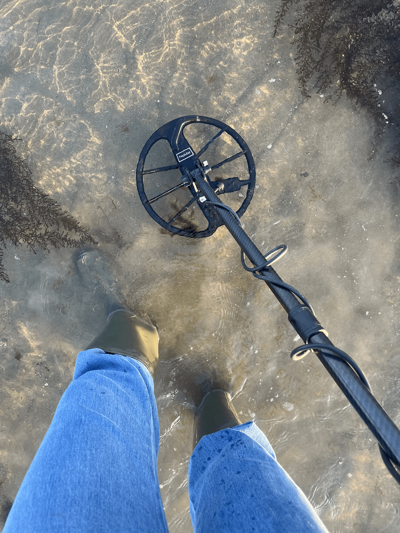
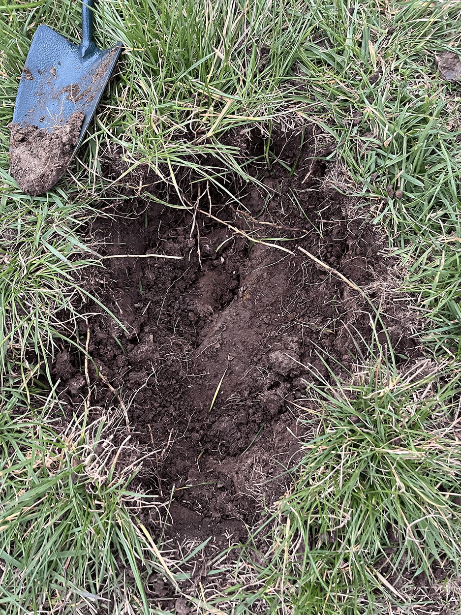
Archeology of Place is an ongoing personal project tracing the layers of history embedded in the British rural landscape. Through regular travel across the UK, I explore remote paths, open fields and overlooked terrain, walking, metal detecting, and collecting found objects to build an evolving archive of fragments.
The project develops from a fascination with how place holds memory, how routes once used for trade, migration, and ritual still echo through today’s fields, hedgerows, and footpaths. It draws attention to the quiet heritage of rural spaces: domestic remnants, agricultural tools, buried traces of everyday life.
I’m interested in the material stories left behind, the marks of how people moved through land, where they paused, and how these movements shaped and were shaped by the landscape itself. The finds range from iron nails and coins to tools, buttons, and pottery shards, small artefacts that speak of labour, dwelling, and long-forgotten hands.
At its heart, Archeology of Place is a slow, embodied way of reading the land. It invites reflection on how we map meaning, how we inhabit terrain shaped by countless lives before us, and what it means to uncover history not in museums, but underfoot.
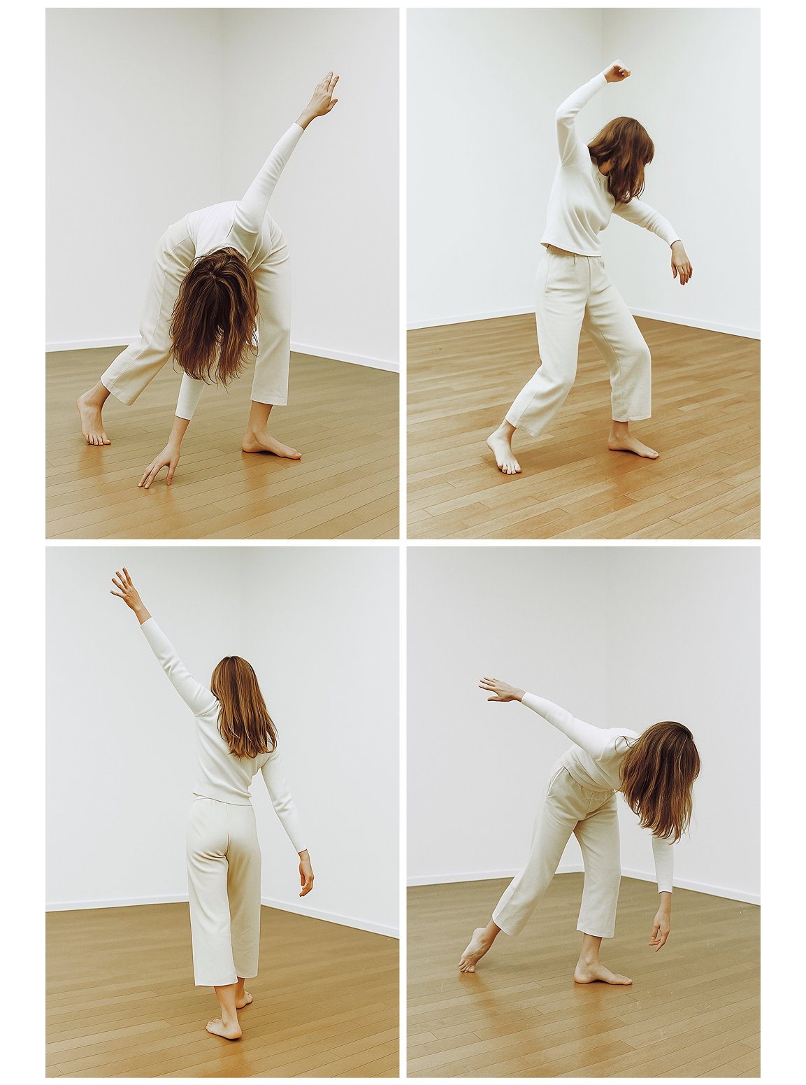
Archeology of Movement
Ongoing embodied research project
Archeology of Movement is a personal practice-based exploration rooted in Gaga, a movement language developed by choreographer Ohad Naharin. Through both in-person group classes and remote personal sessions, I engage with the body as a site of inquiry, observation, and transformation.
Unlike formal dance techniques, Gaga focuses less on form and more on internal awareness. Movements arise from sensation rather than choreography, guided by imagery, memory, instinct, and emotional texture. It’s not about how it looks, but how it feels.
This ongoing project becomes a kind of excavation: a slow uncovering of my own stored experiences, forgotten patterns, and subtle responses within the body. It’s grounded in presence, but constantly shifting, a dialogue between inner landscape and external motion. WIth each class I am exploring vulnerability, pleasure, resistance, and fluidity as tools for understanding myself. Like walking a path with no map, the process is intuitive and open-ended, unfolding moment by moment.
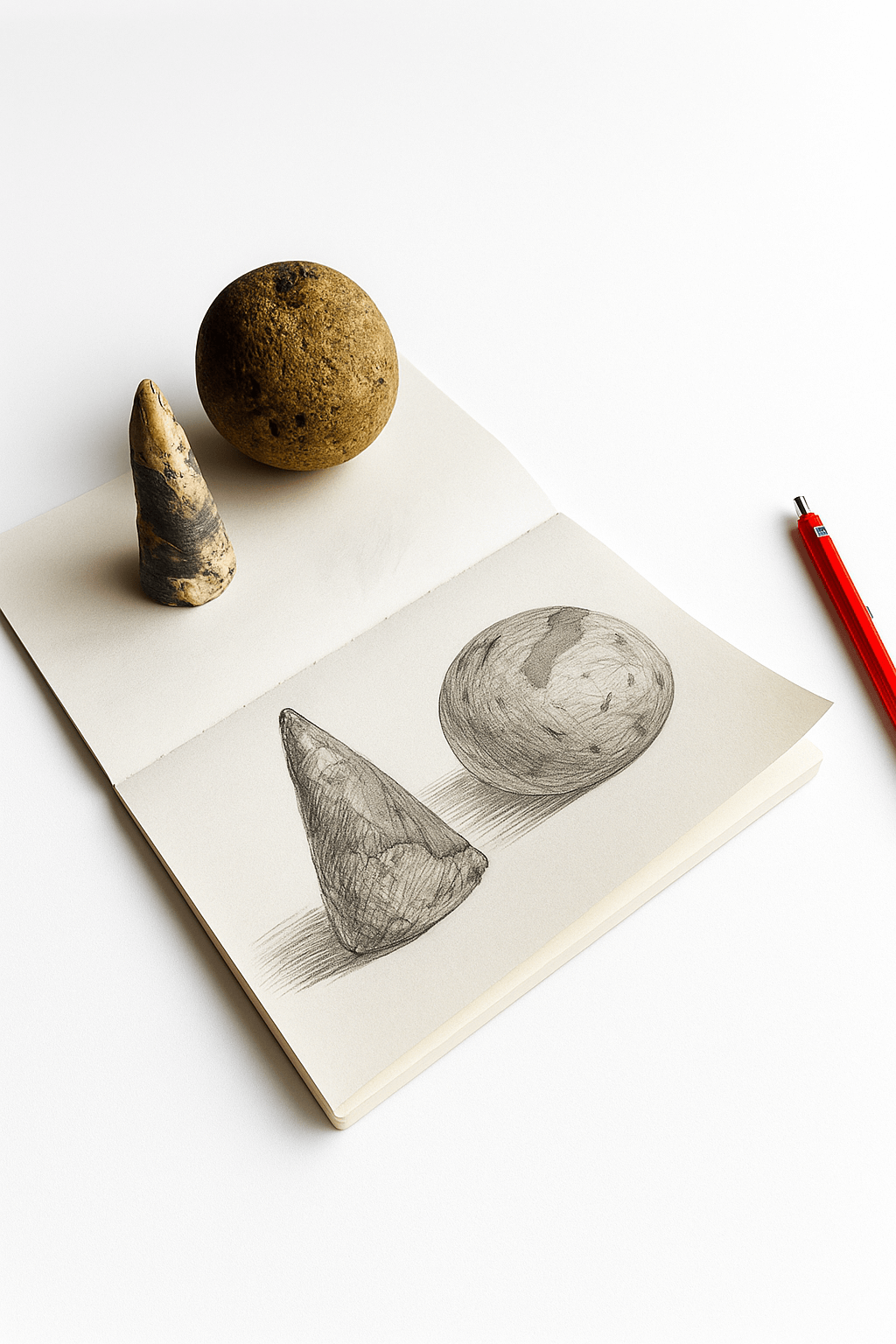
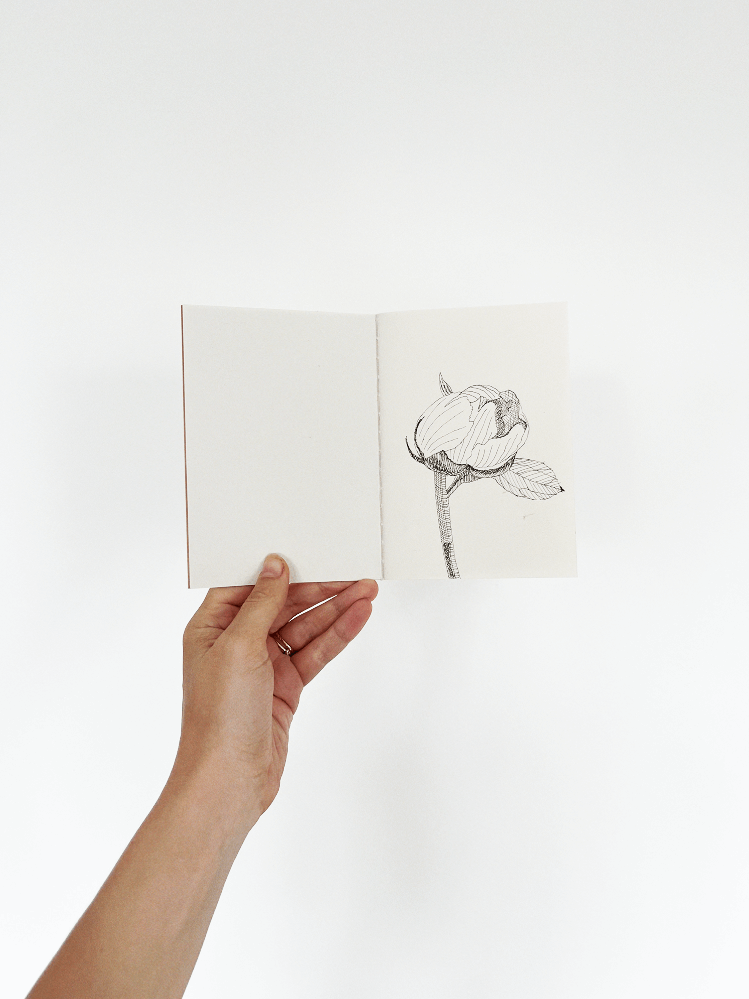
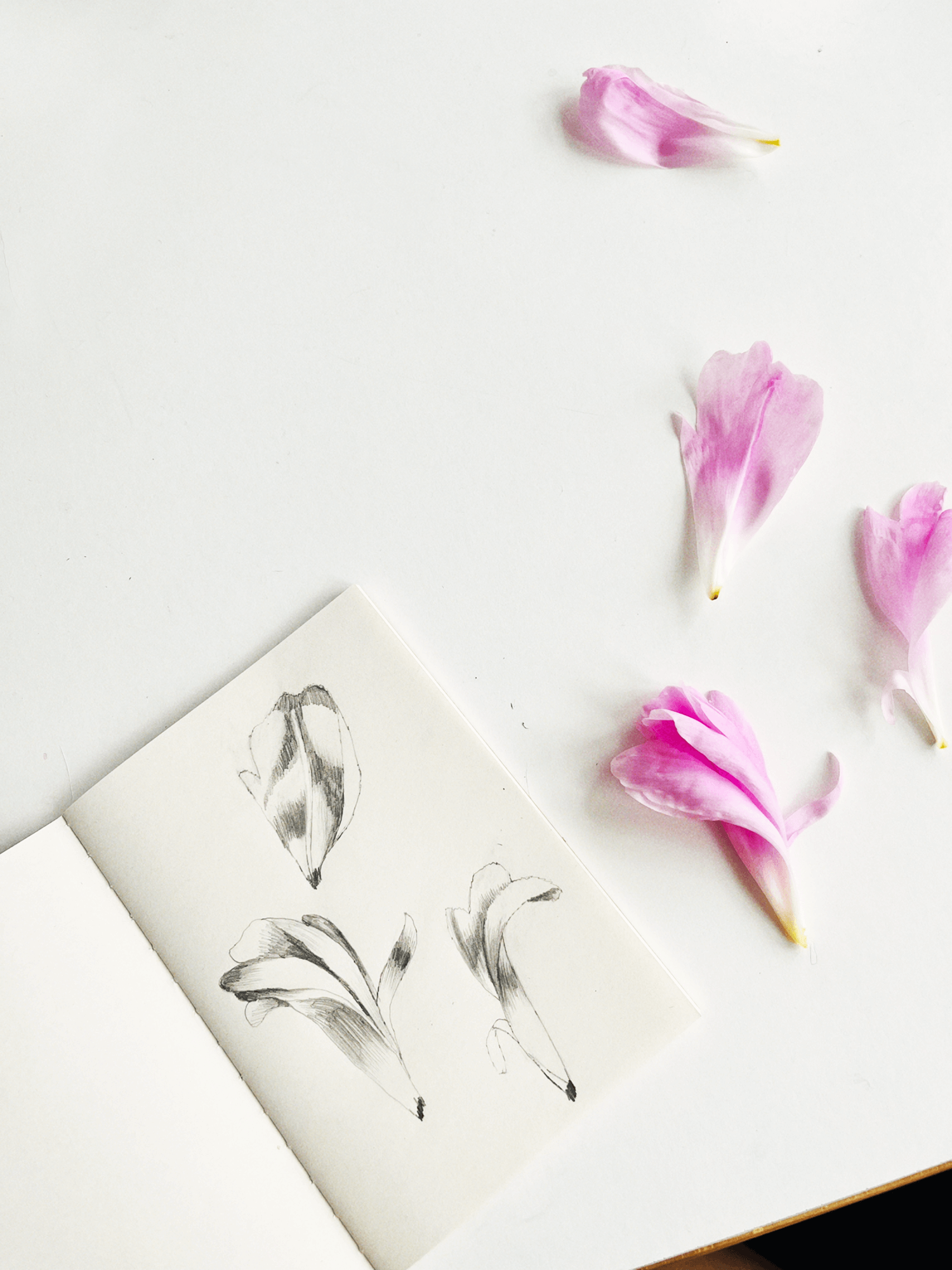
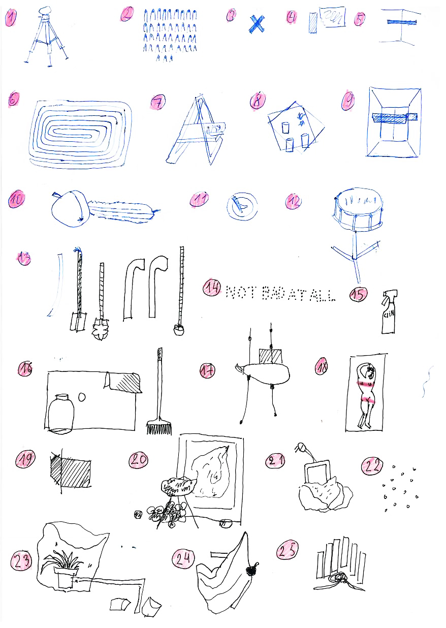
Exploration of Stillness
Ongoing drawing practice
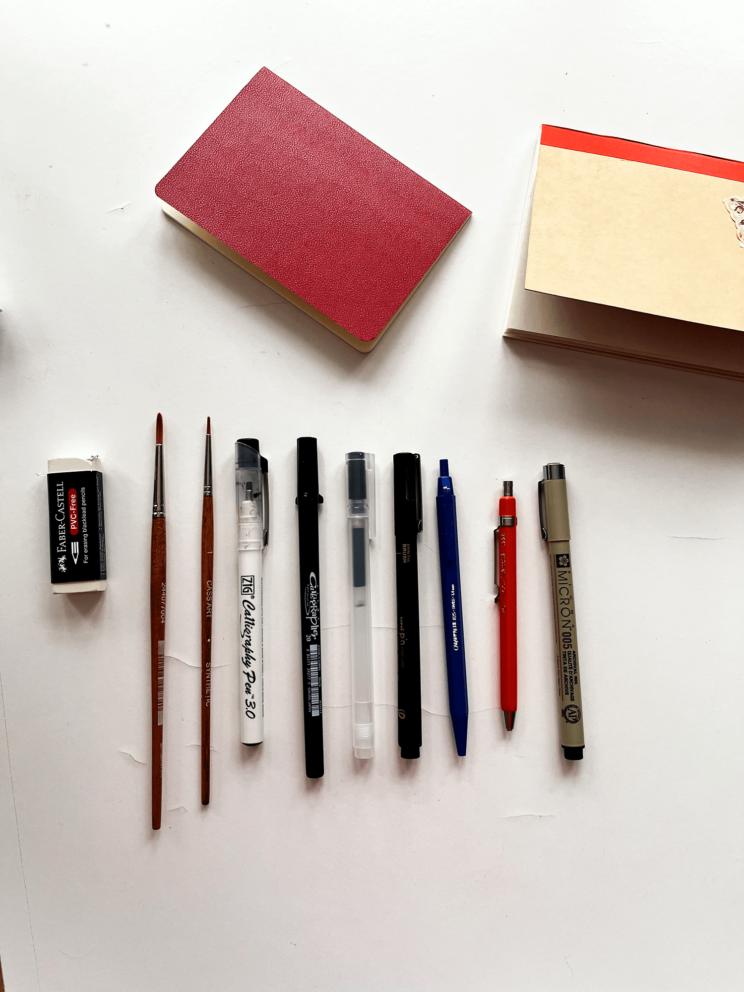
Exploration of Stillness is a quiet, observational practice focused on drawing natural forms as they are, without invention, stylisation, or narrative. It is an exercise in grounding through attention, using pencil and paper as a way to slow down and observe with care.
I work directly from the elements I encounter, stones, sticks, earth-formed objects, sketching them as studies of shape, texture, and weight. Each drawing becomes a record of presence that comes from not interpreting, not imagining, just seeing. Through repetition and still observation, I give space to things that are often passed over, subtle forms, held briefly in my attention.
I work directly from the elements I encounter, stones, sticks, earth-formed objects, sketching them as studies of shape, texture, and weight. Each drawing becomes a record of presence that comes from not interpreting, not imagining, just seeing. Through repetition and still observation, I give space to things that are often passed over, subtle forms, held briefly in my attention.